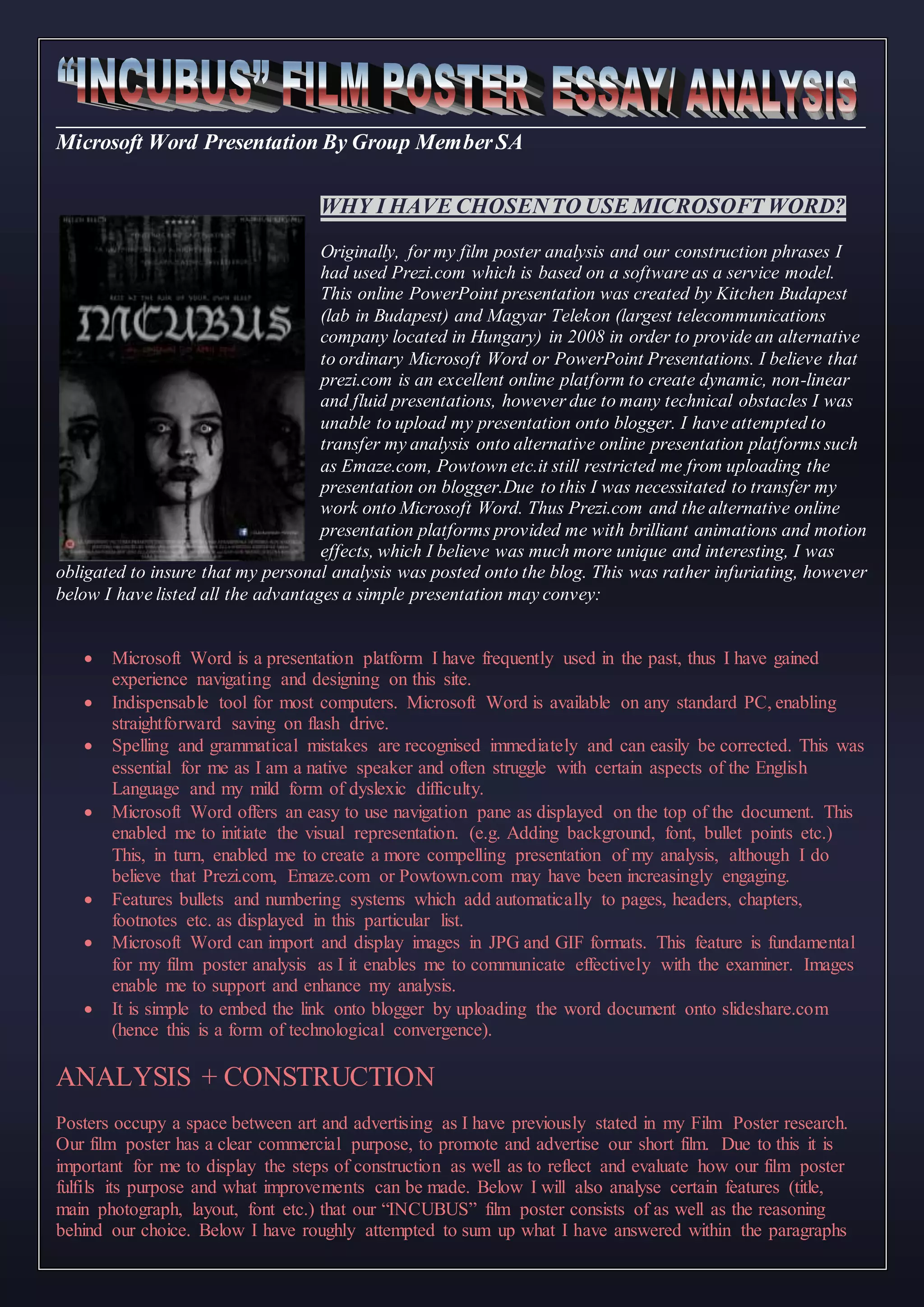
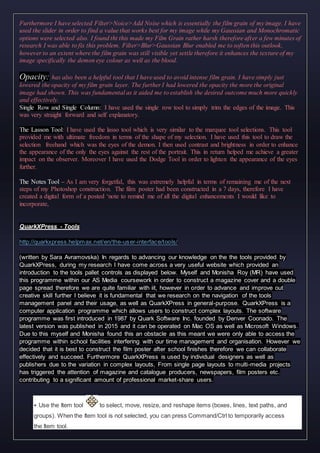
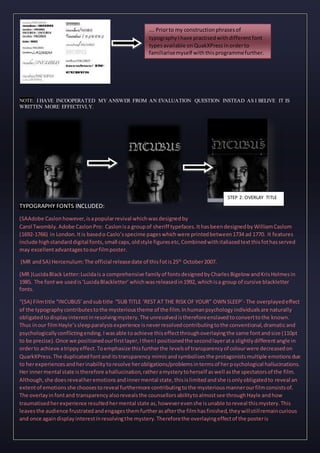
Microsoft Word Presentation By Group MemberSA
WHY I HAVE CHOSENTO USE MICROSOFT WORD?
Originally, for my film poster analysis and our construction phrases I
had used Prezi.com which is based on a software as a service model.
This online PowerPoint presentation was created by Kitchen Budapest
(lab in Budapest) and Magyar Telekon (largest telecommunications
company located in Hungary) in 2008 in order to provide an alternative
to ordinary Microsoft Word or PowerPoint Presentations. I believe that
prezi.com is an excellent online platform to create dynamic, non-linear
and fluid presentations, however due to many technical obstacles I was
unable to upload my presentation onto blogger. I have attempted to
transfer my analysis onto alternative online presentation platforms such
as Emaze.com, Powtown etc.it still restricted me from uploading the
presentation on blogger.Due to this I was necessitated to transfer my
work onto Microsoft Word. Thus Prezi.com and the alternative online
presentation platforms provided me with brilliant animations and motion
effects, which I believe was much more unique and interesting, I was
obligated to insure that my personal analysis was posted onto the blog. This was rather infuriating, however
below I have listed all the advantages a simple presentation may convey:
 Microsoft Word is a presentation platform I have frequently used in the past, thus I have gained
experience navigating and designing on this site.
 Indispensable tool for most computers. Microsoft Word is available on any standard PC, enabling
straightforward saving on flash drive.
 Spelling and grammatical mistakes are recognised immediately and can easily be corrected. This was
essential for me as I am a native speaker and often struggle with certain aspects of the English
Language and my mild form of dyslexic difficulty.
 Microsoft Word offers an easy to use navigation pane as displayed on the top of the document. This
enabled me to initiate the visual representation. (e.g. Adding background, font, bullet points etc.)
This, in turn, enabled me to create a more compelling presentation of my analysis, although I do
believe that Prezi.com, Emaze.com or Powtown.com may have been increasingly engaging.
 Features bullets and numbering systems which add automatically to pages, headers, chapters,
footnotes etc. as displayed in this particular list.
 Microsoft Word can import and display images in JPG and GIF formats. This feature is fundamental
for my film poster analysis as I it enables me to communicate effectively with the examiner. Images
enable me to support and enhance my analysis.
 It is simple to embed the link onto blogger by uploading the word document onto slideshare.com
(hence this is a form of technological convergence).
ANALYSIS + CONSTRUCTION
Posters occupy a space between art and advertising as I have previously stated in my Film Poster research.
Our film poster has a clear commercial purpose, to promote and advertise our short film. Due to this it is
important for me to display the steps of construction as well as to reflect and evaluate how our film poster
fulfils its purpose and what improvements can be made. Below I will also analyse certain features (title,
main photograph, layout, font etc.) that our “INCUBUS” film poster consists of as well as the reasoning
behind our choice. Below I have roughly attempted to sum up what I have answered within the paragraphs
by forming questions therefore it is more apparent to the examiner and possibly more interesting to read.
Thus, some of my answers may contain more complex links from our film poster to our film narrative,
protagonist etc.
 WHY WE HAVE CHOSENA FILM STILL?.STEP 1 OF THE
CONSTRUCTION
A film still is a static photograph taken from a video or a
film, which are kinetic, moving visuals. These can also be
referred to as a still or freeze frames. Freeze frames are
used to illustrating incidents and events, enabling close
security of significant moments. They are in many cases
used for criminal investigations such as for the 9/11
attacks, therefore myself and Monisha Roy have chosen
to incorporate our film still in order to demonstrate
a significant moment within the narrative of our film.
Positioning and framing of the image is fundamental in order to convey certain emotions. I believe that the
close-up shot accentuates and intensifies the terror within our target audience while triggering interest to go
and watch out short film. The close-up shot also revealed the significance of eye colour that emphasises
the inhumanly, supernatural nature of the demonic figures within our film. Furthermore, the
blood indicates the haunting figures In many cases in film time is extended by the use of a slow motion to
create emphasis and a stronger impact on the audience, isolated images from film (freeze frames) can
be classified as an expansion of this cinematic technique. We consider the freeze frame to capture real time
within our narrative to create the impression that the audience is seeing it in real time and experiencing it
from our protagonists point of view, although this isn't revealed in the poster itself contributing to a higher
level of mystery and confusion that Psychological Thrillers often consist of (codes and conventions). To
capture this significant moment in our Psychological Thriller, we straightforwardly Screen-
shoot/grab/captured the visual frame. Moreover the film still collaborates with the main media product, our
film "INCUBUS" and this is very clear as it is captured from a real scene in the film. Once the audience
watch the film they I’ll be able to recognise this aspect which relates to larger structures of the film such as
the narrative allowing extensive analysis. However various elements of the shot (screenshot), we found
rather distracting from the main subject within the image. This lead us to use Photoshop CS6 in order to
overcome this obstacle.
AN EXAMPLE OF THE USE: Thefreeze frame can be seen in Alfred Hitchcock's in his
1929 Champagne, aswell a FrankCapra'schristmas film It's a wonderfulLife.
Key Themesof Psychological Thrillers: Mind, perception, reality, identity and death as well
as existence and purpose
STEP2: FLATPLANNING and CLOSE- UP STEP 2
Website that I have found interesting to read in regards to page
formatting: http://frontrowposters.co.uk/poster_sizes.cfm
For our flat panningprocess, myself and Monisha Roy have decided
to use the portrait pageplan of a publication that mimics the
format of film posters, not only from the Psychological Thriller
Genre. Individualsare often best displayed in a vertical formant,
hence the name‘portrait’ format. This format offers the most
striking and dramaticlayout potential enhancing ourpurpose as we were ableto fill the
space up with the title, sub title, review/positive quotes and other features, in order to
achieve a professional outcome. This format also best suited our composition and camera
shot. The tightly framed imagedisplays detail of texture and contrast effectively. Photoshop
CS6 hashelped me achieve this as displayed below.
STEP 3 –USING PHOTOSHOP CS6 + WHY WE HAVE CHOSEN TO USE
BLACK AND WHITE (COLOUR CONNOTATION
NOTE:THIS IS A REPLICAOF MY EVALUATION.I HAVE ADDED THIS AS I BELIEVE
IT IS RATHER USEFULON THIS PRESENTATIONALSO.
Released in May 2012, Adobe Photoshop CS is a
raster graphics editor was published and develop by
Adobe Systems which are a part of Windows and OS
X I found this software straightforward to use as I
have come across it during my AS Media
Coursework which required me to construct a
magazine cover and a double page spread. Due to
this we believe it is an excellent and appropriate
programme that has aided us to improve our
technical and creative skills from our AS
coursework; however we did face some obstacles.
One of the obstacles included accessibility, as we
were only able to access the programme within school facilities and only the media room, and it
was difficult to arrange timings where the room was free to use outside of our lesson time
disrupting the consistency of our construction. Due to this we had to stay in after school and
during break times which helped us solve this problem. Furthermore, although Adobe
Photoshop CS6 allows users to save final products in a PNG file format, we faced many
difficulties in regards to this as for no apparent reason we were unable to save out final product.
Our final image deleted on several occasions and our fifth attempt of constructing and saving
out poster finally worked. This enabled us upload the poster on Quark X Press (Monisha Roy
will address this software) allowing us to distribute the poster online as well as in a hardware
printed copy. Thus, Photoshop entitled us to digitally manipulate and enhance the quality of our
film poster image as well as to compose the raster image and manipulate its layers, The CS6 has
presented a powerful suite of tools such as colour balance and exposure adjustments, cropping
tool, colour replacement etc. For example, myself and Monisha Roy (MR) have used the
cropping tool to disregard portions outside the chosen section () which has guided us to remove
excess and unnecessary space, enabling a focal point of the film still we have used within out
poster . this helped us enhance the composition of the image. Alternatively, we also used the
cropping tool therefore we can extend the canvas in a desired size by clicking and dragging
outside the existing imagine boarders. This therefore enabling technological convergence with
another contemporary media technology, Quark X Press, leading us to further develop skill of
presentation required for further studies of Media and a media based workplace.
CONSTRUCTION
Below I have listen the tools that we have used with the reasoning behind them:
Cropping Tool: This tool is located in the tools pallete on the right hand side of the Photoshop CS6
document. I have used this tool to select a portrait formatting and disregard the proportions outside of my
chosen selection. This tool allowed me to create a focal point of my image which has furthermore enhanced
my compositionwhile decreasing in file size. I was also used the cropping tool to alternatively extend my
portrait canvas by clicking and dragging outside the existing image
boarders in order to covey the portrait formatting more effectively.
This has enabled me to upload and work with the saved PNG image
on QuarkXPress much more adequately with no difficulty (besides
our saving which I have mentioned in my evaluation above).
The Eyedropper Tool - This tool allowed me to change the
foreground colour on whatever I clicked on. This was helpful for
changing the white colour to black of the extended canvas.
Marquuee Tool:This tool allows more adjustments to be made to a
selected area before cropping. The rectangular marquee tool was
my preferred option in order to further enhance my portrait
formatting. I was able to adjust the width and height of the image
by selecting my specific ratio. This phrase of my construction is
displayed to where the arrow is pointing.
STEP 4: BLACK AND WHITE (COLOUR CONNOTATION)
Photoshop:Black and White Tool
STEPS: COSEN IMAGE > ADJUSTMENTS > BLACK AND WHITE
Firstly I have duplicated my background layer and this was fundamental as my background layer
contains all the pixel information that shold not be lost under any circumstances. A short cut that I found
to this was simply pressing Command+J . I have then used the adjust sliders in order to achieve desired
dark and light tonal values. When dragging the slide to the left the image would achieve darker tonal
ranges where as to the right wouldquite rightly do the opposite. I have also attempted to do this step by
Image> Adjustments > Departure however I was not pleased with the result. I preferred using the
adjustment sliders as I was able to personalise the tonal values to an extent where my desired texture and
detail of the image was revealed.
BEFORE
AFTER
COLOUR CONNOTATION
 Denotative Meaning of Black (Google Definitions) “The adjective black is of the very darkest colour
owing the absence of o compete absorption of light, the opposite of white”
 Denotative Meaning of White (Google Definition “The adjective white is of the colour of milk or
fresh snow, due to the reflection of all visible rays of light, the opposite of black”
However the connotation of black and white determines an idea or a feeling which these adjectives invoke in
addition to their explicit primary or literal denotative meaning. A connotation is often linked to cultural or
emotional associations frequently described as ether negative or positive, in regards to displeasing or
pleasing an emotional connection within the observer. Colour connotation was fundamental within our film
poster for multiple interpretations. The black and white effect was inspired by my Psychological Film Poster
analysis ’23’, by mainly inspired by ‘The Master of Suspense’ Sir Alfred Joseph Hitchcock. The English
director and producer’s stylistic trademarks include camera movements that mimic a characters gaze and
triggered voyeurism within the audience with framed shots that intensify
anxiety and fear
throughout the thrilling
plot. This in turn served
Hitchcock his fame of the
Psychological Thriller
film genre. Alfred has
admirably set the codes
and conventions of
suspense intensifying
films through his Black
and White films, and we did not only use some of his trademarks for our
short film, however myself and my fellow group member wanted to embody
his success by creating a black and white film poster. Hitchcock’s films
remain timeless, therefore by mimicking the black and white effect that his films consist of, I believe we were
able to achieve a connection with our narrative plot like and the passage of time; our protagonist Hayle and
her inability to go to sleep is reflected in this manner. Furthermore Black and White evokes an emotional
connection while allowing the observer (our target audience) to focus on the texture and contrast
contributing to visual interest. As the photographer Eric Kim stated “You can pin point certain details in
the composition, which may have been obstructed by colour. At times I also notice that certain images can
get far too busy in colour, and black and white allows you to cut back on some of the distractions.”
Moreover Lauren Phillips stated “One reason black and white photography creates such feeling is the
contrast between dark and light shades of black, white and gray. The human eye notices two things when
looking at a photo, colour and contrast. With no colour to view, you eye becomes even more sensitive to the
sharp contrast in black and white photos; creating a stronger, more moving image.”Due to this the black
and white photography I believe enhanced the eye colour and the dripping blood of the demon character
(aka myself) furthermore intensifying fear and terror, triggering our audiences attention and interest to
watch our short film. The enhancement of the eye colour due to high levels of contrast and adjusted
brightness as well as saturation I was able to achieve by using Photoshop Adobe CS6; I believe this has a
great impact on the audience as the dehumanised eye colour suggests the supernatural element of our film
while the blood often signifies as a symbol of tolerance, hardships and difficulties, death, mystery while
reinforcing danger that our film upholds; The unknown demonised creatures continuously haunt Hayle’s
mental state and we have aimed to mimic this concept.. For this reason I also believe that our main product
and the film poster collaborate effectively together. Furthermore, the colour black is often connoted to
secrecy and the unknown, which results in establishing a mysterious atmosphere once again providing a
parallel to our film and the final mysterious line of the script ‘I’m afraid I do not know’. In psychology the
colour black is connoted with protection from the external emotional stress, instilling a barrier from the
outside world that Hayle is attempting to pursue by visiting her counsellor. This colour provides comfort
hiding from vulnerabilities (hence the counsellors black clothing attire linking to her characters
professional purpose) and Hayle’s unconventional relationship with her parents “Leaving me home alone…
Again.” (quote from our script). Moreover, the colour black in relation to its denotative meaning is
absorption of all colours and absence of light, which reflects the time-frame in which our story is set (night)
as well as the significant events of Hayle’s sleep paralysis experience. Moreover, black is often connoted
with evil and unfriendly, due to the power it often excludes. The colour radiates authority while excluding
fear in the process which may lead our target audiences to question whether the character on the poster is
the haunted or the hunter? Is she good or evil? If this character was good, what has occurred for her to
convey such a state? Fortunately, all these questions will remain unanswered unless the viewer of our poster
observes our short film; therefore in this manner I believe that the film poster triggers intensified interest
and curiosity. Too much black can also trigger negative mental illnesses such as depression which our
protagonist may be experiencing due to her continuous experiences with sleep paralysis, and I believe that
the film poster therefore excludes awareness of this mental illness. When compiling both colour
connotations together in a form of photography, it projects the psychological conflict that occurs within our
film while also benefiting the tones, detail and texture of my film still. Good and evil is a conflicting aspect
itself which may reflect what our target audience associate our film with based on the film poster. Perhaps
many individuals will believe that a good and evil aspect may consist in the individual’s (our protagonists or
the demon presented within the poster) personality, and perhaps this could trigger a psychological conflict
to an extent of which the character is traumatised and suppressed. This suggests the conflict between good
and evil may shape our protagonists everyday life and actions. Due to this, I believe we have challenged the
conventional use of a photograph of the protagonist on film posters, as our demonised figure reflects the
protagonist’s mental state, although Hayle is not presented on the poster. As a result, I believe this triggers
an increase of interest in the audience. In contrast, white has a rather opposite connotation. White is often
associated with purity, goodness, innocence, cleanliness, perfection, harmlessness and safety. As I have
previously stated white is also associated with doctors and hospital facilities as it is the colour used to
promote many medical products within our society. This could reflect Hayle’s urgency for medical, rather
psychological assistance.
This foreshadows, almost projects the key theme our film consists of.
YOUTUBE VIDEOS I HAVE USED TO HELP ME WITH PHOTOSHOP CS6:
 https://www.youtube.com/watch?v=7ZlXagXwcn4
 https://www.youtube.com/watch?v=OjRqZiAgoHo
 https://www.youtube.com/watch?v=j5mJaCSjW5k
 https://www.youtube.com/watch?v=UrvSR-s21to
Contrast and Brightness: This tool allowed me to make adjustments to the tonal values/ranges within my
image.The adjustment sliders have enabled me to expand the highlights and shadows of my image.
Brightness and contrast simply shifts values to higher and lower when adjusting the brightness. While this
can in some cases cause loss of detail within the image. I have watched this video in order to gain more
insight into this tool:http://www.photoshop.com/tutorials/1668
Spot Healing Tool: This is a default healing tool which has helped me blend pixels form areas seamlessly
with the target areas of my image. This was extremely effective for removing any blemishes or marks in
pursuance of achieving a professional outcome. This tool blends colour and luminosity. This tool is very
similar to the Clone Stamp Tool, however I disliked it due to blending issues. This tool direcly copied the
area I have selected and copied it to the second which was rather infuriating.
The Eraser Tool: is self explanatory. I used this tool to simply erase areas of information that I did not
desire.
Film Grain:Since my main image for the poster was taken as a film still film ‘Incubus’ was already
grainy, however I wanted to enhance this in order to reflect the night time frame of our film. I have firstly
added a new layer with %0% gray and set to overlay. This lead me on to converting the new layer into a
smart object therefore once an effect has been completed, the image would still remain fully editable.
Furthermore I have selected Filter>Noice>Add Noise which is essentially the film grain of my image. I have
used the slider in order to find a value that works best for my image while my Gaussian and Monochromatic
options were selected also. I found tht this made my Film Grain rather harsh therefore after a few minutes of
research I was able to fix this problem. Filter>Blur>Gaussian Blur enabled me to soften this outlook,
however to an extent where the film grain was still visible yet settle therefore it enhances the texture of my
image specifically the demon eye colour as well as the blood.
Opacity: has also been a helpful tool that I have used to avoid intense film grain. I have simply just
lowered the opacity of my film grain layer. The further I had lowered the opacity the more the original
image had shown. This was fundamental as it aided me to establish the desired outcome much more quickly
and effectively.
Single Row and Single Column: I have used the single row tool to simply trim the edges of the image. This
was very straight forward and self explanatory.
The Lasson Tool: I have used the lasso tool which is very similar to the marquee tool selections. This tool
provided me with ultimate freedom in terms of the shape of my selection. I have used this tool to draw the
selection freehand which was the eyes of the demon. I then used contrast and brightness in order to enhance
the appearance of the only the eyes against the rest of the portrait. This in return helped me achieve a greater
impact on the observer. Moreover I have used the Dodge Tool in order to lighten the appearance of the eyes
further.
The Notes Tool – As I am very forgetful, this was extremely helpful in terms of remaining me of the next
steps of my Photoshop construction. The film poster had been constructed in a 7 days, therefore I have
created a digital form of a posted ‘note to remind me of all the digital enhancements I would like to
incorporate,
QuarkXPress - Tools
http://quarkxpress.helpmax.net/en/the-user-interface/tools/
(written by Sara Avramovska) In regards to advancing our knowledge on the the tools provided by
QuarkXPress, during my research I have come across a very useful website which provided an
introduction to the tools pallet controls as displayed below. Myself and Monisha Roy (MR) have used
this programme within our AS Media coursework in order to construct a magazine cover and a double
page spread therefore we are quite familiar with iit, however in order to advance and improve out
creative skill further I believe it is fundamental that we research on the navigation of the tools
management panel and their usage, as well as QuarkXPress in general-purpose. QuarkXPress is a
computer application programme which allows users to construct complex layouts. The software
programme was first introduced in 1987 by Quark Software Inc. founded by Denver Coonado. The
latest version was published in 2015 and it can be operated on Mac OS as well as Microsoft Windows.
Due to this myself and Monisha found this an obstacle as this meant we were only able to access the
programme within school facilities interfering with our time management and organisation. However we
decided that it is best to construct the film poster after school finishes therefore we can collaborate
effectively and succeed. Furthermore QuarkXPress is used by individual designers as well as
publishers due to the variation in complex layouts, From single page layouts to multi-media projects
has triggered the attention of magazine and catalogue producers, newspapers, film posters etc.
contributing to a significant amount of professional market-share users.
 Use the Item tool to select, move, resize, and reshape items (boxes, lines, text paths, and
groups). When the Item tool is not selected, you can press Command/Ctrl to temporarily access
the Item tool.
 Use the Text Content tool to draw text boxes and work with text in boxes.
 Use the Picture Content tool to draw picture boxes and work with pictures in boxes.
 Use the Linking tool to link text boxes.
 Use the Unlinking tool to unlink text boxes.
 Use the Rectangle Box tool to create a rectangular box. To draw a square box, press and hold
Shift while drawing.
 Use the Oval Box tool to create an oval box. To create a circular box, press and hold Shift
while drawing.
 Use the Composition Zones tool to create a Composition Zones box.
 Use the Star Box tool to create a star-shaped box.
 Use the Line tool to create straight diagonal lines of any angle. To constrain a line angle to 45
degrees, press and hold Shift while drawing.
 Use the Bézier Pen tool to create Bézier lines and boxes. To constrain a line angle to 45
degrees, press and hold Shift while drawing.
 Use the Add Point tool to add a point to any type of path. Adding a point to a content box
automatically turns the content box into a Bézier item.
 Use the Remove Point tool to remove a point from any type of path.
 Use the Convert Point tool to automatically convert corner points to curve points, and curve
points to corner points. Click and drag to change the position of a point, the curve of a curved line
segment, or the position of a straight line segment. Select this tool and click a rectangular box or
straight line to convert the item to a Bézier box or line.
 Use the Scissors tool to cut an item into distinct paths.
 Use the Select Point tool to select curves or points so that you can move them or delete them.
Press Shift and click to select multiple points. Option-click/Alt-click a point to make it symmetrical.
 Use the Freehand Line tool to draw any shape line or box you want. If you don’t close a
freehand box, it remains a line. To automatically close a freehand box, press Option/Alt.
 Use the Tables tool to create a table.
 Use the Zoom tool to enlarge or reduce the document view.
 Use the Pan tool to reposition the active layout.
TYPOGRAPHY
NOTE: I HAVE INCOOPERATED MY ANSWER FROM AN EVALUATION QUESTION INSTEAD AS I BELIVE IT IS
WRITTEN MORE EFFECTIVLY.
TYPOGRAPHY FONTS INCLUDED:
(SAAdobe Caslonhowever,isapopularrevival whichwasdesignedby
Carol Twombly.Adobe CaslonPro: Caslonisa groupof sheriff typefaces.IthasbeendesignedbyWilliamCaslom
(1692-1766) in London.Itis basedo Caslo’sspecime pageswhichwere printedbetween1734 ad 1770. It features
include highstandarddigital fonts,small caps,oldstyle figuresetc,Combinedwithitaliazedtextthisfothasserved
may excellentadvantagestoourfilmposter.
(MR andSA) Hercenulum:The official releasedate of thisfotis25th
October2007.
(MR )LucidaBlack Letter:Lucidais a comprehensive familyof fontsdesignedbyCharlesBigelow andKrisHolmesin
1985. The fontwe usedis‘LucidaBlackletter’whichwasreleasedin1992, whichisa group of cursive blackletter
fonts.
“(SA) Filmtitle “INCUBUS’andsubtitle “SUB TITLE ‘REST AT THE RISKOF YOUR” OWN SLEEP’- The overplayedeffect
of the typographycontributestothe mysterioustheme of the film.Inhumanpsychologyindividualsare naturally
obligatedtodisplayinterestinresolvingmystery.The unresolvedisthereforeenslavedtoconverttothe known.
Thus inour filmHayle’ssleepparalysisexperience isneverresolvedcontributingtothe conventional,dramaticand
psychologicallyconflictingending.Iwasable toachieve thiseffectthroughoverlayingthe same fontandsize (110pt
to be precise).Once we positionedourfirstlayer,IthenI positionedthe secondlayerata slightlydifferentangle in
orderto achieve atrippyeffect.Toemphasize thisfurtherthe levelsof transparencyof colourwere decreasedon
QuarkXPress.The duplicatedfontanditstransparency mimicandsymbolisesthe protagonistsmultiple emotionsdue
to herexperiencesandherinabilitytoresolve herobligations/problemsintermsof herpsychological hallucinations.
Her innermental state istherefore ahallucination,ratheramysterytoherself aswell asthe spectatorsof the film.
Although,she doesrevealheremotionsandinnermental state,thisislimitedandshe isonlyobligatedto reveal an
extentof emotionsshe choosestoreveal furthermore contributingtothe mysteriousmannerourfilmconsistsof.
The overlayinfontand transparencyalsorevealsthe counsellorsabilitytoalmostsee throughHayle andhow
traumatisedherexperience resultedhermental state as,howeverevenshe isunable toreveal thismystery.This
leavesthe audience frustratedandengagesthemfurtherasafterthe filmhasfinished,theywillstillremaincurious
and once againdisplayinterestinresolvingthe mystery.Thereforethe overlayingeffectof the posteris
STEP 2: OVERLAY TITLE
…. Priorto my constructionphrasesof
typographyIhave practisedwithdifferentfont
typesavailable onQuakXPress inorderto
familiarisemyself withthisprogrammefurther.
fundamentallyeffectivewiththe combinationof ourshortfilm.Thisisfurtheremphasisedbythe colour
connotationsof blackandwhite as well asthe contrasttheyprovide.
Moreover,the fontsize of 110pt and LucidaBlack LetterfontprovidedbyQuarkXPresscontributestothe estetic
layout.The typographyfontwe have chosenisindicative of the psychologicalthrillergenre asitconveysitscodes
and conventionswhilerepellingtouse simple andbasicfont.The word“Incubus”is alsonot recognisedbymany
individualsdue toitsarchaicorigination. Iwasinspiredtochoose thistitle byHenre Fusseli‘The Nightmare’
painting,year1781, as it trulyresemblesthe classicdepictionsof sleepparalysisperceivedbydemonic
hallucinations/visitationsuponanindividual.The archaicnounisunrecognisable tomodernaudiences,thistriggers
and engagesthe audiencesfurtherasitprovidesthemamysterytosolve bysimplywatchingthe film.Ibelie ve that
once an individual witnessesthe narrative plotline theyare able tounderstandthe meaningbehindincubusandthe
symbolicresemblance itprovidestoourfilm.Ihave alsochosento include anarchaicnounas itresembledthe fact
that psychological conflictsoriginate fromthe past,andinmanycases the past hasan impact inthe individuals
future,suggestingthatinmanycasesthe past can triggersleepparalysisanddetermineonesemotionalandmental
state such as Hayle’s.Due tothe many reasonslistedabove Itrulybelievethatthe title hascollaboratedwiththe
filmrathereffectively.The titleisalsoplacedinthe middle of the page toenhance thisanddraw inthe attentionsof
the audience atfirstglance.”
Positive Quote
(SA) POSITIVEQUOTE- Withinour filmposterwe have decidedtoalsoinclude positivequotesthatare a
conventional elementof thispromotional product.Ourancillarytasksincludednotonlyaposterwhichmyself and
MonishaRoy (MR) have constructed,but alsoa brilliantfilmreview byourfellow groupmemberEllaPonting(EP).In
orderto combine the twoancillarytasksinrelationtoour mainproduct,we concludedthatcarefullypickingout
certainphrasesfromElla’sfilmreviewwouldbe appropriatein ordertoachieve aprofessionaloutlook.(real media
filmpostersalsoinclude positive quotesfromfilmreviews) These included:“ITENSEANDCAPTIVATING”,“A GRIPPIG
TALE OF A NIGHT BESET” as well as“ENCAPSULATIGSHEER TERROR”. The shortand grippingquotesdraw the
observersengagedinteresttowatchour filmbyallowingthentoanopeninterpretationof the plotlinewithahint
that eventswithinthe filmtake place at‘Night’. Itisfundamental thatshortquotesare usedwithemotivefeatures
therefore theyresonatewiththe observerscontributingtothe overall combinedeffectivenessbetweenthe film
poster,filmreviewandthe mainproduct.Thisallowsaunique sellingpointof ourfilm.Moreover,we have carefully
pickedoutcertainphrasesfromthe due to language featuressuchas‘’sheerterror’’,‘’intense’’anda‘’nightbaset’’
as theyare indicative of the themesourpsychological thrillerconsists.We avoidedspecificreferencesandspecified
aspectsof the filmcreatingtoachieve asense of mysteryandtriggerthe attentionof the audience.Thiswas
fundamental asitcontributestothe promotional effectiveness.The quotesclearlyindicate ourpre determined
target marketalongside the supportof the official,professional appearing12+ logo. Thisis particularlyimportantas
viewersof 12 yearsoldand above are able tocope withmore complicatednarrative structuresthat‘INCUBUS’
consistsof,while itmaybe considereddifficultforyoungerobservers.The combinationof the grippingandshort
positive quotesandthe logo,alongsideourpsychological thrillerfilm istherefore effectivelyadvertised/combined.
We have alsochosento use a redand white themedlogoasitcontrastsagainstthe blackand white backgroundof
the filmposterfurthermore enhancingitspurpose,incase the observerof the filmposterisdisinterestedinpositive
quotes(manyobserversmayhave differentinterpretationsof mediaincludingapreferredreading,oppositional
reading,negotiatedaswell asanaberrant reading.) The positive quoteshave alsobeenpositionedatthe top of the
portraitlayout.We have chosenthisas Characterise the theme the filmwhile contributingtothe ecstaticlayoutand
setthe principlesof conventional filmposterswe wantedto achieve inordertoconveyaprofessional outlook.We
have alsolayerthemout Behindthe maintitle the theme of the filmstandsthatthe audience have tofigure out
contributingtothe mysteryaspectof our filmasHayle’sendingline consistsof ‘the blood onmyhands?Howdo you
explainthat’andMissAudrey’s“I’mafraidIdo not know”Furthermore,the quotationshave beendisplayedina
Hercanalumtypeface aswell asina capital fontat 18pt. The use of quotationmarksmakesitapparentto the viewer
that these phraseshave beendepictedfromafilmreview.Inthe contemporarymediaorientatedsociety,
typographyisprogressivelymore andmore mindfulforvisual impactbydesigners.Byexcludingvariationof fontand
by simplyusing3typographyfonts,we were able toavoidoverwhelmingresponses.Thisconveyedfundamental
continuitythroughthe posterinordertoachieve a professional outlookandavoiddisorientation.Hercanalumis
initiallydesignedtograb the attentionof the viewerwhile contributing toemphasistoitsraderedcharacteristics.
We have chosentouse thisfont as itenablesclarityandisapparentto the observer.The fontsize at18pt islarger
thenthe fontsize usedforotheraspectsof the typographyexcludingthe filmtitle,thusthiscontributedtocapturing
the attentionthe viewer.The use of the colourwhite furtheremphasesthisbycontractingtothe blackand white
background.White isalsoconnotedtopurity,perfection,innocence,goodnessetc.White alsohasan equal balance
of all coloursinthe spectrumrepresentingboththe negative andthe positive aspectsof ourfilm.Thisincludesthe
negative effectof ourprotagonistssleepparalysisexperience whileconnotingtothe positive elementasshe seeks
helpfromthe counsellor,hence white isreflectiveandamplifieseverythinginitswaytherefore revealingHayle’s
mental trauma.In conclusion,the positivequoteswereable todisplaythe impactthatthe filmhashadon the
reviewerandinreturnattract a largergroup of audiences.The filmposterhastherefore notonlyeffectively
combinedwith‘Incubus’butthe filmreviewalso.
TARGET AUDIENCECONSTRUCTION
The target audience were particularly important for our film posteras we aimed for viewers
of our film to be pre-determined in the target market, thus information can often be
incorrectly conveyed and producea demerit good (a negative social
perception). From our audience feedback we gathered that even though
a few individuals age rated our film poster 15+, most participants
including some from our video feedback, but mostly from written
questionnaires and public view agreed with our age rating (12+). We
consider 12+ aid the views to decide whether this film is suitable for
them to view. Viewers of 12 years old and over can copewith more
complicated narrative structures that may be rather difficult for
younger observers. The theme of our film is rather mature therefore
this theme is suitable for 12+. No strong language is used (e. g.
F**K) therefore it is not concerned as an abuse towards our target
audience. Forour age ratings aspecton the film poster, we have
downloaded a professional logo from Google.comand situated this
at the bottomleft corner, alongside the billboard which is
conventional of film posters. I believe that the age rating is also
apparent and clear to the observer as the red and white provides an
intense contrastagainst the black and white background.
Our film does not include nudity, hence that all of our group members were female and the
male gaze (Laura Mulvey) theory did not apply. Violence is also absent from our film,
although the presenceof blood and demonized features occur in the film posteras well as out
film. For younger viewers this may be witnessed as a threat and menace; our sleep paralysis
scenes can be seen as gory and intense therefore viewers younger the 12 years old are not
advised to watch our short film. All characters consist of different religions, colour,
disability and possibly sexual orientation therefore no discrimination is portrayed. The
absence of male characters however may suggest that the film postertriggers interest in the
female gender, however for our target audience we decided to present our poster as unisex,
suitable for both genders. Moreover, I personally do not believe that out film poster or short
film is aimed at a particular religion as I find this to be a form of discrimination. Our film is
available on YouTube for all genders, ethnicities and religions to view. No degree of cultural
or religious discomfort can be witnessed in our film; therefore it must not be projected within
the target audience. We are a part of a society which consists of many different religious and
class groups; therefore no individual should be restricted in suchmanner. Thus, according to
our film poster audience feedback many individuals started that our target audience mainly
consists of individuals who display interest in psychological thrillers which I utterly agree
with. Furthermore, according to our audience feedback the film posteris targeted at a niche
group of audiences as well as possibly mainstream, depending on promotional methods and
where we chooseto display our film poster. (Note: We will further analyse this below this
PowerPoint).
Note: In order to develop my understand further, I have also communicated with
audiences on Snapchat, Whatsapp and Facebook. I have displayed proof of this
below:

Construction

  • 1.
    Microsoft Word PresentationBy Group MemberSA WHY I HAVE CHOSENTO USE MICROSOFT WORD? Originally, for my film poster analysis and our construction phrases I had used Prezi.com which is based on a software as a service model. This online PowerPoint presentation was created by Kitchen Budapest (lab in Budapest) and Magyar Telekon (largest telecommunications company located in Hungary) in 2008 in order to provide an alternative to ordinary Microsoft Word or PowerPoint Presentations. I believe that prezi.com is an excellent online platform to create dynamic, non-linear and fluid presentations, however due to many technical obstacles I was unable to upload my presentation onto blogger. I have attempted to transfer my analysis onto alternative online presentation platforms such as Emaze.com, Powtown etc.it still restricted me from uploading the presentation on blogger.Due to this I was necessitated to transfer my work onto Microsoft Word. Thus Prezi.com and the alternative online presentation platforms provided me with brilliant animations and motion effects, which I believe was much more unique and interesting, I was obligated to insure that my personal analysis was posted onto the blog. This was rather infuriating, however below I have listed all the advantages a simple presentation may convey:  Microsoft Word is a presentation platform I have frequently used in the past, thus I have gained experience navigating and designing on this site.  Indispensable tool for most computers. Microsoft Word is available on any standard PC, enabling straightforward saving on flash drive.  Spelling and grammatical mistakes are recognised immediately and can easily be corrected. This was essential for me as I am a native speaker and often struggle with certain aspects of the English Language and my mild form of dyslexic difficulty.  Microsoft Word offers an easy to use navigation pane as displayed on the top of the document. This enabled me to initiate the visual representation. (e.g. Adding background, font, bullet points etc.) This, in turn, enabled me to create a more compelling presentation of my analysis, although I do believe that Prezi.com, Emaze.com or Powtown.com may have been increasingly engaging.  Features bullets and numbering systems which add automatically to pages, headers, chapters, footnotes etc. as displayed in this particular list.  Microsoft Word can import and display images in JPG and GIF formats. This feature is fundamental for my film poster analysis as I it enables me to communicate effectively with the examiner. Images enable me to support and enhance my analysis.  It is simple to embed the link onto blogger by uploading the word document onto slideshare.com (hence this is a form of technological convergence). ANALYSIS + CONSTRUCTION Posters occupy a space between art and advertising as I have previously stated in my Film Poster research. Our film poster has a clear commercial purpose, to promote and advertise our short film. Due to this it is important for me to display the steps of construction as well as to reflect and evaluate how our film poster fulfils its purpose and what improvements can be made. Below I will also analyse certain features (title, main photograph, layout, font etc.) that our “INCUBUS” film poster consists of as well as the reasoning behind our choice. Below I have roughly attempted to sum up what I have answered within the paragraphs
  • 2.
    by forming questionstherefore it is more apparent to the examiner and possibly more interesting to read. Thus, some of my answers may contain more complex links from our film poster to our film narrative, protagonist etc.  WHY WE HAVE CHOSENA FILM STILL?.STEP 1 OF THE CONSTRUCTION A film still is a static photograph taken from a video or a film, which are kinetic, moving visuals. These can also be referred to as a still or freeze frames. Freeze frames are used to illustrating incidents and events, enabling close security of significant moments. They are in many cases used for criminal investigations such as for the 9/11 attacks, therefore myself and Monisha Roy have chosen to incorporate our film still in order to demonstrate a significant moment within the narrative of our film. Positioning and framing of the image is fundamental in order to convey certain emotions. I believe that the close-up shot accentuates and intensifies the terror within our target audience while triggering interest to go and watch out short film. The close-up shot also revealed the significance of eye colour that emphasises the inhumanly, supernatural nature of the demonic figures within our film. Furthermore, the blood indicates the haunting figures In many cases in film time is extended by the use of a slow motion to create emphasis and a stronger impact on the audience, isolated images from film (freeze frames) can be classified as an expansion of this cinematic technique. We consider the freeze frame to capture real time within our narrative to create the impression that the audience is seeing it in real time and experiencing it from our protagonists point of view, although this isn't revealed in the poster itself contributing to a higher level of mystery and confusion that Psychological Thrillers often consist of (codes and conventions). To capture this significant moment in our Psychological Thriller, we straightforwardly Screen- shoot/grab/captured the visual frame. Moreover the film still collaborates with the main media product, our film "INCUBUS" and this is very clear as it is captured from a real scene in the film. Once the audience watch the film they I’ll be able to recognise this aspect which relates to larger structures of the film such as the narrative allowing extensive analysis. However various elements of the shot (screenshot), we found rather distracting from the main subject within the image. This lead us to use Photoshop CS6 in order to overcome this obstacle. AN EXAMPLE OF THE USE: Thefreeze frame can be seen in Alfred Hitchcock's in his 1929 Champagne, aswell a FrankCapra'schristmas film It's a wonderfulLife. Key Themesof Psychological Thrillers: Mind, perception, reality, identity and death as well as existence and purpose STEP2: FLATPLANNING and CLOSE- UP STEP 2 Website that I have found interesting to read in regards to page formatting: http://frontrowposters.co.uk/poster_sizes.cfm For our flat panningprocess, myself and Monisha Roy have decided to use the portrait pageplan of a publication that mimics the format of film posters, not only from the Psychological Thriller Genre. Individualsare often best displayed in a vertical formant, hence the name‘portrait’ format. This format offers the most
  • 3.
    striking and dramaticlayoutpotential enhancing ourpurpose as we were ableto fill the space up with the title, sub title, review/positive quotes and other features, in order to achieve a professional outcome. This format also best suited our composition and camera shot. The tightly framed imagedisplays detail of texture and contrast effectively. Photoshop CS6 hashelped me achieve this as displayed below. STEP 3 –USING PHOTOSHOP CS6 + WHY WE HAVE CHOSEN TO USE BLACK AND WHITE (COLOUR CONNOTATION NOTE:THIS IS A REPLICAOF MY EVALUATION.I HAVE ADDED THIS AS I BELIEVE IT IS RATHER USEFULON THIS PRESENTATIONALSO. Released in May 2012, Adobe Photoshop CS is a raster graphics editor was published and develop by Adobe Systems which are a part of Windows and OS X I found this software straightforward to use as I have come across it during my AS Media Coursework which required me to construct a magazine cover and a double page spread. Due to this we believe it is an excellent and appropriate programme that has aided us to improve our technical and creative skills from our AS coursework; however we did face some obstacles. One of the obstacles included accessibility, as we were only able to access the programme within school facilities and only the media room, and it was difficult to arrange timings where the room was free to use outside of our lesson time disrupting the consistency of our construction. Due to this we had to stay in after school and during break times which helped us solve this problem. Furthermore, although Adobe Photoshop CS6 allows users to save final products in a PNG file format, we faced many difficulties in regards to this as for no apparent reason we were unable to save out final product. Our final image deleted on several occasions and our fifth attempt of constructing and saving out poster finally worked. This enabled us upload the poster on Quark X Press (Monisha Roy will address this software) allowing us to distribute the poster online as well as in a hardware printed copy. Thus, Photoshop entitled us to digitally manipulate and enhance the quality of our film poster image as well as to compose the raster image and manipulate its layers, The CS6 has presented a powerful suite of tools such as colour balance and exposure adjustments, cropping tool, colour replacement etc. For example, myself and Monisha Roy (MR) have used the cropping tool to disregard portions outside the chosen section () which has guided us to remove excess and unnecessary space, enabling a focal point of the film still we have used within out poster . this helped us enhance the composition of the image. Alternatively, we also used the cropping tool therefore we can extend the canvas in a desired size by clicking and dragging outside the existing imagine boarders. This therefore enabling technological convergence with another contemporary media technology, Quark X Press, leading us to further develop skill of presentation required for further studies of Media and a media based workplace. CONSTRUCTION
  • 4.
    Below I havelisten the tools that we have used with the reasoning behind them: Cropping Tool: This tool is located in the tools pallete on the right hand side of the Photoshop CS6 document. I have used this tool to select a portrait formatting and disregard the proportions outside of my chosen selection. This tool allowed me to create a focal point of my image which has furthermore enhanced my compositionwhile decreasing in file size. I was also used the cropping tool to alternatively extend my portrait canvas by clicking and dragging outside the existing image boarders in order to covey the portrait formatting more effectively. This has enabled me to upload and work with the saved PNG image on QuarkXPress much more adequately with no difficulty (besides our saving which I have mentioned in my evaluation above). The Eyedropper Tool - This tool allowed me to change the foreground colour on whatever I clicked on. This was helpful for changing the white colour to black of the extended canvas. Marquuee Tool:This tool allows more adjustments to be made to a selected area before cropping. The rectangular marquee tool was my preferred option in order to further enhance my portrait formatting. I was able to adjust the width and height of the image by selecting my specific ratio. This phrase of my construction is displayed to where the arrow is pointing. STEP 4: BLACK AND WHITE (COLOUR CONNOTATION) Photoshop:Black and White Tool STEPS: COSEN IMAGE > ADJUSTMENTS > BLACK AND WHITE Firstly I have duplicated my background layer and this was fundamental as my background layer contains all the pixel information that shold not be lost under any circumstances. A short cut that I found to this was simply pressing Command+J . I have then used the adjust sliders in order to achieve desired dark and light tonal values. When dragging the slide to the left the image would achieve darker tonal ranges where as to the right wouldquite rightly do the opposite. I have also attempted to do this step by Image> Adjustments > Departure however I was not pleased with the result. I preferred using the adjustment sliders as I was able to personalise the tonal values to an extent where my desired texture and detail of the image was revealed. BEFORE AFTER
  • 5.
    COLOUR CONNOTATION  DenotativeMeaning of Black (Google Definitions) “The adjective black is of the very darkest colour owing the absence of o compete absorption of light, the opposite of white”  Denotative Meaning of White (Google Definition “The adjective white is of the colour of milk or fresh snow, due to the reflection of all visible rays of light, the opposite of black” However the connotation of black and white determines an idea or a feeling which these adjectives invoke in addition to their explicit primary or literal denotative meaning. A connotation is often linked to cultural or emotional associations frequently described as ether negative or positive, in regards to displeasing or pleasing an emotional connection within the observer. Colour connotation was fundamental within our film poster for multiple interpretations. The black and white effect was inspired by my Psychological Film Poster analysis ’23’, by mainly inspired by ‘The Master of Suspense’ Sir Alfred Joseph Hitchcock. The English director and producer’s stylistic trademarks include camera movements that mimic a characters gaze and triggered voyeurism within the audience with framed shots that intensify anxiety and fear throughout the thrilling plot. This in turn served Hitchcock his fame of the Psychological Thriller film genre. Alfred has admirably set the codes and conventions of suspense intensifying films through his Black and White films, and we did not only use some of his trademarks for our short film, however myself and my fellow group member wanted to embody his success by creating a black and white film poster. Hitchcock’s films remain timeless, therefore by mimicking the black and white effect that his films consist of, I believe we were able to achieve a connection with our narrative plot like and the passage of time; our protagonist Hayle and her inability to go to sleep is reflected in this manner. Furthermore Black and White evokes an emotional connection while allowing the observer (our target audience) to focus on the texture and contrast contributing to visual interest. As the photographer Eric Kim stated “You can pin point certain details in the composition, which may have been obstructed by colour. At times I also notice that certain images can get far too busy in colour, and black and white allows you to cut back on some of the distractions.” Moreover Lauren Phillips stated “One reason black and white photography creates such feeling is the contrast between dark and light shades of black, white and gray. The human eye notices two things when looking at a photo, colour and contrast. With no colour to view, you eye becomes even more sensitive to the sharp contrast in black and white photos; creating a stronger, more moving image.”Due to this the black and white photography I believe enhanced the eye colour and the dripping blood of the demon character (aka myself) furthermore intensifying fear and terror, triggering our audiences attention and interest to watch our short film. The enhancement of the eye colour due to high levels of contrast and adjusted brightness as well as saturation I was able to achieve by using Photoshop Adobe CS6; I believe this has a great impact on the audience as the dehumanised eye colour suggests the supernatural element of our film while the blood often signifies as a symbol of tolerance, hardships and difficulties, death, mystery while reinforcing danger that our film upholds; The unknown demonised creatures continuously haunt Hayle’s mental state and we have aimed to mimic this concept.. For this reason I also believe that our main product and the film poster collaborate effectively together. Furthermore, the colour black is often connoted to secrecy and the unknown, which results in establishing a mysterious atmosphere once again providing a parallel to our film and the final mysterious line of the script ‘I’m afraid I do not know’. In psychology the colour black is connoted with protection from the external emotional stress, instilling a barrier from the outside world that Hayle is attempting to pursue by visiting her counsellor. This colour provides comfort hiding from vulnerabilities (hence the counsellors black clothing attire linking to her characters
  • 6.
    professional purpose) andHayle’s unconventional relationship with her parents “Leaving me home alone… Again.” (quote from our script). Moreover, the colour black in relation to its denotative meaning is absorption of all colours and absence of light, which reflects the time-frame in which our story is set (night) as well as the significant events of Hayle’s sleep paralysis experience. Moreover, black is often connoted with evil and unfriendly, due to the power it often excludes. The colour radiates authority while excluding fear in the process which may lead our target audiences to question whether the character on the poster is the haunted or the hunter? Is she good or evil? If this character was good, what has occurred for her to convey such a state? Fortunately, all these questions will remain unanswered unless the viewer of our poster observes our short film; therefore in this manner I believe that the film poster triggers intensified interest and curiosity. Too much black can also trigger negative mental illnesses such as depression which our protagonist may be experiencing due to her continuous experiences with sleep paralysis, and I believe that the film poster therefore excludes awareness of this mental illness. When compiling both colour connotations together in a form of photography, it projects the psychological conflict that occurs within our film while also benefiting the tones, detail and texture of my film still. Good and evil is a conflicting aspect itself which may reflect what our target audience associate our film with based on the film poster. Perhaps many individuals will believe that a good and evil aspect may consist in the individual’s (our protagonists or the demon presented within the poster) personality, and perhaps this could trigger a psychological conflict to an extent of which the character is traumatised and suppressed. This suggests the conflict between good and evil may shape our protagonists everyday life and actions. Due to this, I believe we have challenged the conventional use of a photograph of the protagonist on film posters, as our demonised figure reflects the protagonist’s mental state, although Hayle is not presented on the poster. As a result, I believe this triggers an increase of interest in the audience. In contrast, white has a rather opposite connotation. White is often associated with purity, goodness, innocence, cleanliness, perfection, harmlessness and safety. As I have previously stated white is also associated with doctors and hospital facilities as it is the colour used to promote many medical products within our society. This could reflect Hayle’s urgency for medical, rather psychological assistance. This foreshadows, almost projects the key theme our film consists of. YOUTUBE VIDEOS I HAVE USED TO HELP ME WITH PHOTOSHOP CS6:  https://www.youtube.com/watch?v=7ZlXagXwcn4  https://www.youtube.com/watch?v=OjRqZiAgoHo  https://www.youtube.com/watch?v=j5mJaCSjW5k  https://www.youtube.com/watch?v=UrvSR-s21to Contrast and Brightness: This tool allowed me to make adjustments to the tonal values/ranges within my image.The adjustment sliders have enabled me to expand the highlights and shadows of my image. Brightness and contrast simply shifts values to higher and lower when adjusting the brightness. While this can in some cases cause loss of detail within the image. I have watched this video in order to gain more insight into this tool:http://www.photoshop.com/tutorials/1668 Spot Healing Tool: This is a default healing tool which has helped me blend pixels form areas seamlessly with the target areas of my image. This was extremely effective for removing any blemishes or marks in pursuance of achieving a professional outcome. This tool blends colour and luminosity. This tool is very similar to the Clone Stamp Tool, however I disliked it due to blending issues. This tool direcly copied the area I have selected and copied it to the second which was rather infuriating. The Eraser Tool: is self explanatory. I used this tool to simply erase areas of information that I did not desire. Film Grain:Since my main image for the poster was taken as a film still film ‘Incubus’ was already grainy, however I wanted to enhance this in order to reflect the night time frame of our film. I have firstly added a new layer with %0% gray and set to overlay. This lead me on to converting the new layer into a smart object therefore once an effect has been completed, the image would still remain fully editable.
  • 7.
    Furthermore I haveselected Filter>Noice>Add Noise which is essentially the film grain of my image. I have used the slider in order to find a value that works best for my image while my Gaussian and Monochromatic options were selected also. I found tht this made my Film Grain rather harsh therefore after a few minutes of research I was able to fix this problem. Filter>Blur>Gaussian Blur enabled me to soften this outlook, however to an extent where the film grain was still visible yet settle therefore it enhances the texture of my image specifically the demon eye colour as well as the blood. Opacity: has also been a helpful tool that I have used to avoid intense film grain. I have simply just lowered the opacity of my film grain layer. The further I had lowered the opacity the more the original image had shown. This was fundamental as it aided me to establish the desired outcome much more quickly and effectively. Single Row and Single Column: I have used the single row tool to simply trim the edges of the image. This was very straight forward and self explanatory. The Lasson Tool: I have used the lasso tool which is very similar to the marquee tool selections. This tool provided me with ultimate freedom in terms of the shape of my selection. I have used this tool to draw the selection freehand which was the eyes of the demon. I then used contrast and brightness in order to enhance the appearance of the only the eyes against the rest of the portrait. This in return helped me achieve a greater impact on the observer. Moreover I have used the Dodge Tool in order to lighten the appearance of the eyes further. The Notes Tool – As I am very forgetful, this was extremely helpful in terms of remaining me of the next steps of my Photoshop construction. The film poster had been constructed in a 7 days, therefore I have created a digital form of a posted ‘note to remind me of all the digital enhancements I would like to incorporate, QuarkXPress - Tools http://quarkxpress.helpmax.net/en/the-user-interface/tools/ (written by Sara Avramovska) In regards to advancing our knowledge on the the tools provided by QuarkXPress, during my research I have come across a very useful website which provided an introduction to the tools pallet controls as displayed below. Myself and Monisha Roy (MR) have used this programme within our AS Media coursework in order to construct a magazine cover and a double page spread therefore we are quite familiar with iit, however in order to advance and improve out creative skill further I believe it is fundamental that we research on the navigation of the tools management panel and their usage, as well as QuarkXPress in general-purpose. QuarkXPress is a computer application programme which allows users to construct complex layouts. The software programme was first introduced in 1987 by Quark Software Inc. founded by Denver Coonado. The latest version was published in 2015 and it can be operated on Mac OS as well as Microsoft Windows. Due to this myself and Monisha found this an obstacle as this meant we were only able to access the programme within school facilities interfering with our time management and organisation. However we decided that it is best to construct the film poster after school finishes therefore we can collaborate effectively and succeed. Furthermore QuarkXPress is used by individual designers as well as publishers due to the variation in complex layouts, From single page layouts to multi-media projects has triggered the attention of magazine and catalogue producers, newspapers, film posters etc. contributing to a significant amount of professional market-share users.  Use the Item tool to select, move, resize, and reshape items (boxes, lines, text paths, and groups). When the Item tool is not selected, you can press Command/Ctrl to temporarily access the Item tool.
  • 8.
     Use theText Content tool to draw text boxes and work with text in boxes.  Use the Picture Content tool to draw picture boxes and work with pictures in boxes.  Use the Linking tool to link text boxes.  Use the Unlinking tool to unlink text boxes.  Use the Rectangle Box tool to create a rectangular box. To draw a square box, press and hold Shift while drawing.  Use the Oval Box tool to create an oval box. To create a circular box, press and hold Shift while drawing.  Use the Composition Zones tool to create a Composition Zones box.  Use the Star Box tool to create a star-shaped box.  Use the Line tool to create straight diagonal lines of any angle. To constrain a line angle to 45 degrees, press and hold Shift while drawing.  Use the Bézier Pen tool to create Bézier lines and boxes. To constrain a line angle to 45 degrees, press and hold Shift while drawing.  Use the Add Point tool to add a point to any type of path. Adding a point to a content box automatically turns the content box into a Bézier item.  Use the Remove Point tool to remove a point from any type of path.  Use the Convert Point tool to automatically convert corner points to curve points, and curve points to corner points. Click and drag to change the position of a point, the curve of a curved line segment, or the position of a straight line segment. Select this tool and click a rectangular box or straight line to convert the item to a Bézier box or line.  Use the Scissors tool to cut an item into distinct paths.  Use the Select Point tool to select curves or points so that you can move them or delete them. Press Shift and click to select multiple points. Option-click/Alt-click a point to make it symmetrical.  Use the Freehand Line tool to draw any shape line or box you want. If you don’t close a freehand box, it remains a line. To automatically close a freehand box, press Option/Alt.  Use the Tables tool to create a table.  Use the Zoom tool to enlarge or reduce the document view.  Use the Pan tool to reposition the active layout. TYPOGRAPHY
  • 9.
    NOTE: I HAVEINCOOPERATED MY ANSWER FROM AN EVALUATION QUESTION INSTEAD AS I BELIVE IT IS WRITTEN MORE EFFECTIVLY. TYPOGRAPHY FONTS INCLUDED: (SAAdobe Caslonhowever,isapopularrevival whichwasdesignedby Carol Twombly.Adobe CaslonPro: Caslonisa groupof sheriff typefaces.IthasbeendesignedbyWilliamCaslom (1692-1766) in London.Itis basedo Caslo’sspecime pageswhichwere printedbetween1734 ad 1770. It features include highstandarddigital fonts,small caps,oldstyle figuresetc,Combinedwithitaliazedtextthisfothasserved may excellentadvantagestoourfilmposter. (MR andSA) Hercenulum:The official releasedate of thisfotis25th October2007. (MR )LucidaBlack Letter:Lucidais a comprehensive familyof fontsdesignedbyCharlesBigelow andKrisHolmesin 1985. The fontwe usedis‘LucidaBlackletter’whichwasreleasedin1992, whichisa group of cursive blackletter fonts. “(SA) Filmtitle “INCUBUS’andsubtitle “SUB TITLE ‘REST AT THE RISKOF YOUR” OWN SLEEP’- The overplayedeffect of the typographycontributestothe mysterioustheme of the film.Inhumanpsychologyindividualsare naturally obligatedtodisplayinterestinresolvingmystery.The unresolvedisthereforeenslavedtoconverttothe known. Thus inour filmHayle’ssleepparalysisexperience isneverresolvedcontributingtothe conventional,dramaticand psychologicallyconflictingending.Iwasable toachieve thiseffectthroughoverlayingthe same fontandsize (110pt to be precise).Once we positionedourfirstlayer,IthenI positionedthe secondlayerata slightlydifferentangle in orderto achieve atrippyeffect.Toemphasize thisfurtherthe levelsof transparencyof colourwere decreasedon QuarkXPress.The duplicatedfontanditstransparency mimicandsymbolisesthe protagonistsmultiple emotionsdue to herexperiencesandherinabilitytoresolve herobligations/problemsintermsof herpsychological hallucinations. Her innermental state istherefore ahallucination,ratheramysterytoherself aswell asthe spectatorsof the film. Although,she doesrevealheremotionsandinnermental state,thisislimitedandshe isonlyobligatedto reveal an extentof emotionsshe choosestoreveal furthermore contributingtothe mysteriousmannerourfilmconsistsof. The overlayinfontand transparencyalsorevealsthe counsellorsabilitytoalmostsee throughHayle andhow traumatisedherexperience resultedhermental state as,howeverevenshe isunable toreveal thismystery.This leavesthe audience frustratedandengagesthemfurtherasafterthe filmhasfinished,theywillstillremaincurious and once againdisplayinterestinresolvingthe mystery.Thereforethe overlayingeffectof the posteris STEP 2: OVERLAY TITLE …. Priorto my constructionphrasesof typographyIhave practisedwithdifferentfont typesavailable onQuakXPress inorderto familiarisemyself withthisprogrammefurther.
  • 10.
    fundamentallyeffectivewiththe combinationof ourshortfilm.Thisisfurtheremphasisedbythecolour connotationsof blackandwhite as well asthe contrasttheyprovide. Moreover,the fontsize of 110pt and LucidaBlack LetterfontprovidedbyQuarkXPresscontributestothe estetic layout.The typographyfontwe have chosenisindicative of the psychologicalthrillergenre asitconveysitscodes and conventionswhilerepellingtouse simple andbasicfont.The word“Incubus”is alsonot recognisedbymany individualsdue toitsarchaicorigination. Iwasinspiredtochoose thistitle byHenre Fusseli‘The Nightmare’ painting,year1781, as it trulyresemblesthe classicdepictionsof sleepparalysisperceivedbydemonic hallucinations/visitationsuponanindividual.The archaicnounisunrecognisable tomodernaudiences,thistriggers and engagesthe audiencesfurtherasitprovidesthemamysterytosolve bysimplywatchingthe film.Ibelie ve that once an individual witnessesthe narrative plotline theyare able tounderstandthe meaningbehindincubusandthe symbolicresemblance itprovidestoourfilm.Ihave alsochosento include anarchaicnounas itresembledthe fact that psychological conflictsoriginate fromthe past,andinmanycases the past hasan impact inthe individuals future,suggestingthatinmanycasesthe past can triggersleepparalysisanddetermineonesemotionalandmental state such as Hayle’s.Due tothe many reasonslistedabove Itrulybelievethatthe title hascollaboratedwiththe filmrathereffectively.The titleisalsoplacedinthe middle of the page toenhance thisanddraw inthe attentionsof the audience atfirstglance.” Positive Quote (SA) POSITIVEQUOTE- Withinour filmposterwe have decidedtoalsoinclude positivequotesthatare a conventional elementof thispromotional product.Ourancillarytasksincludednotonlyaposterwhichmyself and MonishaRoy (MR) have constructed,but alsoa brilliantfilmreview byourfellow groupmemberEllaPonting(EP).In orderto combine the twoancillarytasksinrelationtoour mainproduct,we concludedthatcarefullypickingout certainphrasesfromElla’sfilmreviewwouldbe appropriatein ordertoachieve aprofessionaloutlook.(real media filmpostersalsoinclude positive quotesfromfilmreviews) These included:“ITENSEANDCAPTIVATING”,“A GRIPPIG TALE OF A NIGHT BESET” as well as“ENCAPSULATIGSHEER TERROR”. The shortand grippingquotesdraw the observersengagedinteresttowatchour filmbyallowingthentoanopeninterpretationof the plotlinewithahint that eventswithinthe filmtake place at‘Night’. Itisfundamental thatshortquotesare usedwithemotivefeatures therefore theyresonatewiththe observerscontributingtothe overall combinedeffectivenessbetweenthe film poster,filmreviewandthe mainproduct.Thisallowsaunique sellingpointof ourfilm.Moreover,we have carefully pickedoutcertainphrasesfromthe due to language featuressuchas‘’sheerterror’’,‘’intense’’anda‘’nightbaset’’ as theyare indicative of the themesourpsychological thrillerconsists.We avoidedspecificreferencesandspecified aspectsof the filmcreatingtoachieve asense of mysteryandtriggerthe attentionof the audience.Thiswas fundamental asitcontributestothe promotional effectiveness.The quotesclearlyindicate ourpre determined target marketalongside the supportof the official,professional appearing12+ logo. Thisis particularlyimportantas viewersof 12 yearsoldand above are able tocope withmore complicatednarrative structuresthat‘INCUBUS’ consistsof,while itmaybe considereddifficultforyoungerobservers.The combinationof the grippingandshort
  • 11.
    positive quotesandthe logo,alongsideourpsychologicalthrillerfilm istherefore effectivelyadvertised/combined. We have alsochosento use a redand white themedlogoasitcontrastsagainstthe blackand white backgroundof the filmposterfurthermore enhancingitspurpose,incase the observerof the filmposterisdisinterestedinpositive quotes(manyobserversmayhave differentinterpretationsof mediaincludingapreferredreading,oppositional reading,negotiatedaswell asanaberrant reading.) The positive quoteshave alsobeenpositionedatthe top of the portraitlayout.We have chosenthisas Characterise the theme the filmwhile contributingtothe ecstaticlayoutand setthe principlesof conventional filmposterswe wantedto achieve inordertoconveyaprofessional outlook.We have alsolayerthemout Behindthe maintitle the theme of the filmstandsthatthe audience have tofigure out contributingtothe mysteryaspectof our filmasHayle’sendingline consistsof ‘the blood onmyhands?Howdo you explainthat’andMissAudrey’s“I’mafraidIdo not know”Furthermore,the quotationshave beendisplayedina Hercanalumtypeface aswell asina capital fontat 18pt. The use of quotationmarksmakesitapparentto the viewer that these phraseshave beendepictedfromafilmreview.Inthe contemporarymediaorientatedsociety, typographyisprogressivelymore andmore mindfulforvisual impactbydesigners.Byexcludingvariationof fontand by simplyusing3typographyfonts,we were able toavoidoverwhelmingresponses.Thisconveyedfundamental continuitythroughthe posterinordertoachieve a professional outlookandavoiddisorientation.Hercanalumis initiallydesignedtograb the attentionof the viewerwhile contributing toemphasistoitsraderedcharacteristics. We have chosentouse thisfont as itenablesclarityandisapparentto the observer.The fontsize at18pt islarger thenthe fontsize usedforotheraspectsof the typographyexcludingthe filmtitle,thusthiscontributedtocapturing the attentionthe viewer.The use of the colourwhite furtheremphasesthisbycontractingtothe blackand white background.White isalsoconnotedtopurity,perfection,innocence,goodnessetc.White alsohasan equal balance of all coloursinthe spectrumrepresentingboththe negative andthe positive aspectsof ourfilm.Thisincludesthe negative effectof ourprotagonistssleepparalysisexperience whileconnotingtothe positive elementasshe seeks helpfromthe counsellor,hence white isreflectiveandamplifieseverythinginitswaytherefore revealingHayle’s mental trauma.In conclusion,the positivequoteswereable todisplaythe impactthatthe filmhashadon the reviewerandinreturnattract a largergroup of audiences.The filmposterhastherefore notonlyeffectively combinedwith‘Incubus’butthe filmreviewalso. TARGET AUDIENCECONSTRUCTION The target audience were particularly important for our film posteras we aimed for viewers of our film to be pre-determined in the target market, thus information can often be incorrectly conveyed and producea demerit good (a negative social perception). From our audience feedback we gathered that even though a few individuals age rated our film poster 15+, most participants including some from our video feedback, but mostly from written questionnaires and public view agreed with our age rating (12+). We consider 12+ aid the views to decide whether this film is suitable for them to view. Viewers of 12 years old and over can copewith more complicated narrative structures that may be rather difficult for younger observers. The theme of our film is rather mature therefore this theme is suitable for 12+. No strong language is used (e. g. F**K) therefore it is not concerned as an abuse towards our target audience. Forour age ratings aspecton the film poster, we have downloaded a professional logo from Google.comand situated this at the bottomleft corner, alongside the billboard which is conventional of film posters. I believe that the age rating is also apparent and clear to the observer as the red and white provides an intense contrastagainst the black and white background.
  • 12.
    Our film doesnot include nudity, hence that all of our group members were female and the male gaze (Laura Mulvey) theory did not apply. Violence is also absent from our film, although the presenceof blood and demonized features occur in the film posteras well as out film. For younger viewers this may be witnessed as a threat and menace; our sleep paralysis scenes can be seen as gory and intense therefore viewers younger the 12 years old are not advised to watch our short film. All characters consist of different religions, colour, disability and possibly sexual orientation therefore no discrimination is portrayed. The absence of male characters however may suggest that the film postertriggers interest in the female gender, however for our target audience we decided to present our poster as unisex, suitable for both genders. Moreover, I personally do not believe that out film poster or short film is aimed at a particular religion as I find this to be a form of discrimination. Our film is available on YouTube for all genders, ethnicities and religions to view. No degree of cultural or religious discomfort can be witnessed in our film; therefore it must not be projected within the target audience. We are a part of a society which consists of many different religious and class groups; therefore no individual should be restricted in suchmanner. Thus, according to our film poster audience feedback many individuals started that our target audience mainly consists of individuals who display interest in psychological thrillers which I utterly agree with. Furthermore, according to our audience feedback the film posteris targeted at a niche group of audiences as well as possibly mainstream, depending on promotional methods and where we chooseto display our film poster. (Note: We will further analyse this below this PowerPoint). Note: In order to develop my understand further, I have also communicated with audiences on Snapchat, Whatsapp and Facebook. I have displayed proof of this below: