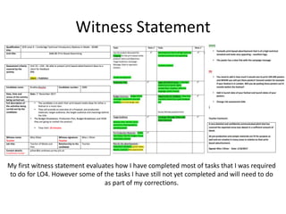
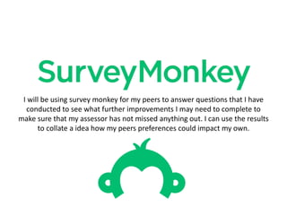
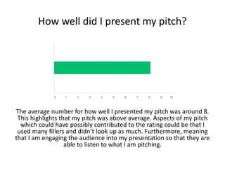
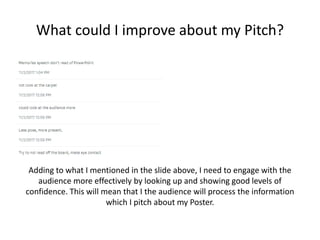
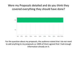
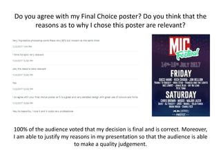
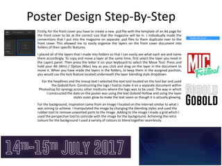
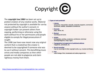
Witness Statement
My first witness statement evaluates how I have completed most of tasks that I was required
to do for LO4. However some of the tasks I have still not yet completed and will need to do
as part of my corrections.
I will be using survey monkey for my peers to answer questions that I have
conducted to see what further improvements I may need to complete to
make sure that my assessor has not missed anything out. I can use the results
to collate a idea how my peers preferences could impact my own.
How well did I present my pitch?
The average number for how well I presented my pitch was around 8.
This highlights that my pitch was above average. Aspects of my pitch
which could have possibly contributed to the rating could be that I
used many fillers and didn’t look up as much. Furthermore, meaning
that I am engaging the audience into my presentation so that they are
able to listen to what I am pitching.
What could I improve about my Pitch?
Adding to what I mentioned in the slide above, I need to engage with the
audience more effectively by looking up and showing good levels of
confidence. This will mean that I the audience will process the information
which I pitch about my Poster.
Were my Proposals detailed and do you think they
covered everything they should have done?
For the question about my proposals, the audience stated that I do not need
to add anything to my proposals as 100% of them agreed that I had enough
information already on it.
Do you agree with my Final Choice poster? Do you think that the
reasons as to why I chose this poster are relevant?
100% of the audience voted that my decision is final and is correct. Moreover,
I am able to justify my reasons in my presentation so that the audience is able
to make a quality judgement.
Production Plan
Location Recce
Before taking any photos I would need to
complete a Location Reece to prepare
equipment that may be needed to
achieve the best photo and a risk
assessment of the location and how I can
overcome them. It is important I
complete a Location Reece so that I am
protecting myself and people I will be
working with.
Proposal
This is my proposal for my poster print
based advertisement which includes
what aims and objectives I have for the
festival and the target audience I will be
marketing to. In addition, briefly talks
about my campaign message.
Campaign Message
The use of the colour purple with contrasting colours such as white and pink creates a
sense of mystery. Purple being the colour of wealth and mystery, MIC connoting that
their festival is unique. For the colour scheme I want to make it retro looking but
modernised to attract a wide range of audiences. For example, I want to use my
inspirations being Bestival and OneDance posters and have elements from them to give
the impression that MIC festival is life changing. I will also be using the slogan used on
the MIC music magazine. Music In Common. Short hand being the logo which makes it
very easy for the audience to remember the slogan. I have chosen this slogan as today
in popular culture people listen to much of the same music.
Photo-Shoot Plan
This is my photo-shoot plan for the print based advertisement poster. This is where I plan out exactly
what I am doing when I do go to take my draft photos needed for my poster. The plan is brief and the
needs of the model are minimal as all I need is a portrait photo which could help me later on in the
design process.
House Style
The house styles which I will be coinciding to is the 80s retro theme. In
particular, similar to the OneDance and Bestival colour schemes. Midnight
purple and other Florissant colours will be used for the poster and
additionally marketing adverts. It is important we maintain consistency across
all mediums so the festival can easily be recognised. Midnight Purple giving
the impression to audiences that we are still living in the past or in a Atari
world. For the font I will be using simple text which can easily be read by
anyone. It is important that there are no issues with the poster so it does not
limit the amount of people attending the festival.
Poster Design
1st Draft 2nd Draft – Final
Budget Summary
For an advert to be inserted into a magazine it would cost
me in the region of £2,500-£3,000. The advertising rates
are of the Q magazine. As Q magazine is of monthly
circulation it would be best to chose Q over the likes of
NME who publish weekly. This would cost too much! The
salaries displayed on this slide is a rough breakdown of
what each of the roles would potentially be earning. We
will not need much equipment however would need to
invest in computers to be used by everyone working for
the festival. A selection of cameras will be on hand for
further marketing and print based purposes.
Staff Salary
Editor(s) £25,000
Designers £21,000
Marketing £23,000
Photographers £20,000
Marketing £24,000
Finance £19,000
Design £20,000
Human Resource £20,000
Equipment Cost
Office Space £184,000
Apple MacBook
Pro
£1,249
Adobe Creative
Cloud Collection
£1,500
Cameras (x3) £1,164
Risk Assessments
Photography Risk Assessment:
Before I take the photos of the subject who I have chosen to be potentially on my
poster, I need to make sure I have the permission to do so. This to be published
online and printed. One way I did this is by using a consent form which is written
with the Data Protection Act 1998. Using this consent form, gave me written
permission by the subject with evidence to the legal conditions of use to make sure
that their information is safe.
Area Risk Assessment:
Before I take the photos of the subject who I have chosen to be potentially on my
poster, I need to make sure I have the area is safe to do so. Risk assessment of the
area needs to guarantee safety of both of us, whether that includes weather
conditions or other visible hazards.
Software Risk Assessment – Resizing an image:
When editing the images I need to make sure that I have resized the image
corresponding to the original photo taken. One way I can do this, when using the
free transform tool I need to press shift whilst using the mouse so that the image
remains in same frame. Therefore, making the poster look neat and professional to
the audience.
Poster Design Step-By-Step
Firstly, for the front cover you have to create a new .psd file with the template of an A4 page for
the front cover to be at the correct size that the magazine will be in. I individually made the
conventions that I put into the magazine on separate .psd files to them duplicate over to the
front cover. This allowed me to easily organise the layers on the front cover document into
folders of their specific features.
I placed all of the layers that I made into folders so that I can easily see what each are and name
them accordingly. To copy and move a layer at the same time, first select the layer you need in
the Layers panel. Then press the letter V on your keyboard to select the Move Tool. Press and
hold your Alt (Win) / Option (Mac) key as you click and drag on the layer in the document to
move it. When you have made the layers in the folders, to keep them in the assigned position,
you would use the lock feature located underneath the layer blending style dropdown.
For the headlines and the lineup text I selected the text tool located on the tool bar and used
the Gobold font. Constructing the logo I had to make it on a separate document within
Photoshop for synergy across other mediums where the logo was to be used. The way in which
I constructed the date on the poster was using the text Gobold Hollow and using the layer
styles outer glow to make the text seem as though it is actually glowing.
For the background, inspiration came from an image I located on the internet similar to what I
was aiming to achieve. I manipulated the image by changing the blending styles and used the
rubber tool to remove unwanted parts to the image. Adding to the image I made a grid which I
used the perspective tool to coincide with the image for the background. Achieving the retro
colours for the background I used a variety of colours to blend together seamlessly.
Issues (Regulatory & Legal, Ethical)
Watermarking an image, is another form of copyrighting. This allows creators protect their creation so that others are unable to falsely claim
their rights to the creation of the image. IP – Intellectual Property Rights allows owners and their trademarks to be profited from their own
work and time. Watermarks need to be of specific nature on the image so it is unable to be changed by compression and other changes to the
image. Watermarking an image is all about making a clear message to the individual that it should not be copied or used without consent from
the creator.
For any creator, without copyrighting their work, may hinder their chances or being able to reproduce content that they enjoy doing. Each
media platform has their own form of copyright laws and regulation, however for some sufficient creators are unable to stand out above the
rest. Using watermarking on their content guarantees safety but also potentially grants accreditation from individuals. There is no actual
number on the pricing of the removal of the watermark from an image and mainly relies on the creators choice. For the watermark to be
removed in the image below, the creator has not put a price on it and can find the original image on his blog page. One most common way to
pay to remove a watermark from the image would find creative commons licensing on the publishers page where you pay a set or optional fee
to use the image the creator has published.
The Data Protection Act controls how your personal information is used by organizations, businesses or the government. Everyone
responsible for using data has to follow strict rules called ‘data protection principles’. They must make sure the information is: used fairly and
lawfully, accurate, kept safe and secure. This ensures that information within the business is maintained and compromised by others.
Everyone in the business has to comply to these rules otherwise they could receive costly fines.
Ethical Issues: When a festival poster is being produced, the publisher will have to look at the consequences after its release. Whether or not
they have targeted certain religions or cultures that are deemed to be vulnerable. This could be of ethnic groups, age, gender and sexual
orientation then forth. If festivals do not take potential offences to the consumers it could possibly impact the brands reputation.
I would need to oblige to a few legal and ethical issues throughout my festival campaign. Firstly, it is important that the model I will be using
for the poster is of legal age and if not then would need to have parental/guardian consent to take any photos. It is also important I check that
there is no offensive or explicit language present in any of the advertising throughout the campaign. In addition, the images that I do use off
the internet are certified for creative purposes and are not copyrighted or creative commons. Also I would have to make sure there no
content which is misleading to anyone.
http://zerogravity.me.uk/urban/#1
Copyright
The copyright law 1988 has been set up to
protect creators of any creative works. Material
not protected by copyright is available for use by
anyone without the author's consent. A
copyright holder can prevent others from
copying, performing or otherwise using the
work without his or her permissions and people
eligible to comply for illegal prosecutions if
caught.
The 1998 Law have now meant now any original
content that is created but the creator is
deemed to be copyrighted if someone else was
to use it without consent. This benefitting music
artists and media companies as then other
people are not able to plagiarize and claim
righteous money from them.
https://www.copyrightservice.co.uk/copyright/uk_law_summary
Conclusion
From LO5, I covered many things which are based on the feedback that I was
given from my Unit 15 LO4 Presentation on MIC Festival. Moreover, I have
also gathered additional feedback from the survey monkey survey that I put
together prior to my presentation so that the audience is able to fill it out
throughout it. This information is vital as I am able to collate both sources of
data and analyse them thoroughly displayed in pie charts to conclude ideas
based on my original ones.
For my poster, I also looked at IPSO and other issues which possibly may
hinder the publication of them and took into consideration if my poster meet
the requirements set.

Unit 15 LO5 PowerPoint

  • 2.
    Witness Statement My firstwitness statement evaluates how I have completed most of tasks that I was required to do for LO4. However some of the tasks I have still not yet completed and will need to do as part of my corrections.
  • 3.
    I will beusing survey monkey for my peers to answer questions that I have conducted to see what further improvements I may need to complete to make sure that my assessor has not missed anything out. I can use the results to collate a idea how my peers preferences could impact my own.
  • 4.
    How well didI present my pitch? The average number for how well I presented my pitch was around 8. This highlights that my pitch was above average. Aspects of my pitch which could have possibly contributed to the rating could be that I used many fillers and didn’t look up as much. Furthermore, meaning that I am engaging the audience into my presentation so that they are able to listen to what I am pitching.
  • 5.
    What could Iimprove about my Pitch? Adding to what I mentioned in the slide above, I need to engage with the audience more effectively by looking up and showing good levels of confidence. This will mean that I the audience will process the information which I pitch about my Poster.
  • 6.
    Were my Proposalsdetailed and do you think they covered everything they should have done? For the question about my proposals, the audience stated that I do not need to add anything to my proposals as 100% of them agreed that I had enough information already on it.
  • 7.
    Do you agreewith my Final Choice poster? Do you think that the reasons as to why I chose this poster are relevant? 100% of the audience voted that my decision is final and is correct. Moreover, I am able to justify my reasons in my presentation so that the audience is able to make a quality judgement.
  • 8.
  • 9.
    Location Recce Before takingany photos I would need to complete a Location Reece to prepare equipment that may be needed to achieve the best photo and a risk assessment of the location and how I can overcome them. It is important I complete a Location Reece so that I am protecting myself and people I will be working with.
  • 10.
    Proposal This is myproposal for my poster print based advertisement which includes what aims and objectives I have for the festival and the target audience I will be marketing to. In addition, briefly talks about my campaign message.
  • 11.
    Campaign Message The useof the colour purple with contrasting colours such as white and pink creates a sense of mystery. Purple being the colour of wealth and mystery, MIC connoting that their festival is unique. For the colour scheme I want to make it retro looking but modernised to attract a wide range of audiences. For example, I want to use my inspirations being Bestival and OneDance posters and have elements from them to give the impression that MIC festival is life changing. I will also be using the slogan used on the MIC music magazine. Music In Common. Short hand being the logo which makes it very easy for the audience to remember the slogan. I have chosen this slogan as today in popular culture people listen to much of the same music.
  • 12.
    Photo-Shoot Plan This ismy photo-shoot plan for the print based advertisement poster. This is where I plan out exactly what I am doing when I do go to take my draft photos needed for my poster. The plan is brief and the needs of the model are minimal as all I need is a portrait photo which could help me later on in the design process.
  • 13.
    House Style The housestyles which I will be coinciding to is the 80s retro theme. In particular, similar to the OneDance and Bestival colour schemes. Midnight purple and other Florissant colours will be used for the poster and additionally marketing adverts. It is important we maintain consistency across all mediums so the festival can easily be recognised. Midnight Purple giving the impression to audiences that we are still living in the past or in a Atari world. For the font I will be using simple text which can easily be read by anyone. It is important that there are no issues with the poster so it does not limit the amount of people attending the festival.
  • 14.
    Poster Design 1st Draft2nd Draft – Final
  • 15.
    Budget Summary For anadvert to be inserted into a magazine it would cost me in the region of £2,500-£3,000. The advertising rates are of the Q magazine. As Q magazine is of monthly circulation it would be best to chose Q over the likes of NME who publish weekly. This would cost too much! The salaries displayed on this slide is a rough breakdown of what each of the roles would potentially be earning. We will not need much equipment however would need to invest in computers to be used by everyone working for the festival. A selection of cameras will be on hand for further marketing and print based purposes. Staff Salary Editor(s) £25,000 Designers £21,000 Marketing £23,000 Photographers £20,000 Marketing £24,000 Finance £19,000 Design £20,000 Human Resource £20,000 Equipment Cost Office Space £184,000 Apple MacBook Pro £1,249 Adobe Creative Cloud Collection £1,500 Cameras (x3) £1,164
  • 16.
    Risk Assessments Photography RiskAssessment: Before I take the photos of the subject who I have chosen to be potentially on my poster, I need to make sure I have the permission to do so. This to be published online and printed. One way I did this is by using a consent form which is written with the Data Protection Act 1998. Using this consent form, gave me written permission by the subject with evidence to the legal conditions of use to make sure that their information is safe. Area Risk Assessment: Before I take the photos of the subject who I have chosen to be potentially on my poster, I need to make sure I have the area is safe to do so. Risk assessment of the area needs to guarantee safety of both of us, whether that includes weather conditions or other visible hazards. Software Risk Assessment – Resizing an image: When editing the images I need to make sure that I have resized the image corresponding to the original photo taken. One way I can do this, when using the free transform tool I need to press shift whilst using the mouse so that the image remains in same frame. Therefore, making the poster look neat and professional to the audience.
  • 17.
    Poster Design Step-By-Step Firstly,for the front cover you have to create a new .psd file with the template of an A4 page for the front cover to be at the correct size that the magazine will be in. I individually made the conventions that I put into the magazine on separate .psd files to them duplicate over to the front cover. This allowed me to easily organise the layers on the front cover document into folders of their specific features. I placed all of the layers that I made into folders so that I can easily see what each are and name them accordingly. To copy and move a layer at the same time, first select the layer you need in the Layers panel. Then press the letter V on your keyboard to select the Move Tool. Press and hold your Alt (Win) / Option (Mac) key as you click and drag on the layer in the document to move it. When you have made the layers in the folders, to keep them in the assigned position, you would use the lock feature located underneath the layer blending style dropdown. For the headlines and the lineup text I selected the text tool located on the tool bar and used the Gobold font. Constructing the logo I had to make it on a separate document within Photoshop for synergy across other mediums where the logo was to be used. The way in which I constructed the date on the poster was using the text Gobold Hollow and using the layer styles outer glow to make the text seem as though it is actually glowing. For the background, inspiration came from an image I located on the internet similar to what I was aiming to achieve. I manipulated the image by changing the blending styles and used the rubber tool to remove unwanted parts to the image. Adding to the image I made a grid which I used the perspective tool to coincide with the image for the background. Achieving the retro colours for the background I used a variety of colours to blend together seamlessly.
  • 18.
    Issues (Regulatory &Legal, Ethical) Watermarking an image, is another form of copyrighting. This allows creators protect their creation so that others are unable to falsely claim their rights to the creation of the image. IP – Intellectual Property Rights allows owners and their trademarks to be profited from their own work and time. Watermarks need to be of specific nature on the image so it is unable to be changed by compression and other changes to the image. Watermarking an image is all about making a clear message to the individual that it should not be copied or used without consent from the creator. For any creator, without copyrighting their work, may hinder their chances or being able to reproduce content that they enjoy doing. Each media platform has their own form of copyright laws and regulation, however for some sufficient creators are unable to stand out above the rest. Using watermarking on their content guarantees safety but also potentially grants accreditation from individuals. There is no actual number on the pricing of the removal of the watermark from an image and mainly relies on the creators choice. For the watermark to be removed in the image below, the creator has not put a price on it and can find the original image on his blog page. One most common way to pay to remove a watermark from the image would find creative commons licensing on the publishers page where you pay a set or optional fee to use the image the creator has published. The Data Protection Act controls how your personal information is used by organizations, businesses or the government. Everyone responsible for using data has to follow strict rules called ‘data protection principles’. They must make sure the information is: used fairly and lawfully, accurate, kept safe and secure. This ensures that information within the business is maintained and compromised by others. Everyone in the business has to comply to these rules otherwise they could receive costly fines. Ethical Issues: When a festival poster is being produced, the publisher will have to look at the consequences after its release. Whether or not they have targeted certain religions or cultures that are deemed to be vulnerable. This could be of ethnic groups, age, gender and sexual orientation then forth. If festivals do not take potential offences to the consumers it could possibly impact the brands reputation. I would need to oblige to a few legal and ethical issues throughout my festival campaign. Firstly, it is important that the model I will be using for the poster is of legal age and if not then would need to have parental/guardian consent to take any photos. It is also important I check that there is no offensive or explicit language present in any of the advertising throughout the campaign. In addition, the images that I do use off the internet are certified for creative purposes and are not copyrighted or creative commons. Also I would have to make sure there no content which is misleading to anyone. http://zerogravity.me.uk/urban/#1
  • 19.
    Copyright The copyright law1988 has been set up to protect creators of any creative works. Material not protected by copyright is available for use by anyone without the author's consent. A copyright holder can prevent others from copying, performing or otherwise using the work without his or her permissions and people eligible to comply for illegal prosecutions if caught. The 1998 Law have now meant now any original content that is created but the creator is deemed to be copyrighted if someone else was to use it without consent. This benefitting music artists and media companies as then other people are not able to plagiarize and claim righteous money from them. https://www.copyrightservice.co.uk/copyright/uk_law_summary
  • 20.
    Conclusion From LO5, Icovered many things which are based on the feedback that I was given from my Unit 15 LO4 Presentation on MIC Festival. Moreover, I have also gathered additional feedback from the survey monkey survey that I put together prior to my presentation so that the audience is able to fill it out throughout it. This information is vital as I am able to collate both sources of data and analyse them thoroughly displayed in pie charts to conclude ideas based on my original ones. For my poster, I also looked at IPSO and other issues which possibly may hinder the publication of them and took into consideration if my poster meet the requirements set.