More Related Content
Similar to 7 basic tool for QUALITY
Similar to 7 basic tool for QUALITY (20)
7 basic tool for QUALITY
- 1. ©
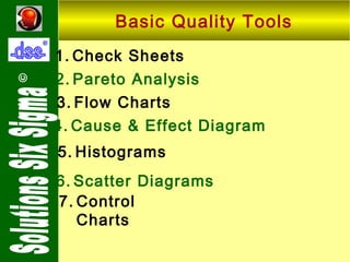
Basic Quality Tools
1. Check Sheets
2. Pareto Analysis
3. Flow Charts
4. Cause & Effect Diagram
5. Histograms
6. Scatter Diagrams
7. Control
Charts
- 3. Check Sheets
©
• Want to find out cause-wise defects
Defects
1
2
3
4
5
6
Total
Missing
component
III
IIII
II
I
III
IIII
18
No solder
II
III
I
IIII
10
Wrong
Insertion
IIII
I
IIII
II
IIII
20
Shorts by
component
II
IIII
III
11
Total
11
9
17
59
IIII
II
9
6
7
- 4. ©
Check Sheets
• More defects on the last day of the
week.
• Missing components and Wrong
Insertion occur more frequently.
- 5. ©
Check Sheets
• Check sheet is a data pattern
detector.
• Check sheet to be used during
problem definition stage and after
implementation stage.
- 6. ©
Check Sheets
1. Distinguishing between fact and
opinion.
2. Gathering data about how
often a problem is occurring.
3. gathering data about the type
of problem occurring.
- 7. ©
Check Sheets
1. Confirmation Check Sheet –
List of steps which must be
complete before shipping a
product.
2. Defect Location Sheet
identify problem areas.
–
- 8. ©
Pareto Analysis
The Pareto Principle states that
only a "vital few" factors are
responsible for producing most of
the problems.
Majority of problems (80%) are
due to a few key causes (20%). If
we correct these few key causes,
we will have a greater probability
of success.
- 10. ©
Pareto Analysis
Causes
% Freq. % Cum. Freq.
Breakout
44
44
Withdrawal problem
14
58
Overflow
9
67
Sheer trouble
8
75
Tundish nozzle erosion
7
82
Dummy bar obstraction
6
88
Hanger
5
93
Tundish nozzle choking
5
98
Bad stream
1
99
Auto control failure
1
100
- 13. ©
Flow Chart
1. A
diagrammatic
picture
showing all steps or stages in
a process.
2. Flow charts help facilitate a
greater understanding of the
entire process by identifying
where problems have occurred
or may occur.
3. You cannot improve a process
until everyone agrees what the
- 14. ©
Cause & Effect (C-E) Diagram
1. Also called Ishikawa Diagram,
Fishbone Diagram.
2. Used to sort out
causes of problems.
potential
3. Organizes theories by causeand-effect relationships.
- 15. ©
Cause & Effect (C-E) Diagram
4. Provides
a
guide
process analysis.
for
5. Highlight likely root causes.
- 17. ©
Histogram
1. Graphical representation of
individual measured values
according to frequency or
relative
frequency
of
occurrence.
1. Used to show distribution
shape
for
one
variable
(location, dispersion).
- 20. ©
Scatter Diagrams
1. Used to visualize relationship
between two variables.
Features of a single product.
Product output & process input.
Two different products.
2. Issues
Strength of correlation,
non-linear relationships.
- 22. ©
Control Charts
1. Purpose
Separate common (inherent)
and special causes.
Monitor process over time.
2. Used
to
Identify
Cause Variation.
Process
patterns
shifts
Special
/
Cyclic
- 23. Control Charts
Means ( X-bar)
©
Xbar and R Chart for : Major OD Minimum
129.85
129.75
MU=129.7
129.65
129.55
LCL=129.52
129.45
Subgroup 0
0.3
Ranges
UCL=129.88
5
10
15
UCL=0.3076
0.2
0.1
R=0.09412
0.0
LCL=0.000