1. Film Poster Analysis Three
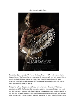
The poster above promotes ‘The Texas Chainsaw Massacre 3D’, a well-known classic
Slasher horror. ‘The Texas Chainsaw Massacre 3D’ is an example of a well-known Slasher
that is filled with blood and gore. As a successful chain of Slasher films, the Texas
Chainsaw franchise has been an inspiration to me as a media practitioner. This is why I
have decided to analyse this poster.
This poster follows the general and layout conventions of a film poster. The image
dominates and fills the frame and presents the audience with a visual insight into what
the film’s narrative is about. Only the antagonist is showcased to the audience, as this is
the only character the audience really need to know about when a film is first promoted
and the character that the audience are most interested in. This is because when Slasher
2. fans see Leatherface, they would instantly recognise him and know this is a poster for a
film in the Texas Chainsaw franchise, whilst his presence on the poster will remind
audiences of the potential scare and gore that the film will present. The appearance of
the antagonist appears to be a convention of Slasher film posters AND when Slasher fans
see the antagonist, they will instantly know he is from a Slasher film due to the mise-en-scene
in the poster; providing this clue is another convention of horror posters. Other
text-based conventions feature also, in the form of the film’s title, tagline and
institutional information. This poster generally follows typical layout conventions of film
posters too. The title is placed below the main image where it will be seen only after the
attention of the audience has been drawn in by the image, whilst institutional
information is situated at the very bottom of the poster in an area that is more
inconspicuous.
The image on this poster is a low angle medium long shot of Leatherface that dominates
the frame. The image alone is enough to inform the audience that this poster is
promoting a Slasher film. This is because Leatherface is a well-known and conventional
example of a Slasher antagonist. This is reflected through the mise-en-scene used in the
poster. Leatherface is presented in baggy overalls, wearing a distinctive and hideous-looking
mask and holding a chainsaw. As said before, this costume and use of mise-en-scene
is conventional and typical of a Slasher antagonist. This is because a mask and
over-sized costume helps to conceal his identity, makes him appear larger, stronger and
most masculine and makes him look twice as frightening than if we could see his real
face. His costume is also effective in giving the audience an insight into the narrative. This
is because we can see that his mask looks like human flesh. This suggests to the audience
that in the narrative, Leatherface uses the faces and skin of his victims make the mask
that is his trademark, which is an incredibly sinister and spine-chilling idea. The mask is
also effective, of course, in the masking his face, and therefore, making him appear more
evil and less human. The image is very dark and dismal with the only light source being a
spotlight coming in from the left of the frame. The spotlight is effective in highlighting to
the audience his mask and the weapon. This makes him appear more frightening as our
eyes are drawn to his horrific mask and his extreme choice of weapon to dispose of his
victims. It also creates the idea that the film is going to be centred on him; he is the ‘star’
as the spotlights on him. With half of Leather face’s features in shadow, this is also an
example of profile lighting; the general effect is to make Leatherface appear more
sinister and dangerous as a character and to suggest that darkness lies within.
Due to the dark background, the setting isn’t very clear. However the spotlight coming
from the left appears to replicate light coming in from a window. This suggests to the
audience that the image is set in an abandoned or isolated house or warehouse where
Leatherface can dispose of his victims unsuspected, with no escape for them. This is a
typical or conventional location for a Slasher horror as it creates tension, frustration and
heightened fear within the film, as the teenagers are isolated with no escape, so the
3. audience are constantly held at the edge of their seat trying to determine if and how
anyone will escape alive. It also hints at the narrative that the this film within the Texas
Chainsaw franchise will be a type of Slasher where a group of teenagers go away for the
weekend to a secluded town or house where Leatherface will murder them one by one.
The use of a low angle shot is very effective in this poster. This is because it emphasises
Leatherface’s dominance and puts the audience in the victims’ shoes, as it appears to be
from their perspective just before Leatherface disposes of them. This theme is further
reinforced by the way that Leatherface is looking down. When the audience look at the
poster, it appears as it Leatherface is looking down at them, which adds to the fear
created. This will draw in the audience, as it will make them experience a greater sense of
terror and make them want to watch the film. This fear is further reinforced through the
use of and presentation of mise-en-scene elements like props. The positioning of the
chainsaw, combined with the low angle shot, reinforces the feeling that the audience are
the victim. This will add to the overall fear created by the poster. It also helps to portray
the fact that the film is in 3D. This will draw the audience into the poster and make them
want to watch the film as they see that the whole film will generate even more fear than
that of the poster, as all of Leatherface’s kills will be emphasised by the 3D feature. The
chainsaw is clearly the dominant feature in the image. Due to effective positioning and
the low angle shot, the audience’s eyes are instantly drawn to it. This is typical of Slasher
film posters as it allows the sub-genre to be clearly promoted and adds to the fear
generated for the audience. The weapon is important in Slasher films as the audience
want to be reassured that it will be one that causes blood and gore, as that’s what they
expect of Slasher horrors. Once the audience clock the chainsaw in this poster, the size
and power of it boosted by the use of camera and placement, they will be in no doubt of
the suffering and terror this weapon will inflict upon it’s victims, increasing the overall
lure of the film for the Slasher fan who adores gore. The focus on the weapon in this
poster gives the audience an insight into the narrative. When they see this poster, they
instantly know it’s a Slasher horror about a psychotic masked killer, disposing of his
victims with a chainsaw. This will entice the audience and make them want to watch the
film.
The title of the film, ‘Texas Chainsaw 3D’ anchors the image and further enhances the
audience’s understanding that this is a horror film poster. As The Texas Chainsaw
Massacre is such a well-known Slasher franchise, the audience would instantly know it’s a
new version of the classic Texas Chainsaw Massacre, which will intrigue and interest
them. The title anchors the image and gives the audience an insight to the narrative, as
the word ‘Chainsaw’ reinforces their idea that the film focuses upon death by chainsaw.
The rest of the title informs the audience of the location of the film. ‘Texas’ informs the
audience that the film will be set in the state of Texas, a state made up of numerous
small towns. This informs the audience that it will be a typical Slasher horror, most likely
being set in a small town where the characters are tormented with no escape. This is a
4. conventional location for Slasher horrors. The title itself is presented in a white,
uppercase, serif font. The use of the title presented white adds to the overall grey and
dark appearance of the poster. It reflects the way that the victims will die in the film, with
their deaths being prolonged until all the colour has drained from them. This adds to the
fear generated for the audience. It also means that the title of the film stands out against
the black background in the frame and the audience’s eyes will be drawn to it. This is an
important feature as the title of the film is the most important text in the frame. The use
of uppercase helps to represent the fact that Leatherface is solid and undefeatable,
masculine and strong. Interestingly, it could also be said that the shape and position of
the title, with the curve of the ‘C’ on the word ‘Chainsaw’ and the longer length of the
second line of the title results in the title actually mimicking the shape of the chainsaw.
A tagline features just below the title of the film. Its power to attract attention is
heightened by the fact it is presented in an uppercase serif font and through the
placement. It helps to further anchor the image and give an insight to the narrative of the
film just before the audience see the title of the film. The tagline, ‘Evil Wears Many
Faces’, is very effective in drawing in the audience. This reflects the fact that when
Leatherface kills one of his victims, he makes their faces into a mask, whilst also drawing
attention to the evil that characterises Leatherface. It could also indicate that
Leatherface’s evil lies deep within; it is not just at face value. The tagline also further
anchors the image by informing the audience that Leatherface is on a rampage to kill
multiple victims.
The poster also features institutional information and the date of release. This is typical
of a film poster because the audience need to know when the film will be released and
also some information about the producers. However, institutional information is
presented at the bottom of the frame in a small font, as it is not extremely important.
The release date, on the other hand, is placed underneath in a slightly bigger font and in
white. This makes the release date grab attention, without taking up much space on the
frame. The positioning of it at the very bottom is important, as it is the last thing the
audience see. This means it will stay in their mind so, after being drawn in by the entire
poster they will know when they can watch the film.
This poster effectively promotes ‘Texas Chainsaw 3D’. It draws in the audience and gives
them a slight insight into the narrative without giving away too much. It is also a clear
and effective representation of the Slasher sub-genre.