Influencing policy (training slides from Fast Track Impact)
Film poster analysis two
1. Film Poster Analysis Two
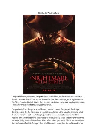
The posterabove promotes ‘A Nightmare on Elm Street’, a well-known classic Slasher
horror.I wanted to make my horrorfilm similar to a classic Slasher, so ‘A Nightmare on
Elm Street’, as the King of Slasher,has been an inspiration to me as a media practitioner.
This is why I have decided to analyse this poster.
This poster follows the general and layoutconventions of a film poster. The image
dominates and fills the frame and presentsthe audience with a visualinsight into what
the film’s narrativeis about. In keeping with the conventions of most Slasher Film
Posters,only the antagonistis showcased to the audience; this is the only character the
audience really need to know about when a film is first promoted.This is because when
Slasherfans see Freddie Crougar,they would instantlyrecognise him and know this is a
2. poster for A Nightmare on Elm Street, which could helpto draw in the audience if they
are fans of this particularfranchise or of the Slashersub-genreof horrorin general. When
the audience see this poster, due to the character of Freddie dominating the image, they
will see many clues thatwill instantlyallow them to know it is a Slasher film and thatit
follows the classic conventionsof Slasher;revealing genre and sub-genreis a convention
of film posters.Other text-based conventionsfeature also,in the form of the film’s title,
tagline and institutionalinformation. This postergenerally follows typical layout
conventionsof film posters. The title is placed below the main image for example, whilst
institutionalinformation is situated at the very bottomof the poster.
The image used on this poster is a medium shotof Freddie Crougar.As Freddie Crougaris
a classic representationof the Slashersub-genre,the audience would instantlyrecognise
him. The symbiotic link between the old Freddie Crougar,and the new one featured in
this film poster is maintained throughthesame mise-en-scene. The image alone is
enoughto inform the audience thatit is promotinga Slasher film. Freddie Crougaris one
of the most well known and popular SlasherAntagoniststhathis presence alone will be
effective enoughto promote the film and its sub-genre.This mise-en-scene used on this
poster is simple yet effective. This reinforces the idea thatfeaturing Freddie Crougaris
enoughto make this poster effective. The image is dominated mainly by the colours
Black and Red. Back lighting is used to emphasise Freddie’s face and to draw attention to
how horrific his appearance is. The use of the red-tint to the postercombined with the
back lighting creates a look of fire. This gives the audience an insight to the narrativeas it
links with Freddie’s pastand how he became the monsterhe is today. It also links in with
the idea of death andhell. This is an effective feature on the posteras the link to hell
could be said to reflect the evil that lies within Freddie, whilst also insinuatingto the
audience thatthe victims in the film are going to be putthrough hellby Freddie, and
there is no escape as he is blocking the light. This also suggeststhatFreddie’s presence
means that allthe warmth and brightnessin the victims’ lives is being takenaway. The
use of texturedblack backgroundcoming from the top corners is equally effective, as it
replicates the smoke created by the fire. This adds to the overall feel of fire andhell,
making the poster seem more terrifying and unnervingatthe same time. It couldalso be
said that the smoke surroundingFreddie could represent the way in which Slasher
antagonistshide in the shadowsand have a certain enigma attached to them. The fact
thatthe smoke appearsto be closing in on Freddie could be said to symbolise how the
darknessis enclosingon the Protagonistsand thatthere is no escape. The idea of fire is
furtherpresented to the audience throughFreddie’scostume; the audience’s attentionis
particularlydrawn to a hole in his jumper, due to the light catching it andthe black frayed
edges of the hole suggestthat it has been burnt.This furtherreinforces Freddie’s back-
story and helpsto give an understandingtothe audience of how he became like this,
whilst on a deeper level reflecting the tarnished appearanceof his soul.His jumper is red
which addsto the overallappearance of the posterand indicates the dangerousnessof
3. this persona. The way the darknessappears to be surroundingFreddie creates the
appearance thathe is coming out of the background,thatthe darknesscomes directly
from within Freddie himself. It also gives the audience anotherinsight into the narrative
as it creates the idea thatwhen it becomes dark, andthe victims are asleep, Freddie
comes outof the darknessto torment them. Freddie is presented wearing a large
rimmed fedora hat, which covers the top half of his face. This allowsFreddie to come
across as a more conventional Slasherkiller as it’s like his face is being covered by a mask.
This adds to the fear of the audience, as they cannot see his face fully. It couldalso
indicate the idea thathe remains hidden and only comes outat night.In the image we
see thathe wears a sinister and twisted half smile, even thoughhe is not directly looking
at the audience, which creates fear for the audience throughthe suggestionthat
although they cannotsee him, he can see them. This alsohints at the narrative slightly;
how the victims only see him when they are unconsciousso don’t directly see him in the
flesh. This idea is further emphasised by his body language.He has his arms crossed, with
his hands on top of each other, which reflects the idea thathe is sinister and calculating
as is plottingsomething. The positioning of his arms is also effective in exposing how he
has knives for fingers. Like in many conventionalSlasherFilm posters,the audience’s
attention is directed to Freddie’s weapon. A successfuluse of lighting helpsto emphasise
the edge and the sharpnessof the weapon. This makes the knife look even more
dangerousandsevere andmore terrifying as it looks like it can cause some real damage.
The useof lighting is very effective in directing the audience’s attention to how the
antagonistdisposes of his victims. This is a common convention of Slasher film postersas
it helpsto promote the sub-genre.The very effective positioning of the knife-finger
makes it appear to be a naturalpartof Freddie’s hand, which could indicate thathe and
his weapon are one and thatkilling is intrinsic andcomes naturallyto Freddie. Only part
of Freddie’s weapon is actually shown,as Slasher fans would know he has a hand of five
knives, which he uses to torment his victims. The fact that only one knife is shown
reinforces the idea that,because A Nightmareon Elm Street is such a well-known
Slasher,only partof Freddie’s weapon is necessary to promote the film.
The title of the film, ‘A Nightmare on Elm Street’ anchorsthe image and furtherenhances
the audience’s understandingthatthis is a horrorfilm poster. As ‘A Nightmare on Elm
Street’ is such a well-known Slasher,when the audience see the title they will instantly
recognise it as a new version and want the see the film, fullof intrigue to find out
whether this newer versionis as good as or even better than the original. The title gives
the audience an insightto the narrativeas the word ‘Nightmare’ suggestshorrorand
fear, andalso relates to the fact thatthe victims are tormented by Freddie when they are
sleeping. The rest of the title informs the audience of the location of the film. ‘Elm Street’
suggeststhatthe film will be set in a suburbantown and streetand that this is where
most of the action will take place. There is lots of potentialfor the title to provokefear in
this respect. The audience will be reminded of the fact thatterrorand evil can lurkin
4. places that shouldbe welcoming andsafe and where they spend and goodproportion of
their time – their street, their home. The title itself is presentedin a red, uppercase serif
font. The use of the title presented in red, I have noticed, appearsto be a convention of
film posters promotingSlasher horrors.This may be due to the fact that the red
representsthe mass of blood thatwill be featured throughoutthefilm. It helpsto anchor
the poster as a Slasher horror.It also means thatthe title of the film standsout in the
frame and the audience’s eyes will be drawn to it. This is an importantfeature as the title
of the film is the most importanttext in the frame. The use of uppercase helps to
representthe fact that Freddie is solid and undefeatable.On partof the title, there is a
smallsmudge of red on the bottom of the text. This gives the audience more insight into
the narrativeas they look like clouds. Cloudsare associated with dreaming butthe red
colourof them suggeststothe audience thatthe protagonist’sdreams are going to be
far from light, happy and peaceful, but will instead be dangerousandsinister. It could
even be said that the red marks resemble bloodsplatters,a direct link to the blood-shed
and killing thattakes places within the film. With this in mind, it is interesting that the sit
this at the base of the word ‘Nightmare’, as this reflect thatthis killingand blood-spill
takes place when the victims are asleep.
A tagline features just above the title of the film. Its power to attract attentionis
heightened by its colour andthe fact it is presentedin an uppercaseserif font. In
accordance with conventions,the tagline helps to furtheranchor the image and give an
insight into the narrative of the film just before the audience see the title of the film. The
tagline, Welcome to YourNew Nightmare, is very effective in drawing in the audience.
The useof Direct Address heightensfear and helpsto reinforce the idea that the
audience are next on Freddie’s hit list. The terror generatedby this will make the
audience want to watch the film. The use of the word ‘Welcome’ is very ironic as the
protagonist’sandthe audiences’ experience is going to be far from warm andwelcoming
and is likely to be one that they want to escape from ratherthanbe embraced by. The
reference to ‘Nightmare’ is, of course, a direct link to the title and to the fact thatFreddie
huntshis victims as they sleep, a time when they are most vulnerable,thusturningtheir
dream into a nightmare.A fullstop is placed at the end of the tagline. The use of a full
stop is very effective as it suggeststothe audience thatthis is the end for the victims;
there is no way of escaping their ‘Nightmare’. The tagline also furtheranchorsthe image
by informing the audience that Freddie Crougaris the Nightmare and thatthere is no way
to escape him.
The posteralso features institutionalinformation and the date of release. This is typical
of a film poster because the audience need to know when the film will be released and
also some information aboutthe producers.However, institutional information is
presented at the bottom of the frame in a small font as it is not extremely important.
Whereas, the release date is placed underneathin a slightlybigger font and in red. This
makes the release date grab attentionmore effectively, without taking up much space
5. on the frame. The positioning of it at the very bottom is important as it is the last thing
the audience see. This means it will stay in their mind. After being drawn in by the poster
as a whole andpersuaded to watch it, they will know when they can.
This poster effectively promotes ‘A Nightmare on Elm Street’. It drawsin the audience
and gives them an insight into the narrative without giving too much away. This film
poster is a clear example of simplicity being the best way to create effect.