TataKelola dan KamSiber Kecerdasan Buatan v022.pdf
Film Poster Analysis - A Nightmare on Elm Street
1. Film Poster Analysis Two
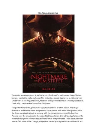
The poster above promotes ‘A Nightmare on Elm Street’, a well-known classic Slasher
horror. I wanted to make my horror film similar to a classic Slasher, so ‘A Nightmare on
Elm Street’, as the King of Slasher, has been an inspiration to me as a media practitioner.
This is why I have decided to analyse this poster.
This poster follows the general and layout conventions of a film poster. The image
dominates and fills the frame and presents the audience with a visual insight into what
the film’s narrative is about. In keeping with the conventions of most Slasher Film
Posters, only the antagonist is showcased to the audience; this is the only character the
audience really need to know about when a film is first promoted. This is because when
Slasher fans see Freddie Crougar, they would instantly recognise him and know this is a
2. poster for A Nightmare on Elm Street, which could help to draw in the audience if they
are fans of this particular franchise or of the Slasher sub-genre of horror in general. When
the audience see this poster, due to the character of Freddie dominating the image, they
will see many clues that will instantly allow them to know it is a Slasher film and that it
follows the classic conventions of Slasher; revealing genre and sub-genre is a convention
of film posters. Other text-based conventions feature also, in the form of the film’s title,
tagline and institutional information. This poster generally follows typical layout
conventions of film posters. The title is placed below the main image for example, whilst
institutional information is situated at the very bottom of the poster.
The image used on this poster is a medium shot of Freddie Crougar. As Freddie Crougar is
a classic representation of the Slasher sub-genre, the audience would instantly recognise
him. The symbiotic link between the old Freddie Crougar, and the new one featured in
this film poster is maintained through the same mise-en-scene. The image alone is
enough to inform the audience that it is promoting a Slasher film. Freddie Crougar is one
of the most well known and popular Slasher Antagonists that his presence alone will be
effective enough to promote the film and its sub-genre. This mise-en-scene used on this
poster is simple yet effective. This reinforces the idea that featuring Freddie Crougar is
enough to make this poster effective. The image is dominated mainly by the colours
Black and Red. Back lighting is used to emphasise Freddie’s face and to draw attention to
how horrific his appearance is. The use of the red-tint to the poster combined with the
back lighting creates a look of fire. This gives the audience an insight to the narrative as it
links with Freddie’s past and how he became the monster he is today. It also links in with
the idea of death and hell. This is an effective feature on the poster as the link to hell
could be said to reflect the evil that lies within Freddie, whilst also insinuating to the
audience that the victims in the film are going to be put through hell by Freddie, and
there is no escape as he is blocking the light. This also suggests that Freddie’s presence
means that all the warmth and brightness in the victims’ lives is being taken away. The
use of textured black background coming from the top corners is equally effective, as it
replicates the smoke created by the fire. This adds to the overall feel of fire and hell,
making the poster seem more terrifying and unnerving at the same time. It could also be
said that the smoke surrounding Freddie could represent the way in which Slasher
antagonists hide in the shadows and have a certain enigma attached to them. The fact
that the smoke appears to be closing in on Freddie could be said to symbolise how the
darkness is enclosing on the Protagonists and that there is no escape. The idea of fire is
further presented to the audience through Freddie’s costume; the audience’s attention is
particularly drawn to a hole in his jumper, due to the light catching it and the black frayed
edges of the hole suggest that it has been burnt. This further reinforces Freddie’s back-story
and helps to give an understanding to the audience of how he became like this,
whilst on a deeper level reflecting the tarnished appearance of his soul. His jumper is red
which adds to the overall appearance of the poster and indicates the dangerousness of
3. this persona. The way the darkness appears to be surrounding Freddie creates the
appearance that he is coming out of the background, that the darkness comes directly
from within Freddie himself. It also gives the audience another insight into the narrative
as it creates the idea that when it becomes dark, and the victims are asleep, Freddie
comes out of the darkness to torment them. Freddie is presented wearing a large
rimmed fedora hat, which covers the top half of his face. This allows Freddie to come
across as a more conventional Slasher killer as it’s like his face is being covered by a mask.
This adds to the fear of the audience, as they cannot see his face fully. It could also
indicate the idea that he remains hidden and only comes out at night. In the image we
see that he wears a sinister and twisted half smile, even though he is not directly looking
at the audience, which creates fear for the audience through the suggestion that
although they cannot see him, he can see them. This also hints at the narrative slightly;
how the victims only see him when they are unconscious so don’t directly see him in the
flesh. This idea is further emphasised by his body language. He has his arms crossed, with
his hands on top of each other, which reflects the idea that he is sinister and calculating
as is plotting something. The positioning of his arms is also effective in exposing how he
has knives for fingers. Like in many conventional Slasher Film posters, the audience’s
attention is directed to Freddie’s weapon. A successful use of lighting helps to emphasise
the edge and the sharpness of the weapon. This makes the knife look even more
dangerous and severe and more terrifying as it looks like it can cause some real damage.
The use of lighting is very effective in directing the audience’s attention to how the
antagonist disposes of his victims. This is a common convention of Slasher film posters as
it helps to promote the sub-genre. The very effective positioning of the knife-finger
makes it appear to be a natural part of Freddie’s hand, which could indicate that he and
his weapon are one and that killing is intrinsic and comes naturally to Freddie. Only part
of Freddie’s weapon is actually shown, as Slasher fans would know he has a hand of five
knives, which he uses to torment his victims. The fact that only one knife is shown
reinforces the idea that, because A Nightmare on Elm Street is such a well -known
Slasher, only part of Freddie’s weapon is necessary to promote the film.
The title of the film, ‘A Nightmare on Elm Street’ anchors the image and further enhances
the audience’s understanding that this is a horror film poster. As ‘A Nightmare on Elm
Street’ is such a well-known Slasher, when the audience see the title they will instantly
recognise it as a new version and want the see the film, full of intrigue to find out
whether this newer version is as good as or even better than the original. The title gives
the audience an insight to the narrative as the word ‘Nightmare’ suggests horror and
fear, and also relates to the fact that the victims are tormented by Freddie when they are
sleeping. The rest of the title informs the audience of the location of the film. ‘Elm Street’
suggests that the film will be set in a suburban town and street and that this is where
most of the action will take place. There is lots of potential for the title to provoke fear in
this respect. The audience will be reminded of the fact that terror and evil can lurk in
4. places that should be welcoming and safe and where they spend and good proportion of
their time – their street, their home. The title itself is presented in a red, uppercase serif
font. The use of the title presented in red, I have noticed, appears to be a convention of
film posters promoting Slasher horrors. This may be due to the fact that the red
represents the mass of blood that will be featured throughout the film. It helps to anchor
the poster as a Slasher horror. It also means that the title of the film stands out in the
frame and the audience’s eyes will be drawn to it. This is an important feature as the title
of the film is the most important text in the frame. The use of uppercase helps to
represent the fact that Freddie is solid and undefeatable. On part of the title, there is a
small smudge of red on the bottom of the text. This gives the audience more insight into
the narrative as they look like clouds. Clouds are associated with dreaming but the red
colour of them suggests to the audience that the protagonist’s dreams are going to be
far from light, happy and peaceful, but will instead be dangerous and sinister. It could
even be said that the red marks resemble blood splatters, a direct link to the blood-shed
and killing that takes places within the film. With this in mind, it is interesting that the sit
this at the base of the word ‘Nightmare’, as this reflect that this killing and blood -spill
takes place when the victims are asleep.
A tagline features just above the title of the film. Its power to attract attention is
heightened by its colour and the fact it is presented in an uppercase serif font. In
accordance with conventions, the tagline helps to further anchor the image and give an
insight into the narrative of the film just before the audience see the title of the film. The
tagline, Welcome to Your New Nightmare, is very effective in drawing in the audience.
The use of Direct Address heightens fear and helps to reinforce the idea that the
audience are next on Freddie’s hit list. The terror generated by this will make the
audience want to watch the film. The use of the word ‘Welcome’ is very ironic as the
protagonist’s and the audiences’ experience is going to be far from warm and welcoming
and is likely to be one that they want to escape from rather than be embraced by. The
reference to ‘Nightmare’ is, of course, a direct link to the title and to the fact that Freddie
hunts his victims as they sleep, a time when they are most vulnerable, thus turning their
dream into a nightmare. A full stop is placed at the end of the tagline. The use of a full
stop is very effective as it suggests to the audience that this is the end for the victims;
there is no way of escaping their ‘Nightmare’. The tagline also further anchors the image
by informing the audience that Freddie Crougar is the Nightmare and that there is no way
to escape him.
The poster also features institutional information and the date of release. This is typical
of a film poster because the audience need to know when the film will be released and
also some information about the producers. However, institutional information is
presented at the bottom of the frame in a small font as it is not extremely important.
Whereas, the release date is placed underneath in a slightly bigger font and in red. This
makes the release date grab attention more effectively, without taking up much space
5. on the frame. The positioning of it at the very bottom is important as it is the last thing
the audience see. This means it will stay in their mind. After being drawn in by the poster
as a whole and persuaded to watch it, they will know when they can.
This poster effectively promotes ‘A Nightmare on Elm Street’. It draws in the audience
and gives them an insight into the narrative without giving too much away. This film
poster is a clear example of simplicity being the best way to create effect.