Download to read offline
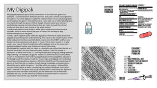

This document discusses how the author's music video and accompanying digipak used and challenged conventions of the indie rock genre. The author followed some conventions such as including a narrative with characters, but challenged others such as not including any band performance. The digipak used minimalist artwork and simple colors as is common, but did not include photos which is a split convention. Symbolic rather than literal connections were made between the digipak and video to seem more modern. Feedback showed those familiar with the genre better understood the references connecting the two pieces. The digipak drew influence from other designs that discussed modern disconnect and resembled medicine packages.


