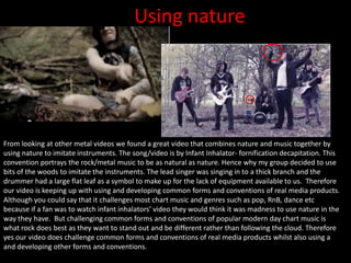
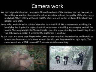
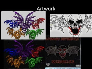
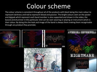
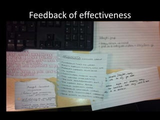
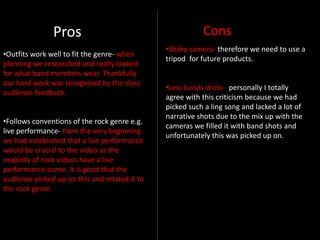
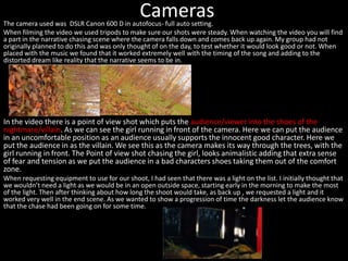
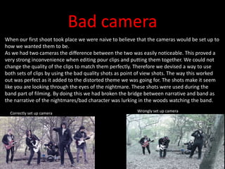
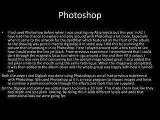
The document discusses the evaluation of a media production project. It describes how new media technologies were used at different stages of the project. During filming, DSLR cameras and tripods were used to capture footage. Poor camera settings on one camera resulted in low quality shots, but these were incorporated into the final video as point-of-view shots. Photoshop was used to edit images and create artwork for promotional materials. Audience feedback on the video was generally positive and highlighted effective elements like the opening sequence, but also noted areas for improvement such as adding more narrative footage.
This is an answer to the evaluation question number one, titled "In what ways does your media product use, develop or challenge forms and conventions of real media products?"
The document discusses various visual elements that are consistently used across the band's music video, CD packaging, and promotional materials. These consistent elements include the lead singer's circle glasses, black clothing worn by the band members, a mysterious mask worn by the lead singer, a gothic font style, the band's record label branding, and a color scheme of black, white, red, and grey. Maintaining consistent hair styles, lighting, and excluding certain elements like an axe or childhood flashbacks of the lead singer helps reinforce the band's punk image and genre conventions while avoiding confusion. The consistent visual elements are intended to create familiarity and brand recognition for the audience across all of the band's media products.
The document discusses how the media product, a music video for the song "Tertius Bestia", uses and develops conventions of real music videos and the visual kei genre. It incorporates narrative elements and Todorov's theory of equilibrium and disequilibrium to tell a story of a woman undergoing extreme substance abuse. Performance aspects are also included to promote the band. Editing is synchronized to the music's pace and lyrics are subtly linked to the narrative. The poster and digipack created for the band also use visual kei conventions like focusing on the narrative protagonist and incorporating motifs across materials to develop band identity.
The document provides an evaluation of the ways in which the student's music video product uses, develops, or challenges conventions of real music videos. It summarizes numerous influences and references for the video's concept, style, shots, and editing from other music videos and media products. Key influences included the music videos for "Time to Dance" by Jake Gyllenhaal, "The Hunter" by Slaves, "Control" by Chase and Status, and elements from films like American Psycho. The design of the accompanying digipak and magazine ad were also influenced by album artwork, using themes of mazes and a color scheme inspired by films like American Psycho and Se7en.
The document summarizes how a media product uses, develops, and challenges conventions of real media. It discusses using a simple font across all materials for continuity. It develops on ideas from real albums by adding gradients and effects to images and text. It challenges conventions by combining an image with canvas and making backgrounds blurry rather than sharp.
This document summarizes the influences and conventions the student drew from in creating a music video and magazine advertisement (CD digipak). For the music video, the student analyzed many existing music videos and drew specific shots, lighting, costumes, and narrative elements to develop their own video. They incorporated elements from videos by Kendrick Lamar, The Shoes, The Strays, Blur, and more. For the CD digipak, the student created a storyboard exploring design influences from films, video games, and existing album covers to develop their hooded character concept and layout.
The students created a digipak for a band following conventions they researched. They used consistent fonts and colors, with band members wearing similar outfits incorporating one color. The digipak had contrasting colors and images of the band playing instruments to portray an indie aesthetic. It also included typical elements like logos, barcodes and copyright notices, following the layout of an existing album.
This document discusses how the media producer's music video challenges and develops conventions of real music videos.
The music video was influenced by rock genre videos such as Arctic Monkeys videos through its use of live performance elements, disco lighting, and narrative structure that cuts between performance and story. Robot costumes were used to challenge conventions while relating to the song's lyrics.
Consistency between the music video, magazine ad, poster, and digipak packaging helps audiences recognize the interconnected elements and strengthens the promotional package's effectiveness for its target youth audience. Black and white imagery and street style locations connect the elements to the genre of Arctic Monkeys.
The document discusses how the media producer's music video develops and challenges conventions of the rock genre. The video incorporates elements of rock music videos that were researched, such as using disco lights to link live performance scenes. It also challenges conventions by using robot costumes instead of typical rock attire. The producer aimed to create consistency across the music video, magazine ad, poster, and digipak by using the same robots and black/white color scheme. Feedback from audience research influenced design choices to meet target audience preferences like a consistent theme. Overall, the combination of the main video with ancillary texts is effective at creating synergy through shared visual elements that link the pieces together.
The document discusses conventions used in Little Comet's music videos and how the media product develops or challenges these conventions. It summarizes that the media product uses conventions like live performance, close-ups of the artist singing, and filming in multiple short locations. However, it also develops these conventions by using longer shots and additional locations. The document also discusses conventions used in Little Comet's editing, use of stock motion, animation relating to lyrics, and color schemes, fonts, and imagery used in digipaks and advertisements. It aims to appropriately use, develop, and challenge conventions from real media products to create a realistic work.
The document discusses the production of a music video for a dubstep remix of Professor Green's song "Jungle". It summarizes how the video challenged conventions of the dubstep genre by including a storyline, and developed some conventions through the use of editing techniques and effects. Feedback indicated that the video flowed well and location was well chosen, though some felt there were too many fade-to-black effects. Ancillary materials like the album packaging effectively captured the themes and style of the video. Various media technologies were used in researching, planning, shooting and editing the project.
The document discusses how the main music video product and ancillary texts like the digipak, magazine advertisements, and posters effectively correlate with each other. Specifically:
- They all follow a predominantly greyscale color scheme with small uses of red to make elements stand out. This color scheme is also reflected in the band members' clothing.
- The same font, "Orator Std", is used consistently across all products to look simple, easy to read and eerie, representing the band effectively.
- One poster directly links to a scene in the music video by depicting a tree with blood splatter, foreshadowing what happens in the video.
- All products feature the band's record label, Rise
The document evaluates the effectiveness of combining a music video with ancillary texts like a digipak and advert for promoting a fictional band called North Picaro. It discusses how the music video, digipak, and advert use consistent colors, fonts, and visual elements like splattered paint to create a cohesive brand identity and connect all the media products. The combination of the main music video with supplemental materials is deemed effective at promoting the band's image and genre while appealing to a wide audience regardless of gender.
The document discusses how the media product challenged conventions of dubstep music videos. Research found dubstep videos lacked storylines and had flashing lights and quick cuts. The product developed these techniques but also included a storyline. Feedback was positive about the video and ancillary materials flowing together through similar colors, themes and images. Audiences recommended reducing fade to black effects. Technologies like YouTube, Final Cut Pro and Photoshop were used for research, editing and designing ancillary materials.
The music video created was for an unsigned rock band called 'And The Winner Is...' to help promote them. The video drew upon conventions of rock music videos identified by Goodwin, such as genre characteristics, relationships between lyrics/music and visuals, and close-ups of band members. Some conventions were followed, like a performance-based video and black and white filter to suggest rock. Other conventions were challenged, like using unusual farming equipment in shots. The video aimed to create a lively, energetic expression of the band through techniques like changing shots on the beat and unique props. Both conforming and challenging conventions helped make the video original and attention-grabbing.
The document discusses how the media product challenges conventions of the alternative genre. It analyzes the music video created for the song "Things We Lost in the Fire" by Bastille. The music video focuses on developing a clear narrative over including stylistic elements like band performances. It uses symbolism and a chronological narrative structure with flashbacks. Black and white filming is used to represent memories of the protagonist. The editing matches lyrics but also allows narrative progression. Overall, the music video challenges conventions like complex intertextual references and visuals matching lyrics in order to prioritize narrative clarity.
The document discusses a music video project for a dubstep remix of Professor Green's song "Jungle". It summarizes how the video challenged conventions of the dubstep genre by including a narrative storyline in addition to artist performance shots. Audience feedback was positive about the video and felt the editing, locations, and music fit well together. They also responded positively to the ancillary materials like the digipack and magazine cover that maintained visual and tonal consistency with the video. Various technologies were used in the research, planning, filming and editing stages of the project, including YouTube, Final Cut Pro, and a Canon camera.
The document summarizes how the media product used and developed conventions of real music videos. It analyzed videos by the band Kodaline to inform the narrative, camera work, mise-en-scene, and surreal elements of the produced video. Audience feedback was gathered through social media to gauge the video's reception. A variety of media technologies were used at different stages, including YouTube, Photoshop, Premier Pro, and blogs for research, planning, construction, and evaluation of the project.
This document compares the media student's video and ancillary texts for their song "Louder" to real music videos and albums by artists like Little Mix and Neon Jungle. It discusses how they used similar shots and styles seen in popular music videos, such as close-ups and group shots, but also challenged conventions by not including revealing costumes and not featuring the artists on the album cover. The document also analyzes similarities between their album design and real albums in terms of fonts, logos and essential information.
- The document discusses a music video created by the author for the indie band Modern Mafia to promote their song "Rain Dance".
- Research was conducted on conventions of indie music videos including camera angles, locations, lighting, costumes, and editing techniques.
- Feedback was received on the music video which noted some dark lighting that made the band's performance unclear at times and slightly repetitive scenes. Positive feedback praised the variety of shots and how elements linked to the song lyrics.
- Ancillary texts including a magazine ad and DVD case were also created using consistent branding and design informed by research. Feedback found these promotional materials professionally linked the products.
The document discusses the use of forms and conventions from real Pendulum media products in the student's created media products for their band. For their digipack, they incorporated the band's logo and font styles from previous albums. They designed the album cover and interior to reference aspects of Pendulum's previous albums and music videos. Their magazine advert also featured the band's logo and color schemes in a style similar to Pendulum's real advertisements. Their music video included narrative elements and band performance shots consistent with Pendulum videos, as well as references to themes from Pendulum songs. Across all their ancillary texts, the student aimed to establish consistency in design and tie the products together through shared visual cues like the
The document discusses album art ideas for a group project focusing on Avenged Sevenfold's album "Nightmare". The artist drew the band's symbol, the Death Bat, and added the Joker's makeup to create their own twist. They scanned and digitally edited the drawing, then drew another poster design. A draft digipak layout was proposed including forest imagery to represent the album's theme and location for their music video shoot. The group aimed to develop original artwork while representing Avenged Sevenfold for their coursework.
The document describes the process of designing a digipak album cover for a fictional Avenged Sevenfold album. It discusses editing the album art image in Photoshop, choosing fonts and colors, adding elements like the parental advisory logo and Warner Brothers logo, and designing the front, back and inside layout. The goal was to create a design matching Avenged Sevenfold's style while also conveying the dark, nightmare theme of the fictional album.
The survey results contained 12 responses from various occupations. One response was identified as anomalous and set apart from the others. The document provided high-level information about a survey and its results but did not include many details.
The magazine uses bold colors, graphics, and headlines to attract its target audience of mostly male rock fans aged 16-24. The large masthead in black and white contrasts colors to stand out. A "freebie" of trainers every month is advertised to appeal to the casual, teenage interests of the audience. Featured artist Corey Taylor is depicted in black clothing and a flat cap to represent the working-class background and rough, scratchy vocal style associated with the magazine's music genres. Graphics like a "smashed screen" effect and plugs about bands aim to portray the audience as passionate and rebellious.
This document discusses planning a music video project for a rock/metal genre. The group chose to do the genre because they are fans and understand the target audience. They selected the Avenged Sevenfold song "Nightmare" because the lyrics describe being in a nightmare, allowing room for interpretation. The group's initial plan is to include a section of the band playing in the woods to make it spooky like a nightmare and fit with the genre's stereotypes of isolation. Scouting locations and using effects to make the woods look darker and colder will help the video look professional and of high quality.
This document summarizes the ways in which the media product uses and develops conventions of real magazines.
It discusses using conventions like overlaying the title on the front cover image, including feature headlines and price, and using a banner to promote prizes. On the contents page, conventions like labeling sections, including editorials and images are used. Effects like bevel and emboss are applied to titles to make them stand out. Across pages, conventions of labeling images and articles clearly are developed. Overall, the document shows how conventions of layout, design elements and common magazine sections are used and developed to make the media product feel like a realistic magazine.
Cities in delta areas are threatened by the impacts of climate change, urbanization and land subsidence. In this presentation, the concept of ‘Flood-proof Ecocity’ has been introduced to cope with the expected challenges and to summarize recent debates about future water cities. In a ‘Flood-proof Ecocity’ urban water systems are used as a source of energy, nutrients and local water supply. There is an important role for citizens as co-producers of the urban space. Citizens will also be involved in local water supply and energy production. Surface water in Flood-proof Ecocities is used for a wide variety of functions including floating buildings and water-based urban transport. The water manager is involved from the beginning of spatial developments. To adapt cities to extreme weather events and flood risk, flood control is integrated with urban development and urban renewal. Next to technical and design elements, this presentation has presented multiple building blocks that are needed for the governance of Flood-proof Ecocities. Important elements include: improving stakeholder receptivity, improving the competitiveness of innovations, creating a commercial markets for innovations, introducing new institutional mechanisms and facilitating new roles for citizens, technical professionals and designers.
This presentation elaborates on the strategies and measures that can be applied in cities to become flood resilient. The presentation was initially part of my Inaugural Lecture at Rotterdam University of Applied Science in November 2012, but I removed it due to time restrictions. Next to my work on floating cities I also work on transformation of land based cities into floodproof eco cities. This presentation contains results from teh EU FP7 project FloodProBe en the work we did for waterboards in the Netherlands.
The document describes several uses of underwater drones to monitor water quality by Dutch water authorities and municipalities. Applications included using drones to search for pollution sources in canals and culverts, measure dissolved oxygen and turbidity in lakes, measure conductivity in a canal experiencing saltwater intrusion, assess the effectiveness of filters and fountains, monitor water quality near houseboats, and inspect floating gardens and urban aquaculture systems. Water quality parameters like dissolved oxygen, temperature, conductivity and turbidity were measured at various depths and locations to map conditions and identify issues.
The group created a promotional package for the band Arctic Monkeys that included a magazine advertisement, music video, and digipack. The music video focuses more on the girl in the song "Arabella" than the lead singer, challenging conventions. Shots of the band are in black and white to match the original video. Lighting, costumes, and camerawork were chosen to fit indie music video conventions. The advertisement and digipack use dark colors and simple designs that represent the indie rock genre. Some inconsistencies exist, like high key lighting in the digipack, but overall the package uses synergy across products to represent the band and genre.
The combination of the music video and ancillary materials like the poster and album packaging is effective in conveying the message and style of the indie genre. The poster features an actress from the music video to promote curiosity about the band and music. The album packaging continues the visual theme of the poster to make the products clearly connected. New media technologies like Final Cut Pro, Photoshop, social media, YouTube and message boards were used in planning, research, production and evaluation.
The student produced a music video, digipack, and magazine advert for an indie band as a class project. They researched conventions of indie music videos such as relaxed clothing, varied settings, and still or energetic performances. The music video incorporated these conventions through costumes, locations, and small movements. Feedback noted the video could have been brighter and included a storyline. The print products linked through shared design elements and were generally well received, though some found the text hard to read. Various software programs were used effectively in production and editing.
The document discusses the creation of a music video, digipak, and advert for a song and album. It describes how the creator used other bands as style models and ensured the projects fit the rock/metal genre. The music video tells the story of the song through lyrics and blurred realities. Its purpose is to promote the album. The digipak focuses more on the band and other songs, while the advert links the video and album and promotes an upcoming tour. Overall, the music video is deemed the strongest product as it conveys a message beyond simple promotion.
The promotional package for Royal Blood includes a music video, digipak, and magazine advertisement.
In the music video, the group studied camera work theory and analyzed other music videos to incorporate conventions like close-ups of both band members. Locations were chosen to fit the narrative and genre conventions of showing the band's live performance. Costumes and instruments were used to portray the band accurately. Editing used rhythmic cutting and effects like black and white continued the band's style.
Research of other digipaks informed the design process to include common conventions like layout, two disks of content, and live photo on the back. The advertisement replicated the digipak art and included key information audiences expect to see promoted
The document discusses how the media product conforms to and challenges conventions of real music videos and the alternative rock genre. It follows conventions such as showing the relationship between the music and visuals, using close-ups of the band members, and choosing a gritty, abandoned location. However, it chooses not to focus on the relationship between lyrics and visuals or use a narrative concept to instead emphasize the band's musical skills. The document also discusses how the designed digipak and magazine advertisement conform to conventions like including lyrics but develop them by printing the lyrics under the CD rather than in a separate booklet.
The document summarizes a group project to create a promotion package for a new album, including a music video, CD cover, and magazine advertisement. The group chose an electro/baseline genre and targeted an audience of 18-24 year olds. They developed the media products using conventions like bright colors from music videos they researched, but also challenged conventions by using unusual backgrounds and animation in the video. Feedback indicated the products effectively linked through consistent imagery, fonts, and colors, though could be improved by linking the elements more closely. The group learned about audience tastes and used various media technologies in planning, research, construction and editing.
The student believes their main music video and ancillary products (digipak and poster) work well together. Similar themes, images, and colors are used across all products to create cohesion and a distinct identity. Specifically, the dark color palette and sad expressions of the band members are consistently depicted. Additionally, the album titles, song lyrics, and video narrative reflect a theme of heartbreak. Overall, the products are effectively linked while maintaining an authentic indie style that appears self-produced.
The student created a music video and accompanying marketing materials for a fictional girl band.
For the music video, she researched conventions of the genre and incorporated elements like quick cuts, split screens, and matching visuals to lyrics. Feedback suggested adding more fast editing and "mise-en-scene."
Accompanying materials like a digipak and poster used colors and imagery from the video. The digipak included song titles, credits, and photos of each band member. The poster advertised an album release and Valentine's Day date.
New media like blogs, YouTube, Photoshop and Final Cut Pro were used for research, planning, construction and evaluation. Feedback was gathered through social media to improve
The student created a music video and accompanying marketing materials for a fictional girl band.
For the music video, she researched conventions of the genre and incorporated elements like quick cuts, split screens, and matching visuals to lyrics. Feedback suggested adding more fast editing and "mise-en-scene."
Accompanying materials like a digipak and poster reflected the video's color scheme and incorporated roses as a motif. They included necessary information like the record label.
New media like Final Cut Pro, Photoshop, blogs and social media were used for construction, research, and gathering audience feedback.
The document summarizes the student's use of conventions in their music video project. It discusses how they researched conventions of girl bands and incorporated elements like establishing shots, split screens, and performance scenes. Their video included intertextual references and quick cuts matched to the beat of the song. Feedback indicated audiences wanted more fast editing and "mise-en-scene." New media like blogs, YouTube, PowerPoint, and Final Cut Pro were used for research, planning, construction and evaluation.
Our magazine advert challenges some conventions while following others. We used minimal text and simple black and white graphics/photos centered on the page. Typically ads include more text like tour dates. We included the Parlophone logo but omitted text that would clutter the design. While minimal, it follows conventions like artist/song names placement. Some critiques suggest adding more details like release dates or ratings to seem more professional.
Our music video challenged conventions of dubstep videos by including a storyline. We developed some conventions like effects but wanted to make it more understandable to audiences. Feedback was positive about the video and packaging flowing together, though some said we used too many fade to black effects. You learned audiences liked the catchy music and video would watch more dubstep. Location and camerawork also received praise, though one shaky shot could have used zoom instead.
The document discusses how the media product uses, develops and challenges conventions of real media. It summarizes:
1) The music video conforms to conventions like including a performance element and narrative, but uses a documentary style which is less common.
2) Different cinematography techniques like shots were used to enhance the rock genre. Conventions like relating lyrics and visuals were challenged.
3) Feedback from audiences helped improve the idea and choose an effective font for ancillary texts like posters and albums covers. Social media feedback also helped produce a better final music video.
The document discusses the effectiveness of combining a music video, digipak, and poster for a band. The music video uses a black and white scheme with four pastel colors representing each band member. This color scheme is continued in the digipak layout and design. However, the poster only uses black and white to appear crisper and appeal to a wider audience. Overall, the imagery, themes, and representation of the band remain consistent across products while allowing for variation to suit each format.
The document discusses how the group's music video for Professor Green's "Jungle" as a dubstep remix challenged conventions of typical dubstep videos by including a storyline while also developing some conventions through the use of editing techniques and effects. Feedback on the video and ancillary materials like the digipack was generally positive about how well they flowed together and suited the genre. The group used various media technologies at different stages of production from online research to filming and editing software.
The main product was a music video for the song "Electric Feel" by MGMT, which could be narrative, conceptual, or performance-based. The ancillary products were a magazine advertisement and digipak for the music video. Research was conducted on conventions for music videos, magazine ads, and digipaks in the synth pop genre. The products were effectively linked through repeated use of shots, angles, fonts, colors, and iconography between the music video, magazine ad, and digipak. This consistency helped create a clear brand identity and connection between the products.
Our music video challenged conventions of dubstep videos by including a storyline. We developed some genre conventions like effects. Audience feedback was mostly positive, praising editing and flow. However, some said we overused fade to black effects and one shot was too shaky. They felt our ancillary texts like the digipack effectively reflected the video without watching it.
I have converted our original paper storyboards into digital format so they will be easier to access when we begin filming. The digital storyboards can be downloaded onto my phone for quick reference on set, avoiding the need to flip through physical pages or risk losing paper copies during outdoor filming. Plus, the original paper storyboards will be kept safe at home.
The document discusses album art ideas for a group project focusing on Avenged Sevenfold's album "Nightmare". The artist drew interpretations of Avenged Sevenfold's iconic "Death bat" symbol to use on the album cover and digipak. A twist was added by incorporating the Joker's makeup onto the bat to reference the song's theme of being chased by clown-like figures. The drawings were scanned and digitally edited to refine the lines and appearance. Additional artwork was created for the poster and possible inclusion in the digipak. A draft design for the digipak incorporates images from the planned music video filming location in the woods to set a dark, scary tone fitting the rock genre.
The document describes the process of designing a digipak album cover for a fictional Avenged Sevenfold album. It discusses editing the album art image in Photoshop, choosing fonts and colors, adding elements like the parental advisory logo and Warner Brothers logo, and designing the front, back and inside layout. The goal was to create a design matching Avenged Sevenfold's style while also conveying the dark, nightmare theme of the fictional album.
The document discusses choosing a band and song for a music video project on the rock/metal genre. The group selected Avenged Sevenfold and their song "Nightmare." Details are provided on why this band and song were chosen, including that the lyrics could be interpreted broadly for the nightmare theme. Analysis is also given of Avenged Sevenfold music videos to get ideas for shooting locations, effects, and how they appeal to fans.
The target viewer for this video is a 18-year-old white British male student who has a part-time job. He enjoys rock music festivals and has tattoos. The video will include close-ups of tattoos, dark clothing, and focus on the band's instruments and clothing to appeal to his interests in rock music styles and fashion. It aims to include elements stereotypical of metal music like black clothing and long dark hair to connect with its target genre audience.
Story boards are visual representations of a film or video that show the sequence of events in a scene and how they relate to each other. They help filmmakers plan shots and visualize how a scene will look and flow before going into production. Each panel represents a scene and includes images representing the action, location, camera angles, and other details to map out the scene.
Progression of digipak and album art workKayleighSorby
The document discusses album artwork created for a school project on Avenged Sevenfold's album "Nightmare". The artist drew the band's symbol, the Death Bat, and added the Joker's makeup to represent nightmarish clown-like figures chased in the song. The image was scanned and effects were added in Photoshop. A digipak draft was also presented, planning to include forest images representing the planned video shoot location and band photos, with hidden Joker-faced figures revealed when removing the CDs. The artwork was meant to be original while representing the band for the coursework.
Progression of digipak and album art workKayleighSorby
The document discusses album artwork created for a school project on Avenged Sevenfold's album "Nightmare". The artist drew the band's symbol, the Death Bat, and added the Joker's makeup to represent characters in the accompanying music video. The drawing was scanned and edited in Photoshop to refine the lines. It was used on the album cover and digipak. The digipak draft layout includes forest images representing the video's setting, with Joker-faced figures hiding behind the CDs to surprise the viewer. The artwork was designed to be recognizable while adding their own creative twist.
The document discusses research conducted on the target audience for a rock music video. A survey found the audience was split 60:40 male to female. It was also found that those aged 17-24 made up most of the responses. The research showed all respondents were white British. Most watch music videos on computers and laptops. Respondents said they like seeing the band playing and having a good time. The research group concluded they would include both staged live performances of a band as well as a narrative to appeal to different preferences and keep the video interesting.
Research and analysis of digipacks,posters and websiteKayleighSorby
The document discusses research into digipaks, posters, and website themes of the band Avenged Sevenfold. For digipaks, it notes that Avenged Sevenfold album covers are drawn art rather than photos, and discusses including the band's logo. For posters, it describes posters from a magazine and one featuring the band's logo. For website themes, it discusses the band's official site featuring their logo and connections to social media to promote the band.
The document discusses choosing a band and song for a music video project for a class. The group chose Avenged Sevenfold and their song "Nightmare." They felt the song's title fit well with their plans to make the video scary or nightmare-themed. They also discussed shooting part of the video in woods to fit the dark, isolated feel of rock music videos. Comparing Avenged Sevenfold and Bullet for My Valentine, they felt Avenged Sevenfold had a larger fan base and recognition, though did not want to use a song from their newest album due to mixed reviews.
This document discusses a group's choice to create a music video for the rock/metal genre. The group chose this genre because they are fans and understand the target audience. Rock stereotypically has dark, gothic themes that the group wants to manipulate in their video. They discuss possible bands and songs to feature, settling on "Nightmare" by Avenged Sevenfold. The group analyzes Avenged Sevenfold music videos to get ideas, noting use of fire, close-ups, and natural settings. They want to film the band playing in woods to fit the dark, isolated rock theme.
The document discusses a group's choice to create a music video for a rock/metal genre project. The group chose to do rock/metal because they are fans of the genre and understand the target audience. They felt this genre had many stereotypes they could manipulate in their video. The group selected the Avenged Sevenfold song "Nightmare" because the song title fits with their idea to portray a nightmare theme. They plan to include scenes of the band playing in the woods to make the video spooky like a nightmare and connect to the earth element. Shooting in the woods also aligns with how many rock/metal bands use isolated areas in their videos.
This document summarizes how the media product uses conventions from real magazines and represents social groups.
[1] The front cover uses conventions like overlaying the title on the main image and including promotional banners. The contents page lists articles in columns and includes images. The double page spread uses a 50/50 text to image ratio and columns.
[2] The magazine represents young people aged 16-25 interested in rock music. It features a female model with brightly colored hair that challenges stereotypes. Competitions and prizes are included to appeal to this audience. The magazine aims to show it's okay to be different and not conform to stereotypes about gender, appearance, and interests.
[3]
The document discusses the readership of two UK music magazines: Kerrang! and NME. It summarizes that Kerrang!'s circulation and readership numbers have been decreasing slightly each year, though the difference is not significant. Kerrang! has been able to maintain readership over 29 years by appealing to younger people aged 22 on average. Though NME has a slightly higher percentage of male readers, its median age is similar at 23, with 42% of readers being students. Both magazines effectively profile their target demographics to understand reader interests and tailor content accordingly.
The peer feedback on a pitch focused on both positive and constructive comments. The feedback recipient incorporated some suggestions to modify their pitch, such as keeping the proposed magazine's price under £3 to appeal to the target audience. While the depth of genre knowledge was praised, reviewers recommended providing more clarity around the planned double page spread.
1) The interviewee, a 17-year-old male college student with a strong interest in music, would spend £50 on gig tickets or CDs because he loves music and finds it uplifting.
2) Over an average weekend, the interviewee plays guitar, goes jogging, and helps his parents, showing that the target audience is active, talented, and interested in music.
3) The interviewee's favorite genre of music is rock because he loves the unexpected sounds and many different styles within rock music.
This document outlines photography plans for a rock music magazine cover and inside pages. It describes using friends as models in various poses and locations to portray an aggressive, rebellious rock style. The cover will feature a close-up of a female model with long hair. Inside pages will include a male model being interviewed in a studio and a smaller image of a guitarist. The editor will also be featured with a friendly smile. A double page spread will show a female band member in a "rocky" Paramore-inspired pose with brightly colored hair.
This document outlines photography plans for a rock music magazine cover and inside pages. It describes using a female friend with a black t-shirt and aggressive facial expression for the cover. For inside pages it discusses a male friend photographed in a studio looking directly at the camera to convey attitude. It also mentions including a small poster image, a headshot of the female editor with a slight smile, and a double page spread of a female band member posed in a "rocky" style inspired by Paramore.
➒➌➎➏➑➐➋➑➐➐KALYAN MATKA | MATKA RESULT | KALYAN MATKA TIPS | SATTA MATKA | MATKA.COM | MATKA PANA JODI TODAY | BATTA SATKA | MATKA PATTI JODI NUMBER | MATKA RESULTS | MATKA CHART | MATKA JODI | SATTA COM | FULL RATE GAME | MATKA GAME | MATKA WAPKA | ALL MATKA RESULT LIVE ONLINE | MATKA RESULT | KALYAN MATKA RESULT | DPBOSS MATKA 143 | MAIN MATKA
The cherry: beauty, softness, its heart-shaped plastic has inspired artists since Antiquity. Cherries and strawberries were considered the fruits of paradise and thus represented the souls of men.
Heart Touching Romantic Love Shayari In English with ImagesShort Good Quotes
Explore our beautiful collection of Romantic Love Shayari in English to express your love. These heartfelt shayaris are perfect for sharing with your loved one. Get the best words to show your love and care.
Tanjore Painting: Rich Heritage and Intricate Craftsmanship | Cottage9Cottage9 Enterprises
Explore the exquisite art of Tanjore Painting, known for its vibrant colors, gold foil work, and traditional themes. Discover its cultural significance today!
3. 1) In what ways does your
media product use, develop
or challenge forms and
conventions of real media
products?
4. Narrative structure
From my research into the genre I had found one crucial element to a video. That was each
Rock/metal video that I had watched had at least one shot of the band playing. Therefore it was
obvious that we had to include this into our video for it to look like a real Rock/metal video. I
looked at videos from Slipknot, Korn, Bullet For My Valentine, Foo Fighters, Guns ‘N’ Roses etc
another thing I had found was that all videos had the bands playing but not all had a
narrative/storyline. Myself and the group discussed whether or not to include a narrative but
because it was a six minute song we all agreed that it would have been to repetitive and boring.
Therefore we thought of a narrative that would suit the song. We had read the lyrics and
brainstormed the idea and we had all decided that we had to have a narrative the represented a
nightmare. Therefore we thought of common fears and nightmares and the first thing that
sprang to mind was clowns. Many people have fears of clowns and clowns have been used in
many horror films, which would suit the song perfectly.
A few years prior the batman trilogy had been a big success and the Joker was used a villain. As
it wasn't an old film we knew that people would recognise the Joker face paint and link the two
together. This therefore promoted both our video and the batman films, which many of the fans
of rock genres are into comic books and superheroes. This is a type of synergy. In addition, the
band Avenged Sevenfold in their video of nightmare include scary themes as well as having
close ups on tarantulas which many people are afraid of.
5. Editing
The final Digipak was edited many times to achieve the desired look. We really wanted to include the
nature/earth element as this develops and uses the conventions of the metal/rock genre. We edited the
colour scheme of the woods to make it look darker and more distorted. The colour itself is very plain as the
images look rather beige/brown, this is to convey the element of earth, soil and trees in the winter (with no
bright, colourful leaves). The plain beige colour of the woods looks calming in comparison to the black front
cover contents and inside page. This again is a common convention of the genre as peacefulness makes the
theme/genre look darker and heavier. Just like the colour scheme of black and white. They are two complete
opposites making each other look bolder. The image at the bottom was our draft of how we would want our
Digipak to look like. I did this by taking images from Google of woods and Slipknot to combine what my
group envisioned.
By doing this we started to get a feel of what works and
what doesn’t as our aim was to use and develop codes
and conventions from our chosen genre to achieve a
professional look.
When editing the Digipak we had decided to include a small twist.
this is that when the individual lifts the CD out of the case the nightmare
Is no longer hiding behind the trees. This symbolises putting the
Nightmare into the CD player to make the nightmare come to
life.
6. Close ups
Another common convention of Rock music videos is close ups. Almost every video I have seen
has an extreme close up. I think this adds to the intensity of the song as images become more
distorted and less recognisable to the viewer the closer you get. As this is a very popular
technique used it was only obvious that my group would include these close ups. When
watching the completed video back it is clear that our close ups were not close enough to
achieve the desired affect. This is especially present when comparing my music video to
Avenged Sevenfold's video as there are many extreme close ups within the video of nightmare.
This will have been done to add that extra scare factor to the video for example a close up on a
tarantula.
7. Using nature
From looking at other metal videos we found a great video that combines nature and music together by
using nature to imitate instruments. The song/video is by Infant Inhalator- fornification decapitation. This
convention portrays the rock/metal music to be as natural as nature. Hence why my group decided to use
bits of the woods to imitate the instruments. The lead singer was singing in to a thick branch and the
drummer had a large flat leaf as a symbol to make up for the lack of equipment available to us. Therefore
our video is keeping up with using and developing common forms and conventions of real media products.
Although you could say that it challenges most chart music and genres such as pop, RnB, dance etc
because if a fan was to watch infant inhalators’ video they would think it was madness to use nature in the
way they have. But challenging common forms and conventions of popular modern day chart music is
what rock does best as they want to stand out and be different rather than following the cloud. Therefore
yes our video does challenge common forms and conventions of real media products whilst also using a
and developing other forms and conventions.
8. The Digipak supports conventions of common rock bands and the genre. Some examples would be
infant annihilators'- decapitation fornification and Slipknot’s- left behind. Both videos are filmed in the
woods . The colour scheme of the Digipak uses the conventions of these videos as the colour is dull
with lots of black incorporated within the image. I would personally say that our Digipak resembles all
three of the real media product images as it has the tall trees and surrounds wood with the dark sky
above
Although the Digipak doesn't look as
professional as I would have liked it too be
because of the effects. I definitely think that it
uses common forms and conventions of the
real media products.
9. PosterPersonally, I would say that the poster we created,
definitely complies with common forms and
conventions of common rock themes. Although it may
look amateur due to lack of experience, the themes are
all there. Looking at the posters/advertisements of
other Rock/metal bands it is clear to see that dark
themes such as colours and art are often used. In my
poster we have used distorted fonts for the text to
emphasise the loud distorted sounds of the instruments
that are played in the band, black background
symbolising out of space giving the idea that the album
is out of this world and the artwork which is five skulls.
Also included on the poster are Facebook and Twitter
icons/logos which many bands use to promote
themselves. This is an example of cross-media
convergence as many types of media are displayed in
one place.
There is also an image of the albums front cover this will
help the buyers know what to look for when purchasing
the album. The whole purpose of the poster is to
promote the album being released.
10. Camera work
We had originally taken two cameras to film with and one of the cameras had not been set to
the setting we wanted, therefore the colour was distorted and the quality of the shots were
really bad. When editing we found that the shots worked well as we turned the clip in to a
point of view shot.
In my video we included as point of view shot to make it look like someone was watching the
band play live. It gave the impression that someone or something was creeping around the
woods. The song Monster by The Automatic gives the impression big foot is watching. In my
video the camera makes it seem like the nightmare is watching.
As our shoot was done over the period of two days we consulted the technician and he told us
how to set the cameras to how we wanted them in case they weren't set right again. The
camera used was a DSLR canon 600 D, autofocus-full auto setting.
11. 2) How effective is the
combination of your
main product and
ancillary texts?
12. Cross-media convergence
• Facebook and twitter logos/icons- introduces the product to the world anyone can
see it. By having Facebook and twitter icons on my products, popularity for the
band and those social networking sites will increase. If someone see the
advertisement and wants to find out more they can log into Facebook or sign up
with a new account and find the page, therefore promoting Facebook as a good
reliable source to receive all new news and announcements. This works the same
in reverse as well as somebody could be on Facebook looking at different pages
and then come across the page with all of our news on. If they like what they see
they can share and promote the band and video. Cross-media convergence is a
great way for different medias to help promote each other.
• Whether people prefer to be online or read magazines they will see the artwork
and name of our products even of they are looking through YouTube. That is why
similar artwork, fonts and colours are crucial in promoting. This is because you
need an image that it recognisable to the audience. Therefore when they see the
poster they will notice the deathbat artwork and will remember who the band is,
then when they see the Digipak the previous images from the poster will be
similar. Hence making the products linked but in different ways.
13. Synergy
All three products have a common link
whether it be through the artwork,
text or colour scheme. There is
something in each product that is
represented in all three as a
collective group of products.
The colour scheme was kept dark and
basic for the common theme to run
throughout the products. Each
product has one of the pieces of
artwork on them. This way when
viewers see one product and then
see another they will recognise the
style of art and the band that goes
with it.
14. Audience
The video has done fairly well and there is still a
continuous amount of hits happening. So far
we are at 145 hits. Although this is not a lot in
comparison to any famous internet video, the
numbers will increase with time. With the
poster and album itself becoming more
recognisable and out there then the numbers
will most definitely increase.
Some verbal feedback that we received mostly
said that our package as a whole looked
good because of consistent themes that ran
throughout.
16. The artwork used in all of our products had continuity through the fact that the death
bat and skulls were used a lot. Although they are not the best drawings they are drawn
by hand and have been digitally edited to add colour, boldness and definition to clean
them up. The artwork worked perfectly as the consistent use of the iconic death bat is
always displayed in all of the products.
17. Colour scheme
The colour scheme is consistent throughout all of the products with black being the main colour to
represent darkness and red to represent blood and passion. The bright colours seen on the poster
and digipak which represent each band member is also supported and shown in the video, the
bassist and drummer in this particular shot can be seen wearing or playing an instrument which is
their colour. By doing this the look and image of the band is always there making them recognisable
through any product they promote.
18. 3) What have you
learned from
your audience
feedback?
19. YouTube
The feedback from YouTube has been quite minimal, although we have
received over 100 hits/views on the video. Therefore many people have
watched it and may have shared with friends which in turn promotes the
video. To have so many views is definitely a positive thing. Even if the
individual watched the video once and disliked it, they will tell others who
will then watch it for themselves to form their own opinion
We haven't received any useful comments from Facebook as of yet. Although
my group does have a lot of feedback after a class viewing. There may be
many reasons as to why we have no feedback on YouTube as it accessible
on smart phones many might have watched the video quickly and not had
time to comment. As many people who I personally know have watched the
video they have told me what they think of it in discussion. Most feedback
is positive in terms of editing and effects. The only criticism that has proven
to be a minor problem is that there wasn't enough footage of the storyline
itself. When editing the clips we had realised we didn't have enough
footage but we tried to extend it and include as much as possible. Many
people thoroughly enjoyed the band shots. The feedback has been positive
as they enjoyed the camerawork and setting of the band.
21. Pros Cons
•Shaky camera- therefore we need to use a
tripod for future products.
•Less bands shots- personally I totally
agree with this criticism because we had
picked such a ling song and lacked a lot of
narrative shots due to the mix up with the
cameras we filled it with band shots and
unfortunately this was picked up on.
•Outfits work well to fit the genre- when
planning we researched and really looked
for what band members wear. Thankfully
our hard work was recognised by the class
audience feedback.
•Follows conventions of the rock genre e.g.
live performance- from the very beginning
we had established that a live performance
would be crucial to the video as the
majority of rock videos have a live
performance scene. It is good that the
audience picked up on this and related it to
the rock genre.
22. Likes and dislikes
Almost all feedback commented on the opening sequence. Most thought it was creative
and fit the opening of the song well as the fade to blacks were in time with the music.
The overall opinion was that the opening set the mood/tone for the rest of the song as
it was creepy and tension was thrown at the audience instantly.
Also the ending was proven to be a success as many thought that the shot of the girl
running away shot through the mirror was different and effective. Right at the very end we
see the band walking away from the cameras, smiling and putting there instruments down.
This was found to be a common theme used in rock videos as it shows the band relax. The
band seem to have gone from serious to normal which makes the audience feel like they
have some level of connection with the band members.
Some dislikes or criticisms we received were definitely reasonable and fair. For starters
myself and many other had picked up on the fact that the camera was a bit shaky in places.
In hindsight the tripod should have been used consistently.
Again some thought that the narrative could have been more clear and this could have
been done through making the narrative parts longer, we could have done this by doing
shot reverse shots from the guitarist doing his solo to the narrative. This would definitely
be an improvement to work upon as we had six and half minutes to fill.
23. 4)How did you use new
media technologies in the
construction and research,
planning and evaluation
stages?
24. CamerasThe camera used was DSLR Canon 600 D in autofocus- full auto setting.
When filming the video we used tripods to make sure our shots were steady. When watching the video you will find
a part in the narrative chasing scene where the camera falls down and comes back up again. My group had not
originally planned to do this and was only thought of on the day, to test whether it would look good or not. When
placed with the music we found that it worked extremely well with the timing of the song and adding to the
distorted dream like reality that the narrative seems to be in.
In the video there is a point of view shot which puts the audience/viewer into the shoes of the
nightmare/villain. As we can see the girl running in front of the camera. Here we can put the audience
in an uncomfortable position as an audience usually supports the innocent good character. Here we
put the audience in as the villain. We see this as the camera makes its way through the trees, with the
girl running in front. The Point of view shot chasing the girl, looks animalistic adding that extra sense
of fear and tension as we put the audience in a bad characters shoes taking them out of the comfort
zone.
When requesting equipment to use for our shoot, I had seen that there was a light on the list. I initially thought that
we wouldn’t need a light as we would be in an open outside space, starting early in the morning to make the most
of the light. Then after thinking about how long the shoot would take, as back up , we requested a light and it
worked very well in the end scene. As we wanted to show a progression of time the darkness let the audience know
that the chase had been going on for some time.
25. Bad camera
When our first shoot took place we were naive to believe that the cameras would be set up to
how we wanted them to be.
As we had two cameras the difference between the two was easily noticeable. This proved a
very strong inconvenience when editing pour clips and putting them together. We could not
change the quality of the clips to match them perfectly. Therefore we devised a way to use
both sets of clips by using the bad quality shots as point of view shots. The way this worked
out was perfect as it added to the distorted theme we was going for. The shots make it seem
like you are looking through the eyes of the nightmare. These shots were used during the
band part of filming. By doing this we had broken the bridge between narrative and band as
the narrative of the nightmares/bad character was lurking in the woods watching the band.
Correctly set up camera
Wrongly set up camera
26. Photoshop
• I had used Photoshop before when I was creating my AS projects but this year in A2 I
have had the chance to explore and play around with Photoshop a lot more. Especially
when it came to the artwork for the deathbat which featured on the front of the album.
As the drawing was pencil I had to digitalise it in some way. I did this by scanning the
picture then importing it in to Photoshop. Here I played around with a few tools to see
how I could make the line jet black. From previous experience I remembered that I could
do it through the magnetic lasso tool where I go around a line and then fill it colour. I
found this was very time consuming but the overall image looked great. I also added the
red joker smile to the mouth using the same technique. When the image was completed,
it was then added to the album cover and the whole group was happy with how it turned
out.
Both the advert and Digipak was done using Photoshop as we all had previous experience
with Photoshop. We used Photoshop as it is an easy program to import images and fonts
to combine a professional look through the effects and tools that are supplied.
On the Digipak and poster we added layers to create a 3D look. This made them look like they
had depth and less plain looking. By doing this it adds different levels and adds that
professional look we were going for.
27. Macs and Premiere
I had no previous experience with Macs or premiere which
proved a problem during the editing stages. Although some
members of my group had a lot of experience in which they
taught me how to use it. I learned how to add transitions,
colour filters and how to crop clips and to import videos
and music. Although my skills are very basic I have some
understanding of how to operate the Mac and the premiere
software on it. No idea how to use either as it was a new
computer and software.
In our completed video we included many fade to blacks
which worked well with the beat of the music. We also
included a grey/blue filter on the clips to make them seem
colder and scary to add tension.
28. Facebook and YouTube and survey
monkey
Firstly YouTube was a great way to research music videos of the chosen genre, metal/rock.
When watching a video there is a column at the side that has suggestions of other songs like
that particular video. This made it quick, easy and helpful to watch many videos of the same
genre. YouTube was also proven useful when uploading our music video as it is an accessible
site which many people use. The ease of access to the site made it better for the audience to
watch as they could view the video through phones, iPods, iPads and computers/laptops.
Facebook was helpful in the sense of organisation and communication. My group members and
I are all friends on Facebook therefore we made a group chat where all of us could
communicate and share ideas without having to plan to meet up somewhere as we all live in
different locations. Also by having a group chat on Facebook we could share links to videos.
Survey monkey i had used prior to A2 coursework as I had used it for my AS coursework as well.
The sight had seemed easy and familiar to use. I could use the URL link to post on to
Facebook and twitter for friends and relatives to take part in. The answers were anonymous
which gave people the chance to say what they really felt without being discriminated
against. With the site you can put results in to all different types of charts and graphs to
present your results. This was handy to show our audience research results.
Images of YouTube page
suggestions, YouTube
icon, group chat, how to
share via Facebook .
29. Slideshare and blogger
I already had previous experience with Slideshare and blogger
from doing AS coursework. All PowerPoints on my blog are
uploaded on to Slideshare then I copy the url and post it
onto blogger by selecting a new post and pasting.
All of my PowerPoints are backed up on Slideshare as i had
some complications with my blog account due to it being
closed for spam. By backing up my work I could simply start
a new blog post and re-upload my work.
I had customised my blog to suit the theme of my posts. I used
the band artwork and dark colours that complied with the
colour scheme. This way the general theme of my was
consistent and suitable for the work being displayed.