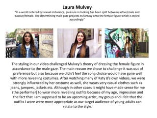
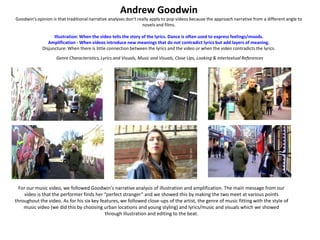
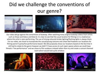
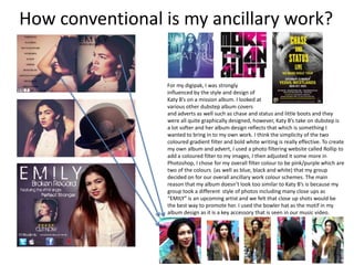
EVALUATION - QUESTION ONE.
   In what ways does your media
 product use, develop or challenge
forms and conventions of real media
            products?
Laura Mulvey
  “In a world ordered by sexual imbalance, pleasure in looking has been split between active/male and
  passive/female. The determining male gaze projects its fantasy onto the female figure which is styled
                                              accordingly”


 The styling in our video challenged Mulvey’s theory of dressing the female figure in
 accordance to the male gaze. The main reason we chose to challenge it was out of
  preference but also because we didn’t feel the song choice would have gone well
with more revealing costumes. After watching many of Katy B’s own videos, we were
  strongly influenced by her costume as well, she wears very casual clothes such as
jeans, jumpers, jackets etc. Although in other cases it might have made sense for me
 (the performer) to wear more revealing outfits because of my age, impression and
  the fact that I am supposed to be an upcoming artist, my group and I felt that the
  outfits I wore were more appropriate as our target audience of young adults can
                                  relate to the style.
Andrew Goodwin
Goodwin's opinion is that traditional narrative analyses don't really apply to pop videos because the approach narrative from a different angle to
                                                                 novels and films.

                   Illustration: When the video tells the story of the lyrics. Dance is often used to express feelings/moods.
                Amplification - When videos introduce new meanings that do not contradict lyrics but add layers of meaning.
             Disjuncture: When there is little connection between the lyrics and the video or when the video contradicts the lyrics.
                    Genre Characteristics, Lyrics and Visuals, Music and Visuals, Close Ups, Looking & Intertextual References


  For our music video, we followed Goodwin's narrative analysis of illustration and amplification. The main message from our
    video is that the performer finds her “perfect stranger” and we showed this by making the two meet at various points
throughout the video. As for his six key features, we followed close-ups of the artist, the genre of music fitting with the style of
    music video (we did this by choosing urban locations and young styling) and lyrics/music and visuals which we showed
                                           through illustration and editing to the beat.
Carol Vernallis

                       •    Edits in music videos come much more frequently than in film.
                                           • Jump cuts are often used.
                                 • Camera often moves in time with the music.
  •   Usual rules of "continuity editing" (usually found in classic broadcast fiction), are broken in order to draw
                                             attention to what is on screen.
                  • A master shot (basetrack) is frequently used to give the video a structure.
       • Edits may be really obvious to draw attention to themselves, such as wipes and special effects.


  As a whole, when it came to editing my group used a lot of the conventions mentioned by Vernallis. One of the
main things we stuck to was editing to the beat, we had to use loads of markers on our timeline as our song had a
really fast beat which would have been hard to keep up with otherwise. We used as many base tracks as we could
   to help our video flow as much as possible and we used edits/special effects such as rewinds, fade in/out and
                                       framing such as the example above.
Influences
          NEYO – SO SICK
This music video influenced our
style of framing for the shots of
   traffic moving in west end.


                        LITTLE MIX – WINGS
                      The styling in this music
                    video influenced our choice
                    of styling for our own. It’s a
                   very young and popular style
                    which was how we wanted
                                 ours.


                         LEONA LEWIS – HAPPY
              This video influenced the narrative to our
                own. We really loved the way that the
               reality isn't revealed until the end and it
               makes the audience believe everything
                that’s happening throughout. We were
              meant to adopt this idea by not revealing
              the “perfect strangers” face until the end
              but we ended up only doing it partially by
              making him catch the performers eye but
                         never actually meeting.
Did we challenge the conventions of
                our genre?


 Our video did go against the conventions of dubstep. After watching many original dubstep videos from artists
     such as Chase and Status and Katy B, it is clear to see that the usual location for filming is in a club/venue
  where the artist is seen performing. The use of strong coloured strobe lighting/flashing lights is always there.
   For our video, we chose to incorporate the casual/young costume and urban feel however our locations for
  filming weren’t party/live performance based. We did purposely chose our locations based on the fact that it
     still had to relate to the genre however we didn't’t have access to such open spaces where we could have
filmed a “live performance” and we chose to film outdoors instead rather than try and create a concert themed
                                        room which would look quite amateur.
How conventional is my ancillary work?


                 For my digipak, I was strongly
                 influenced by the style and design of
                 Katy B’s on a mission album. I looked at
                 various other dubstep album covers
                 and adverts as well such as chase and status and little boots and they
                 were all quite graphically designed, however, Katy B’s take on dubstep is
                 a lot softer and her album design reflects that which is something I
                 wanted to bring in to my own work. I think the simplicity of the two
                 coloured gradient filter and bold white writing is really effective. To create
                 my own album and advert, I used a photo filtering website called Rollip to
                 add a coloured filter to my images, I then adjusted it some more in
                 Photoshop, I chose for my overall filter colour to be pink/purple which are
                 two of the colours (as well as blue, black and white) that my group
                 decided on for our overall ancillary work colour schemes. The main
                 reason that my album doesn’t look too similar to Katy B’s is because my
                 group took a different style of photos including many close ups as
                 “EMILY” is an upcoming artist and we felt that close up shots would be
                 the best way to promote her. I used the bowler hat as the motif in my
                 album design as it is a key accessory that is seen in our music video.

Presentation1q1

  • 1.
    EVALUATION - QUESTIONONE. In what ways does your media product use, develop or challenge forms and conventions of real media products?
  • 2.
    Laura Mulvey “In a world ordered by sexual imbalance, pleasure in looking has been split between active/male and passive/female. The determining male gaze projects its fantasy onto the female figure which is styled accordingly” The styling in our video challenged Mulvey’s theory of dressing the female figure in accordance to the male gaze. The main reason we chose to challenge it was out of preference but also because we didn’t feel the song choice would have gone well with more revealing costumes. After watching many of Katy B’s own videos, we were strongly influenced by her costume as well, she wears very casual clothes such as jeans, jumpers, jackets etc. Although in other cases it might have made sense for me (the performer) to wear more revealing outfits because of my age, impression and the fact that I am supposed to be an upcoming artist, my group and I felt that the outfits I wore were more appropriate as our target audience of young adults can relate to the style.
  • 3.
    Andrew Goodwin Goodwin's opinionis that traditional narrative analyses don't really apply to pop videos because the approach narrative from a different angle to novels and films. Illustration: When the video tells the story of the lyrics. Dance is often used to express feelings/moods. Amplification - When videos introduce new meanings that do not contradict lyrics but add layers of meaning. Disjuncture: When there is little connection between the lyrics and the video or when the video contradicts the lyrics. Genre Characteristics, Lyrics and Visuals, Music and Visuals, Close Ups, Looking & Intertextual References For our music video, we followed Goodwin's narrative analysis of illustration and amplification. The main message from our video is that the performer finds her “perfect stranger” and we showed this by making the two meet at various points throughout the video. As for his six key features, we followed close-ups of the artist, the genre of music fitting with the style of music video (we did this by choosing urban locations and young styling) and lyrics/music and visuals which we showed through illustration and editing to the beat.
  • 4.
    Carol Vernallis • Edits in music videos come much more frequently than in film. • Jump cuts are often used. • Camera often moves in time with the music. • Usual rules of "continuity editing" (usually found in classic broadcast fiction), are broken in order to draw attention to what is on screen. • A master shot (basetrack) is frequently used to give the video a structure. • Edits may be really obvious to draw attention to themselves, such as wipes and special effects. As a whole, when it came to editing my group used a lot of the conventions mentioned by Vernallis. One of the main things we stuck to was editing to the beat, we had to use loads of markers on our timeline as our song had a really fast beat which would have been hard to keep up with otherwise. We used as many base tracks as we could to help our video flow as much as possible and we used edits/special effects such as rewinds, fade in/out and framing such as the example above.
  • 5.
    Influences NEYO – SO SICK This music video influenced our style of framing for the shots of traffic moving in west end. LITTLE MIX – WINGS The styling in this music video influenced our choice of styling for our own. It’s a very young and popular style which was how we wanted ours. LEONA LEWIS – HAPPY This video influenced the narrative to our own. We really loved the way that the reality isn't revealed until the end and it makes the audience believe everything that’s happening throughout. We were meant to adopt this idea by not revealing the “perfect strangers” face until the end but we ended up only doing it partially by making him catch the performers eye but never actually meeting.
  • 6.
    Did we challengethe conventions of our genre? Our video did go against the conventions of dubstep. After watching many original dubstep videos from artists such as Chase and Status and Katy B, it is clear to see that the usual location for filming is in a club/venue where the artist is seen performing. The use of strong coloured strobe lighting/flashing lights is always there. For our video, we chose to incorporate the casual/young costume and urban feel however our locations for filming weren’t party/live performance based. We did purposely chose our locations based on the fact that it still had to relate to the genre however we didn't’t have access to such open spaces where we could have filmed a “live performance” and we chose to film outdoors instead rather than try and create a concert themed room which would look quite amateur.
  • 7.
    How conventional ismy ancillary work? For my digipak, I was strongly influenced by the style and design of Katy B’s on a mission album. I looked at various other dubstep album covers and adverts as well such as chase and status and little boots and they were all quite graphically designed, however, Katy B’s take on dubstep is a lot softer and her album design reflects that which is something I wanted to bring in to my own work. I think the simplicity of the two coloured gradient filter and bold white writing is really effective. To create my own album and advert, I used a photo filtering website called Rollip to add a coloured filter to my images, I then adjusted it some more in Photoshop, I chose for my overall filter colour to be pink/purple which are two of the colours (as well as blue, black and white) that my group decided on for our overall ancillary work colour schemes. The main reason that my album doesn’t look too similar to Katy B’s is because my group took a different style of photos including many close ups as “EMILY” is an upcoming artist and we felt that close up shots would be the best way to promote her. I used the bowler hat as the motif in my album design as it is a key accessory that is seen in our music video.