SlideShare a Scribd company logo
1 of 2
Task 6 – Cans –
This was my first design, using the colours that IRN-BRU
already use and have used a bold italic font for the name of
the drinks then having the slogan written on the back, I would
have the nutrition and contents of the drink written on the
side. It’s a very basic but clean looking design and would need
to add a lot to it but might be good for improvement as there
is a lot of different things I could add in to make it look more
professional.

For my second design I choose a different approached and
add a lot more into the can design and looks good and the
lightening bolts work well with the slogan that I have
included. I have again still stuck to using the same colours as I
feel that’s necessary and would be good to see as a final
product as it looks good now and with a font specifically
chosen from dafont instead of what is on Photoshop I could
make the appearance better, I would also include the logo
although I’m currently making my own in order to replace it.

For this design I decided to show of the colour of the can but
include the colours from IRN-BRU and so using this was able
to use a slogan I felt appropriate for the design which is
‘STEEL CAN, STEEL ABS’ although because of the constraints
and policy’s of making packaging I wouldn’t be able to use
this as someone would be able to make a complaint about
false claims and could cost a lot of money in order to correct
and sort the problem out. The font I have chosen is okay and
works well for the boldness of the drink as it’s a very bold
text as it is and almost looks like army writing which makes
the number ‘32’ look good.

This design is very basic again and would be good for improvement and development but would have to
choose a good font that works well with the can and the
style that I have chosen for this particular can. To make this
can my own I would make my own logo that IRN-BRU
currently use and take one myself in order for it to be more
of my design but I would use that on any of the cans I take
forward for developing.
I have chosen to stick to this can as it was my
favourite and I have edited since I first started it I
have changed the blue and added a shadow effect
to make it look more curved to the can and makes
the blue stand out more I have also changed the
text used for ‘IRN-BRU’ and have changed the colour
of 32 to be the same as the slogan that I have used.

More Related Content

What's hot

Task 6 - Magazine advert
Task 6 - Magazine advertTask 6 - Magazine advert
Task 6 - Magazine advertolibrandon
 
Evaluation question 7
Evaluation question 7Evaluation question 7
Evaluation question 7odsaukila
 
My front cover
My front coverMy front cover
My front coverahiya777
 
Print screen of progress contents page
Print screen of progress contents pagePrint screen of progress contents page
Print screen of progress contents pagecaitlin959767
 
Contents page development
Contents page developmentContents page development
Contents page developmentTheSupaPablo
 
Personal branding project
Personal branding projectPersonal branding project
Personal branding projectFelixStanton
 
As media evaluation 7
As media evaluation 7As media evaluation 7
As media evaluation 7AndyB_
 
Danielle's Poster Designs
Danielle's Poster DesignsDanielle's Poster Designs
Danielle's Poster Designsdeawou
 
Development of the magazine
Development of the magazineDevelopment of the magazine
Development of the magazineben_dickinson
 
Preliminary task evaluation
Preliminary task evaluationPreliminary task evaluation
Preliminary task evaluationZaralucille
 
Final Evaluation 7 power point
Final Evaluation 7 power pointFinal Evaluation 7 power point
Final Evaluation 7 power pointJames Meadows
 
2nd processes of front page
2nd processes of front page2nd processes of front page
2nd processes of front pagelaurenfitzsimons
 

What's hot (18)

Stages
StagesStages
Stages
 
Task 6 - Magazine advert
Task 6 - Magazine advertTask 6 - Magazine advert
Task 6 - Magazine advert
 
Evaluation question 7
Evaluation question 7Evaluation question 7
Evaluation question 7
 
My front cover
My front coverMy front cover
My front cover
 
Task4 and 5 social
Task4 and 5 socialTask4 and 5 social
Task4 and 5 social
 
Question 7
Question 7Question 7
Question 7
 
Print screen of progress contents page
Print screen of progress contents pagePrint screen of progress contents page
Print screen of progress contents page
 
Contents page development
Contents page developmentContents page development
Contents page development
 
Personal branding project
Personal branding projectPersonal branding project
Personal branding project
 
As media evaluation 7
As media evaluation 7As media evaluation 7
As media evaluation 7
 
Danielle's Poster Designs
Danielle's Poster DesignsDanielle's Poster Designs
Danielle's Poster Designs
 
Fibbers
FibbersFibbers
Fibbers
 
Question 7
Question 7Question 7
Question 7
 
Question 1
Question 1Question 1
Question 1
 
Development of the magazine
Development of the magazineDevelopment of the magazine
Development of the magazine
 
Preliminary task evaluation
Preliminary task evaluationPreliminary task evaluation
Preliminary task evaluation
 
Final Evaluation 7 power point
Final Evaluation 7 power pointFinal Evaluation 7 power point
Final Evaluation 7 power point
 
2nd processes of front page
2nd processes of front page2nd processes of front page
2nd processes of front page
 

Viewers also liked

Viewers also liked (20)

Practicing shots
Practicing  shotsPracticing  shots
Practicing shots
 
3d print
3d print3d print
3d print
 
Maria Dos Prazeres - Gabriel García Marquez
Maria Dos Prazeres - Gabriel García MarquezMaria Dos Prazeres - Gabriel García Marquez
Maria Dos Prazeres - Gabriel García Marquez
 
Vegetables!
Vegetables!Vegetables!
Vegetables!
 
Imagery
ImageryImagery
Imagery
 
Medios ambiente ........ 2015
Medios ambiente ........ 2015Medios ambiente ........ 2015
Medios ambiente ........ 2015
 
Rm 199-2015-med-modifica parcialmente dcn
Rm 199-2015-med-modifica parcialmente dcnRm 199-2015-med-modifica parcialmente dcn
Rm 199-2015-med-modifica parcialmente dcn
 
ThinkSmall Basics
ThinkSmall BasicsThinkSmall Basics
ThinkSmall Basics
 
Ensayo evaluación
Ensayo evaluaciónEnsayo evaluación
Ensayo evaluación
 
Randy Braby Resume June 2015
Randy Braby Resume June 2015Randy Braby Resume June 2015
Randy Braby Resume June 2015
 
Pd. educación física
Pd. educación físicaPd. educación física
Pd. educación física
 
Tipos de evaluacion de izamar
Tipos de evaluacion de izamarTipos de evaluacion de izamar
Tipos de evaluacion de izamar
 
El alcoholismo
El alcoholismoEl alcoholismo
El alcoholismo
 
Corte dei conti definitivo 1
Corte dei conti definitivo 1Corte dei conti definitivo 1
Corte dei conti definitivo 1
 
Task 5
Task 5Task 5
Task 5
 
Mochila digital
Mochila digitalMochila digital
Mochila digital
 
4bequipo18
4bequipo184bequipo18
4bequipo18
 
Los 16 alimentos mas saludables
Los 16 alimentos mas saludablesLos 16 alimentos mas saludables
Los 16 alimentos mas saludables
 
Argie bond quant track record
Argie bond quant track recordArgie bond quant track record
Argie bond quant track record
 
Resume Parag Potdar
Resume Parag PotdarResume Parag Potdar
Resume Parag Potdar
 

Similar to Task 6

Can and Magazine evaluations
Can and Magazine evaluationsCan and Magazine evaluations
Can and Magazine evaluationsHannah Sewell
 
Task 6, development of packaging
Task 6, development of packagingTask 6, development of packaging
Task 6, development of packagingsavannahryan11
 
Devlopment
DevlopmentDevlopment
Devlopmenthndoja
 
Task 6 magazine advert
Task 6 magazine advertTask 6 magazine advert
Task 6 magazine advertolibrandon
 
Devlopment
DevlopmentDevlopment
Devlopmenthndoja
 
6. fmp production reflection ip
6. fmp production reflection ip6. fmp production reflection ip
6. fmp production reflection ipOliverFrost4
 
Production powerpoint
Production powerpointProduction powerpoint
Production powerpointAbbeyAndJess
 
Production powerpoint
Production powerpointProduction powerpoint
Production powerpointAbbeyAndJess
 
TASK 7- EVALUATIONS
TASK 7- EVALUATIONSTASK 7- EVALUATIONS
TASK 7- EVALUATIONSsanemesra1995
 
Task 6 Development of Magazine Advert
Task 6 Development of Magazine Advert Task 6 Development of Magazine Advert
Task 6 Development of Magazine Advert katietorpey1
 
Task 5 final ideas
Task 5   final ideasTask 5   final ideas
Task 5 final ideasAbbeyAndJess
 
Mini Evaluation (Can Designs)
Mini Evaluation (Can Designs)Mini Evaluation (Can Designs)
Mini Evaluation (Can Designs)ChloeandRachel
 

Similar to Task 6 (20)

Evaluation
EvaluationEvaluation
Evaluation
 
Can and Magazine evaluations
Can and Magazine evaluationsCan and Magazine evaluations
Can and Magazine evaluations
 
Mini Evaluations
Mini EvaluationsMini Evaluations
Mini Evaluations
 
Mini Evaluations
Mini EvaluationsMini Evaluations
Mini Evaluations
 
Task 6, development of packaging
Task 6, development of packagingTask 6, development of packaging
Task 6, development of packaging
 
Task 5
Task 5Task 5
Task 5
 
Devlopment
DevlopmentDevlopment
Devlopment
 
Task 6 magazine advert
Task 6 magazine advertTask 6 magazine advert
Task 6 magazine advert
 
Devlopment
DevlopmentDevlopment
Devlopment
 
Draft evaluation
Draft evaluationDraft evaluation
Draft evaluation
 
6. fmp production reflection ip
6. fmp production reflection ip6. fmp production reflection ip
6. fmp production reflection ip
 
Production powerpoint
Production powerpointProduction powerpoint
Production powerpoint
 
Production powerpoint
Production powerpointProduction powerpoint
Production powerpoint
 
TASK 7- EVALUATIONS
TASK 7- EVALUATIONSTASK 7- EVALUATIONS
TASK 7- EVALUATIONS
 
TASK 7- EVALUATIONS
TASK 7- EVALUATIONSTASK 7- EVALUATIONS
TASK 7- EVALUATIONS
 
Task 6 Development of Magazine Advert
Task 6 Development of Magazine Advert Task 6 Development of Magazine Advert
Task 6 Development of Magazine Advert
 
Task 7
Task 7Task 7
Task 7
 
Task 5 final ideas
Task 5   final ideasTask 5   final ideas
Task 5 final ideas
 
Mini Evaluation (Can Designs)
Mini Evaluation (Can Designs)Mini Evaluation (Can Designs)
Mini Evaluation (Can Designs)
 
Evaluation
EvaluationEvaluation
Evaluation
 

More from olibrandon (20)

Peer feed back
Peer feed back Peer feed back
Peer feed back
 
Task 10 pp
Task 10 pp Task 10 pp
Task 10 pp
 
Task 10 evaluation
Task 10   evaluationTask 10   evaluation
Task 10 evaluation
 
Task 9
Task 9Task 9
Task 9
 
Task 9
Task 9 Task 9
Task 9
 
Task 9
Task 9 Task 9
Task 9
 
Task 3 and 4 re done
Task 3 and 4 re done Task 3 and 4 re done
Task 3 and 4 re done
 
Task 8
Task 8 Task 8
Task 8
 
Task 8
Task 8Task 8
Task 8
 
Task 8
Task 8Task 8
Task 8
 
Task 7
Task 7Task 7
Task 7
 
Task 7
Task 7 Task 7
Task 7
 
Task 5
Task 5 Task 5
Task 5
 
Task 6
Task 6 Task 6
Task 6
 
Task 6
Task 6Task 6
Task 6
 
Task 5
Task 5Task 5
Task 5
 
Task 4 pp
Task 4 pp Task 4 pp
Task 4 pp
 
Task 3
Task 3 Task 3
Task 3
 
Task 4
Task 4Task 4
Task 4
 
Evaluation
EvaluationEvaluation
Evaluation
 

Task 6

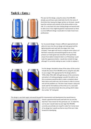
  • 1. Task 6 – Cans – This was my first design, using the colours that IRN-BRU already use and have used a bold italic font for the name of the drinks then having the slogan written on the back, I would have the nutrition and contents of the drink written on the side. It’s a very basic but clean looking design and would need to add a lot to it but might be good for improvement as there is a lot of different things I could add in to make it look more professional. For my second design I choose a different approached and add a lot more into the can design and looks good and the lightening bolts work well with the slogan that I have included. I have again still stuck to using the same colours as I feel that’s necessary and would be good to see as a final product as it looks good now and with a font specifically chosen from dafont instead of what is on Photoshop I could make the appearance better, I would also include the logo although I’m currently making my own in order to replace it. For this design I decided to show of the colour of the can but include the colours from IRN-BRU and so using this was able to use a slogan I felt appropriate for the design which is ‘STEEL CAN, STEEL ABS’ although because of the constraints and policy’s of making packaging I wouldn’t be able to use this as someone would be able to make a complaint about false claims and could cost a lot of money in order to correct and sort the problem out. The font I have chosen is okay and works well for the boldness of the drink as it’s a very bold text as it is and almost looks like army writing which makes the number ‘32’ look good. This design is very basic again and would be good for improvement and development but would have to choose a good font that works well with the can and the style that I have chosen for this particular can. To make this can my own I would make my own logo that IRN-BRU currently use and take one myself in order for it to be more of my design but I would use that on any of the cans I take forward for developing.
  • 2. I have chosen to stick to this can as it was my favourite and I have edited since I first started it I have changed the blue and added a shadow effect to make it look more curved to the can and makes the blue stand out more I have also changed the text used for ‘IRN-BRU’ and have changed the colour of 32 to be the same as the slogan that I have used.