The document provides a mini evaluation of a can design project.
In the first draft:
- The gradient text design was an improvement but some elements like the "32" could be improved.
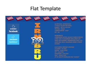
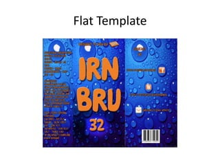
- The template was not fully completed and could use more content from the IRN BRU website.
In the second draft:
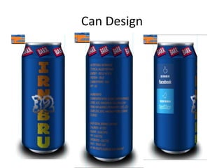
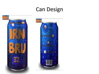
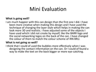
- The designer was happier with the can design and used layer styles to make it look more 3D.
- Some elements like social media logos were adjusted to match the color scheme.
- The bubbles and text on the back could be used or designed more effectively.
