
Recommended
More Related Content
What's hot
What's hot (19)
Viewers also liked
Viewers also liked (18)
Similar to Explore shoe variations and design techniques using Adobe Illustrator
Similar to Explore shoe variations and design techniques using Adobe Illustrator (20)
Recently uploaded
Recently uploaded (20)
Explore shoe variations and design techniques using Adobe Illustrator
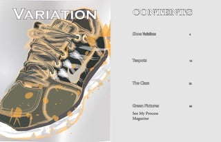
- 1. Variation Contents Shoe Variations 4 Teapots 14 The Class 22 Green Pictures 36 See My Process Magazine
- 2. Shoe Variations Getting Started In class we were assigned to take a picture of an inanimate object to bring to class and we were taught how to make variations to the picture using Adobe Illustrator. I decided to bring a picture of my Nike running shoe and with the skills learned from class I created what appears to be an entirely different shoe. In class we were taught how to change the colors of the original picture, the strokes of the lines, the backgrounds to the picture. At first we tried making a picture that was as close as possible to the original photo that we took. After a while we went in the complete opposite direction to try and makd the picture as unrealistic as possible using different tools in the program. The collection of pictures that will be shown will strart from the original and go through the ones I found most interesting. These will have many changes from the original including the stroke of the lines, to make things like the laces and the sole of the shoe seem fake. The backgrounds of the picture will change completely and turn into different colors to focus on the shoe, or designed background to make the viewer look at the picture as a whole. With this strategy, the viewer picks where their eyes go first because the background designs, as well as the shoe designs, can be appreciated equally.
- 3. Original Learning to The first thing we closest match to the color learned to do in Adobe we were looking for. Illustrator was use the Using Adobe original image to create Illustrator you have the use Adobe a picture in the program. power to make the image With the pen tool we cre- as detailed as you want to ated an outline of the dif- make it look exactly like Illustrator ferent parts of our picture. the original. On the other Then, with the eye drop- hand, it gives you the op- per tool, we filled in the tion to leave out certain color using the original things that you may not image and what Illustra- find necessary and still tor thought was the give a good picture.
- 4. Color ChangingthePictureWithColors In Adobe Illustrator, The bottom left of how the picture was made. images are all one color there are many different de- picture sticks out because of its The white also helps add more to give the outline look signs and colors to be used to simplicity in color variation. detail as opposed to the ones to the picture. With the change a picture. Going from The background is almost a with the colors. The shoe is outline look you are still many different colors to one shaded black and the shoe is able to get a sleek design by able to get its depth from main color is very simple. In completely white with every- taking all of the color out and the detail of the shoe. the first picture the green shoe thing outlined. Some parts of putting in shading where the The black outline on the pops out because the back- the background are the same different parts of the shoe oc- red background make the ground is made, by expanding color as the shoe but still the cur. shoe design really pop out the stroke, to look like it is not shoe is the main focus just and give it its own look. imporatant for the picture. The by the coloring. The all white The final shoe on the different color of the back- on shaded black gives more page was made completely ground from the shoe and the detail to the shoe and gives the red. The shoe, the background black dark circle really make viewer a better understanding color and the background the shoe the main foc
- 7. Teapots Drawing With Adobe To get comfortable with drawing on the pad using the computer, we used line strokes to create teapots. Being that it was my first time using these tools, the teapots didn’t turn out fancy but the goal of getting used to drawing on a computer turned out well. Along with lines picture. pot. To help practice we used the number 5 to create different teapots figuring out shading, we The goal for used pencil to do the as an exercise to get truly using the color in the same thing we did on comfortable with the pro- teapots was to create the computer too com- gram. The main goal of a picture from strokes pare the differences in all of this was not to make and different variations our pictures and under- the images look profes- of the same color. The stand how lighting is a sional or fancy, but to get different colors along big part of the creation comfortable with using with placing the strokes of a drawing. the pen on a computer to in the correct position see how it reacts with dif- gave the image its own ferent hand techniques. unique look and added a color that is not on the The next couple of program. pages will go through the different teapots I created The shading and explain the technique of the teapots was the I tried to utilize in the dif- same concept as the ferent pictures. color part except for only using white, black After getting com- and grays. We had our fortable with the pen tool own teapots to draw and the Adobe system, we and tried to create a explored the variations similar image to what that the program offered, we seen in real life from such as color and creating the ligthing on to the a shading feel to the
- 8. “Five” Drawing Creating Images With Five In the first image uniqueness and gives a being able to maintain on the left, there is a tea- to add to the creativeness varied look from reality. something so simple, the pot and a vase drawing. of it. From far it looks The original image can oject and what it is. These drawings are made like a cluster of lines and clearly be seen as a whole completely out of the colors but as you the but when you really look In the picture on number 5. The technique viewer gets closer and into the design of it you top, we used the number 5 is to use the number 5 to starts to pay attention, are able to see the number again, this time not to raw draw an image just as you the fives pop out and cre- 5 and it is designed that a picture but to see what would if you were using ate its own image. way. The height, width, come out of our strokes lines. With the number depth and image can all while changing the color. instead of the lines, the be appreciated by doing The picture has the number drawing created its own something so radical, but 5 as well as five typed out
- 9. Pot Progression Step Two Adding More Color Along With More Lines Beginning Stage After completing the basic colors and line strokes, I decided to add bigger and more colorful lines to give With my teapot in place in front of me I chose shade of green to start filling in the image even more emphasis to the picture. The lines start to come together to give the picture a completely different color than any the color green and all of its variations to create an im- with value and adding a shading effect on the image. of the colors used. The darker colors are used to show the shading that the teapot has and how it looks in real age and show the shading. The first step is to use line Going over the picture adds emphasis to where the life. The more colors that are used, the more detail the image gets and the picture starts to create an image all on strokes to form the image. We were told to avoid creat- artist wants the viewer to look and can give the real its own. All different shades of the green I picked are used in the picture as lines to add color and shading to the ing the outline of the picture first and to let the strokes look of a picture, even with the colors and shapes being image. It looks a little sloppy because all of the lines are starting to form together and with the addition of more create the edges of the picture as we go on. We then different. lines, the more crisp the image looks. begin to create lines around the entire piece, filling in as much white space as we can to create the entirety of the image. When that was completed I went to another
- 10. Final More Lines, Better Look The final stages to complete the pot is to add way the lines are drawn add emphasis to a certain more shading and colors to fill all empty space. The point of the picture. The shading can have an angled less space there is, the more complete the picture will look if that is what the artist wants the viewer to see. look because of all the strokes in it. The straight up and down lines give the object its base and its identity. The sideway, more curved lines give Adding color gives the object a more defined the object its shading. Also these lines can give the feel feel to show the true density of the original picture. of more light to the picture by representing where the The dark colors show shading where its supposed to be light hits the real object and is translated to the picture. and the light colors relect the light off of the object in real life. Color and line placement are very important when creating a picture in Illustrator. If used properly Direction of the lines also is a key factor. The there are no limits to what one can do with a picture.
- 11. The Class
- 12. By Allison Horn Converse By Amy Duffy Street Car
- 13. By Christian Rosales Downtown By Jordan Juarez Hat
- 14. VAC By Lovette Fernandez By Giovanni Diaz Beach Basketball
- 15. By Robert Furlan Messy Desk By Roxy Wasiunec Nike Shoes
- 16. Fall Into Fashion By Shawnita Montgomery By Synthia Wesley Buidlings
- 17. House By Tom Zwarycz
- 18. Green Pictures In the series, to see both the green In this magazine I “Green Pictures” I show pieces of work and have brought you through the entire class’s art work the other variations the start of our works as with the color green in the the different students a class, to the final works. majority of the picture. For decided to do with their We learned to use Adobe our projects on variations, pictures. to make things and also one of the requirements as a way to edit things. was to make an all green The green This magazine is a little picture to put on display. pictures have their own tour throughout our class’s I took those pictures to section because of the projects to show what we make the green part of the beauty the all green have been doing with our magazine. Everyone has brings to the table. The time here. Our knowledge different pictures and the one color theme helps of using computers for art use of green really puts the viewer to really take has grown since the begin- them all together. The final in the picture for what ning of class and now we are products came out very it is rather than the advanced enough to make well and because of this I many different colors a magazine through the was able to take the pic- used in the majority of computer, Adobe InDesign, tures to really help out my the original photos. and things learned from our magazine. teacher. Every person from our class has some piece of Each picture in the art featured in this maga- green series is a variation zine. Appreciate the time of an art work already in and effort it took for each of the magazine in a different us to make these artworks section. The viewer is able and enjoy them in their own unique way. -Nico Krajecki
- 19. Green Pictures By Allison Horn By Christian Rosales By Amy Duffy By Giovanni Diaz
- 20. By Jordan Juarez By Robert Furlan By Lovette Fernandez
- 21. By Roxy Wasiunec By Synthia Wesley By Tom Zwarycz By Shawnita Montgomery