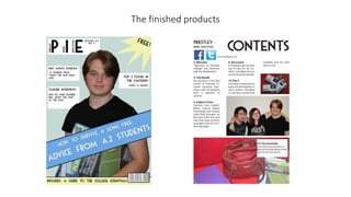
2. Identifiable font
Large mast head Direct mode of address
Splash
Cover lines
Banner – Main covering
line
Barcode
Date, issue number,
price (free)
Following the codes and conventions of magazine covers:
3. Following the codes and conventions of magazine contents:
“Contents written at
top”
Pictures
Name of magazine
Small font
White background
3 columns
Categories/features
Website
Limited colour
scheme/house style
4. Comparing my work with a professional
(challenging the conventions)
Title is too small
Cover lines are in boxes,
which looks strange
Image isn’t cut out
of background, like
with mine
5. Comparing my work with a professional
(challenging the conventions)
White background
Only one image, unlike mine
which has 3 and looks too busy
I only used 3
columns
6. Evaluating uses of new media technologies:
Use of new media technologies:
• Photoshop
Skills used in Photoshop:
• Use of the magnetic lasso tool
• Cropping and resizing images
• Shape tool (for making splashes and banners)
Skills that need developing more in Photoshop:
• Using colours that work better together
• Smoother cropping/deleting backgrounds
• Using easier to read fonts
Use of new media technologies:
• Quark
Skills used in Quark:
• Use of the text tool to make headlines/columns/text
• Cropping and resizing images
Skills that need developing more in Quark:
• Resizing certain images
7. Overall Weaknesses of my cover:
• Colours do not work well together
• Photograph used is not lit very well and isn’t in full focus
• The photograph looks out of place on the cover
• Cover lines are in boxes, which looks odd.
• In comparison to professional magazines, my attempt is very basic
• The font is not very easy to read on the cover lines, it would be better to use
a different font for these parts and only use the current font for the title
• The magazine would look more professional if there were more cover lines
Overall weaknesses of my cover
8. Overall weaknesses of my contents
Overall Weaknesses of my contents:
• The Facebook and Twitter images are too large and do not have any
information regarding how to find the college on these websites
• The link to the website looks out of place
• There are too many images
• “14. The Essentials” the white box is too large and the text looks odd in this
place
• There are limited sections in the contents, making the overall page look bare
• Though the font is small, it is still too large when compared with a
professional contents page, this makes my product look incomplete
9. Using the Camera
• Using the college camera under strict time constraints limited the quality of my images greatly, I was able to edit the photos taken in
Photoshop, however, to get them to the highest quality that I could manage.
Image unused: it was unfocused Image unused: it was unfocused
Image used: it was the most in-focus
photo and was a mid-shot
Image unused: the photo is not close
enough