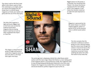
1. The colours used on the front cover
differ to the colours used on Total
Film and Empire as no bright colours
are used for the background, this
shows that it is a British based
magazine as it looks very realistic and
gritty with the use of the colour grey.
The title of the magazine is
Sight and Sound. Biggest text
on the front cover so that the
audience know which
magazine they are buying.
Doesn’t stand out as much as
other mastheads like Empire
or Total Film.
This slogan is a boast from the
writers of Sight and Sound to
make there magazine stand out
from the others in the hope
that it gets more buys.
Biggest picture on the poster is
a character from the British film
‘Shame’, this shows that Shame
is going to be the main talking
point in this magazine. It also
makes the character stand out
to make him look important to
the film.
Magazine is sponsored by the
BFI, which shows it is a British
related magazine, which is a
perfect fit for my film because
mine is a British social realism
film.
The shot connotes that this
character is oblivious to what is
going on as he is directly looking
past the camera even though the
camera is close to his face as this
is a close up shot. He also looks
mysterious as we don’t know
anything else about him other
than what his face looks like.
The anchorage text is displaying a British film called Shame which
anchors with the main image. Shows that Shame is a main talking point
of the magazine which is unusual because usually, film magazines tend
to have the big Hollywood blockbusters featured on the front cover.
However this magazine has smaller films on the front cover so Sight
and Sound would be a perfect magazine to put my film on.