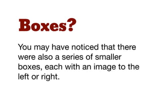
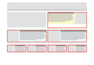
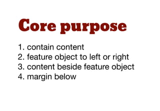
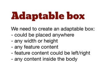
Download as PDF, PPTX

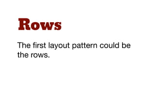
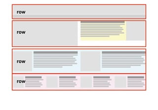
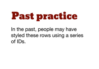
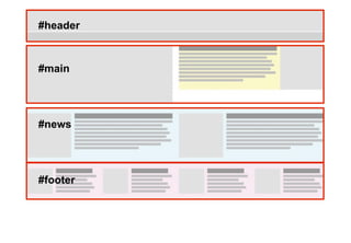
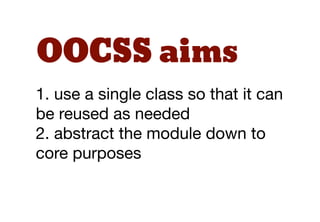
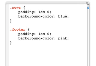
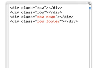
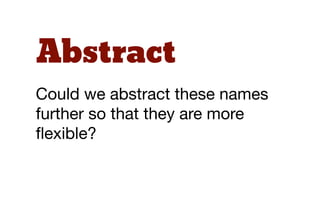
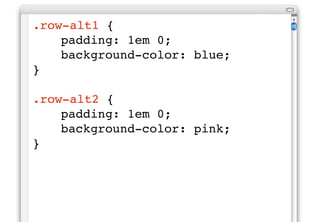

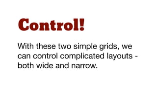


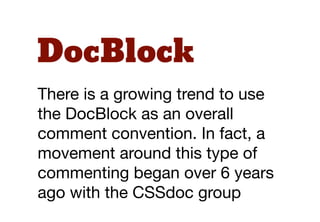


The document discusses the challenges of maintaining CSS, particularly in larger websites, and introduces Object-Oriented CSS (OOCSS) as a solution for creating reusable and efficient styles. It explains fundamental concepts of OOCSS such as modules, modifiers, and the importance of abstraction in layout patterns for better code reuse. Additionally, it touches on Scalable and Modular Architecture for CSS (SMACSS) for organizing styles, emphasizing semantic and sensible class naming to promote maintainability and flexibility.


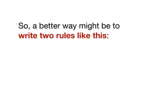
![[译]Efficient, maintainable CSS](https://cdn.slidesharecdn.com/ss_thumbnails/efficient-091215042328-phpapp01-thumbnail.jpg?width=640&height=640&fit=bounds)


![5G Explained! A High Level Overview [Introduction]](https://cdn.slidesharecdn.com/ss_thumbnails/5gexplainedahighleveloverview-260119165306-cc137a3e-thumbnail.jpg?width=640&height=640&fit=bounds)


