Download as PDF, PPTX


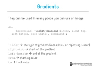


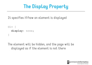
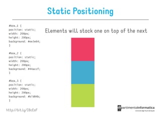
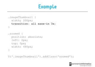
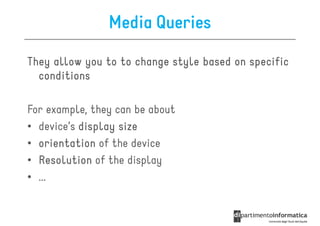
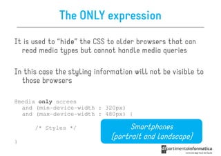
![Other Selectors from CSS1 & CSS2
• div p all <p> elements inside a <div>
• div>p all <p> elements where the parent is a <div>
• div+p all <p> elements that are placed immediately
after <div>
• [target] all elements with a target attribute
• [target=_blank] all elements with target=
"_blank“
• p:first-child
p:first- every <p> element that is the first
child of its parent](https://image.slidesharecdn.com/lecture11-120430105757-phpapp02/85/CSS3-Refresher-20-320.jpg)
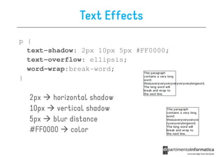
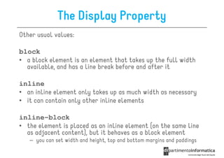
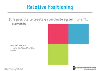
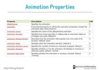
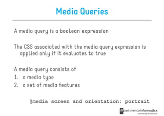
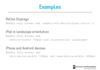
![Some selectors introduced in CSS3
• a[src^="https"]
a[src^="https"]
src every <a> element whose src
attribute value begins with "https”
a[src$=".pdf
src$=".pdf"]
• a[src$=".pdf"] every <a> element whose src attribute
value ends with ".pdf”
a[src
src*=“mobile"]
• a[src*=“mobile"] every <a> element whose src
attribute value contains the substring “mobile“
p:nth-
• p:nth-child(2) every <p> element that is the second
child of its parent
p:nth-last-
• p:nth-last-child(2) every <p> element that is the
second child of its parent, counting from the last child
• :not(p) every element that is not a <p> element](https://image.slidesharecdn.com/lecture11-120430105757-phpapp02/85/CSS3-Refresher-21-320.jpg)


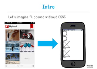
This document provides an overview of CSS3 features including basics, selectors, the box model, positioning, fonts, visual effects, and media queries. Some key points covered include: - CSS3 is the presentation companion of HTML5 and allows for simpler, more performant, and accessible web design. - New CSS3 features are supported by most modern browsers and provide benefits like fewer images, less code, and better search engine optimization. - CSS3 introduces properties for backgrounds, borders, text effects, transitions, transforms, animations and flexible box layout. - Media queries allow styling to adapt based on conditions like device width, orientation and resolution.


![[2017/2018] Introduction to Software Architecture](https://cdn.slidesharecdn.com/ss_thumbnails/ivano02softwarearchitecture-171120182731-thumbnail.jpg?width=640&height=640&fit=bounds)
![[2017/2018] AADL - Architecture Analysis and Design Language](https://cdn.slidesharecdn.com/ss_thumbnails/ivano04saaadl-171122165132-thumbnail.jpg?width=640&height=640&fit=bounds)
![Object-oriented design patterns in UML [Software Design] [Computer Science] [...](https://cdn.slidesharecdn.com/ss_thumbnails/04designpatterns-180228160652-thumbnail.jpg?width=640&height=640&fit=bounds)
![[2017/2018] Architectural languages](https://cdn.slidesharecdn.com/ss_thumbnails/ivano03salanguages-171122083931-thumbnail.jpg?width=640&height=640&fit=bounds)

![Modeling behaviour via UML state machines [Software Design] [Computer Science...](https://cdn.slidesharecdn.com/ss_thumbnails/05statemachines-180306225932-thumbnail.jpg?width=640&height=640&fit=bounds)

![Requirements engineering with UML [Software Design] [Computer Science] [Vrije...](https://cdn.slidesharecdn.com/ss_thumbnails/02requirements-180213083117-thumbnail.jpg?width=640&height=640&fit=bounds)

![Structure modeling with UML [Software Design] [Computer Science] [Vrije Unive...](https://cdn.slidesharecdn.com/ss_thumbnails/03structuremodeling-180219151135-thumbnail.jpg?width=640&height=640&fit=bounds)
![Modeling and abstraction, software development process [Software Design] [Com...](https://cdn.slidesharecdn.com/ss_thumbnails/01intro-180206151252-thumbnail.jpg?width=640&height=640&fit=bounds)
![[2017/2018] Agile development](https://cdn.slidesharecdn.com/ss_thumbnails/ivano05agiledevelopment-171123214423-thumbnail.jpg?width=640&height=640&fit=bounds)


![Modeling objects interaction via UML sequence diagrams [Software Design] [Com...](https://cdn.slidesharecdn.com/ss_thumbnails/06sequencediagrams-180314152521-thumbnail.jpg?width=640&height=640&fit=bounds)


![How Maintainability Issues of Android Apps Evolve [ICSME 2018]](https://cdn.slidesharecdn.com/ss_thumbnails/icsme2018-180928081558-thumbnail.jpg?width=640&height=640&fit=bounds)


