Downloaded 44 times

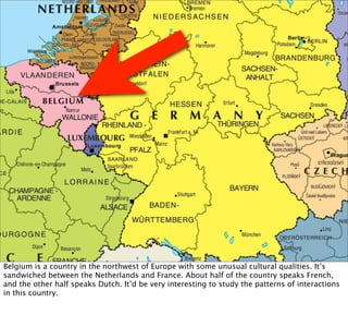
![Belgian
phonecall
network
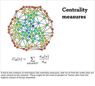
Fast unfolding of communities in large networks, Blondel et al [2008]
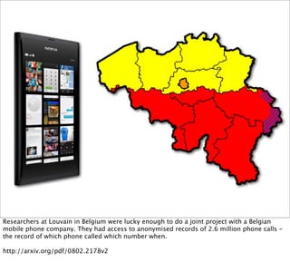
They used these calls to construct a “call graph”. They were able to develop a community-
detection algorithm that could detect the two separate clusters of Dutch and French speakers
that were mostly only calling each other. The algorithm achieved this simply by analysing the
shape of the graph. It knew nothing about French, Dutch or phone calls.
http://arxiv.org/pdf/0803.0476](https://image.slidesharecdn.com/stratanyc2011ignite-placegraph-110921201530-phpapp02/85/Place-graphs-are-the-new-social-graphs-10-320.jpg)


This document discusses using graphs to represent relationships between places instead of people. It describes how researchers analyzed anonymized phone call records from Belgium to construct a "call graph" and identify separate clusters of Dutch and French speakers. The author analyzed routing logs from a location app to create a "place graph" showing connections between cities based on how often people drive between them. This place graph could be used to recommend neighborhoods in an unfamiliar city based on similarities to neighborhoods a traveler likes in cities they know.