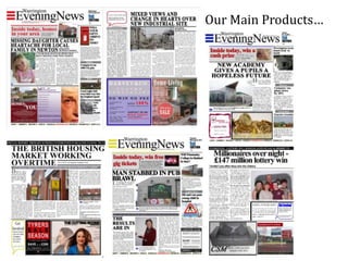
2. Our Main Products…
-It fits into the genre of existing local
newspapers, we aimed to achieve this look by
using a set colour scheme of red, blue and
yellow.
- Works along side conventions of existing
newspapers such as a catchy slogan, striking
title, encouragement of audience feedback,
political views, town news.
-We researched the theme of our stories
before including them in our paper to ensure
they fit the genre of local papers.
3. We used the same colour scheme
throughout and focussed on colours red
blue and yellow with each of us using a
different colour for our own newspaper
issue. As you can see we also
incorporated the title into our ancillary
product.
4. Our ancillary products… Our ancillary
products include a
poster and radio
advertising our
newspaper.
Together they work
well as they use the
same colour
scheme as our
main products, we
ensured to
incorporate our
title and slogan
into our radio ad to
show a link
between all of our
products.
5. Links between text…
At first glance it is clear that all of our products link together, from the bright bold
colour scheme and the catchy slogan. This was our main aim when making our
products as we really wanted to focus on our brand identity.
How effective?
The use of the
bright colour
scheme is one
of the most
important
factors when it
comes to the
identity of our
newspaper.
Changes?
We are very happy
with all our
products and feel
the layout changes
we made have
worked to our
advantage.