1. They have simply used three different
colours (red, black and white) as the colour
Front Cover – scheme. Each of them go very nicely
Q. together and by doing this it makes the
magazine look classy and eye catching
towards the audience.
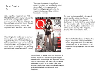
At the top of the magazine it says ‘FREE The cover photo creates both a strong and
MUSIC INSIDE’ as it’s in capital letters and a artistic feel. She is taller than famous
block, black, rectangle at the top it is landmarks and also is the only colour as the
purposely meant to stick out. Hinting to the buildings are all black and white. Meaning that
reader that it’s an exclusive edition and that she stands out and is the dominant picture on
it is also a unique selling point for the the cover. Also they have used someone who
magazine. This is the use of a ‘buzz word’. is then later in showing in the magazine,
drawing in the audience once more.
The writing that is used is easy to read and
the headlines are in capital letters, or in a The master head is obvious to the eye. It is
large font. They have made the writing easy big and colourful. It is designed to be the
to read so that they buyer can read see and second thing on the front cover that they
make sense of the magazine from afar, or audience will look at. And because it’s in a
whilst looking on a magazine rack, ensuring prominent red square that is precisely what
that the reader will be able to read it easily. happens.
The headlines on the left hand side are shown in
order of importance. The writing gradually gets
smaller as the headlines get less important as such.
Then on the left hand side there is a circle with a
headline in it, which as an audience you then
assume is a edition as it’s alone making you watch
as an audience look at it before the other
headlines.
2. The page numbers are written in red next to
Contents Page – Q. the headlines in black writing allowing the
audience to look at just the page numbers
quickly if they wish. It also draws your
attention to the headlines a little bit more.
Q have include their master head in the The colour scheme has stayed the same:
contents page as well, just in a much smaller red, white and black, allowing the reader to
version. This makes the reader become create a reference with the front cover to all
aware of the master head and they will in of the other pages. They have used only two
turn recognise it unconsciously the more pictures on the content page which works
they see it, making the reader more familiar well as you have enough for it to not be
with the magazine. boring but at the same time not over doing
it. Also as one of the pictures takes up the
majority of the page it allows the magazine
They have shown the reader that they are a to show the reader the main article in the
loyal magazine in two subtle ways. They magazine.
have included the issue number ‘267’ at the
top right hand corner of the magazine and in
the bottom left hand corner they have
included an ‘every month’ section On the left hand-side underneath
suggesting that they know their customers ‘FEATURES’ they have written ‘OASIS
well and they supply them with what they SPECIAL’ but you can tell that it’s a special
want. And it obviously works as they have feature as the headline is in gold, the only
made ‘267’ copies of the magazine. place that another colour is use and it is also
boxed in on it’s own evidently showing that
the magazine what to make it stick out.
Once again the writing is easy to read for the
audience and the colour scheme of
red, black and the headlines are in capital
letters then there is a little bit of extra
information in a smaller font
underneath, letting the reader chose for
themselves if they want to move further on
or not.
3. One half of the double page spread is Lady Gaga.
This is a typical convention of a music magazine and
Double Page Spread it emphasises that she is the main focus of the
magazine. The picture is artistic, dominant and quite
– Q. quirky which suits music magazines and the artist.
Also on the right page of the double page spread it
says ‘lady GAGA’ again highlighting that she is the
key feature and very important.
In the bottom right hand
Again, the same as the corner they have included
other two, the colour the page number and the
scheme is the same. master head of the
Showing familiarity and magazine once again. As I
professionalism as the said previously it allows
pages are well suited (as the reader to familiarise
they should be) and you themselves with the
don’t question that they magazine and the master
are the same magazine at head becomes really
all as they match. common with them.
The writing on the magazine is once again easy to read
and it is written in columns; a typical convention of a
magazine. Also on the ‘S’ and ‘I’ they have used drop
capital, which again is a typical convention of magazines
starting a new paragraph. And then obviously the ‘L’ is
prominent. Not only does it emphasise the importance of
Lady Gage but it also gives the magazine a different edge
to it and makes the written piece more appealing.
4. Front Cover
The front cover makes it obvious to the audience
– NME. the exclusive elements that the magazine
contains. As the two circles and the line at the
very top are more eye catching than the
information at the bottom highlighting their
significance to the reader.
NME are following a typical
The master head of the magazine convention of having a simple three
is the last layer of the magazine colour, colour scheme. Making it
meaning that the whole of it is simple but stylish. Also the white
shown and it’s not cut off by body of the front cover allows there
anybody’s head or headlines etc... to be freedom with the colour font
Meaning that it is the most colours can be easily seen on a white
important thing on the page. It is background.
also fairly big and bold meaning
that it catches the audiences eye.
The writing on the front cover are
really easy to read. All the fonts There are two people on the cover
are clear and the writing is both which takes the focus away from the
big and in capital letters. The only one person, obviously, but perhaps
smaller font on the page is the draws in more attention to the
added information that is there if audience as you wouldn’t normally
anyone wants to read further on see these two together creating a
once they have picked up the mystery (as such) for the readers.
magazine.
5. Contents Page –
NME.
NME have used their Showing the genre of their
master head through to magazine well as they have a
the contents page. This I ‘band index’ section on the left
have discovered seems to and then they have the main
be a typical convention of contents on the right hand
music magazines. side, they have headlines then
sub headings which shows that
they are grouping parts of the
magazine together as much as
possible making it easy for the
Again the colour scheme has
audience.
stayed the same throughout
the contents page – linking
the pages of the magazine
nicely together showing that
they are of the same By writing ‘NME THIS WEEK’ it lets
magazine. They font is the the audience know that it is a
same throughout as well. The weekly magazine, whilst at the
headlines are also capitalised same time not having to obviously
as they are on the front cover write ‘contents page’ – works as a
creating a parallel of the double effect. Also as there is a
pages. subscription box and the bottom of
the page it shows that they are a
popular magazine and they are
promoting themselves also.
6. Double Page
Spread –
NME.
The writing on the pages
is easy to read, again the
Followed the convention headlines are capitalised
of a big picture covering following the rest of the
one of the two pages. magazine and then the
Again a cool and quirky article has been written in
picture that suits the two columns following
magazine and the story the convention of a
on the other side. magazine layout – which
is something I will be sure
to include in my
magazine. Again the
background where the
The double page spread is main writing is, is light so
really shown in a way that that it can be seen clearly.
the audience know they
are the same story as the
title for it overlaps the
Split up the writing a little bit. By putting some
page with the picture on They have included the master head at the
on a white background and then more on a black
it. Also the colour scheme bottom of the page again. Familiarising the
background makes the audience think it’s really
is the same throughout audience with their name and master head
different – even though it’ll linked as it’s on the
the pages ensuring that of their magazine. Also they have written
same double page spread. It just makes it more
they are matching and their website promoting themselves once
exciting for the reader as it’s set out slightly
colour co-ordinated. more.
differently.
7. Front Cover – The fonts, once again aren’t
too fancy and they are really
Vibe. easy for the buyer to read
and clear for them to see
whilst scanning the magazine
The colour scheme is isle.
conventional. Three
colours which seems to
be the norm for the music
magazines. Making it
both simple but stylish. All writing on this page is
Also all the colours go capitalised grabbing the
well with each other audiences attention. This
which is good as seems to be a typical
otherwise it would look a convention of the front
mess. cover of a music
magazine.
The headlines that are
The master head isn’t the more important are much
main thing on this bigger than the other
magazine as it is blocked ones. For example the
out by headlines and the headlines on the left are
cover photo, you can still important but the ‘JANET
see it, just the cover JACKSON’ headline
photo is what’s drawing catches your eye first.
in all the attention for the
magazine.
8. Contents Page –
Vibe.
The picture is quite a cool They have used clear
picture. The guy is well dressed fonts and written
and he has a girl sticking a ‘contents’ in a stylish and
heart to him. He is probably a unique way. Also they
role model for other young have a big ‘V’ in the
guys who are reading the background highlighting
magazine and other young girls the fact that it’s ‘Vibe’
are probably wanting to be the magazine.
woman. This helps tell the
reader the target audience of
the magazine, which is both
men and women.
The font used is very easy
to read. The headlines
have a fancier font but
that works well as it
distinguishes them from
the other information.
Also as the page is black
By splitting the contents of the and white with a glimpse
magazine up into tow main of red it makes the page
areas makes it easier for the more interesting.
reader to find out where the
article they want to read is.
9. Double Page The colour scheme for the magazine
is simple, again just three colours.
Spread – Not over-doing things but having
Vibe. enough colour for the magazine to be
entertaining to the eye still.
At the bottom of the page Written in columns showing
there is a ‘V’ telling the that it is a magazine by
reader that it is Vibe following the conventions of
magazine once more. one. The font is easy to read
Having the master head and most of the text is
at the bottom of the page written in black which with
is a thing that I the background of the
continuously find with magazine is white it makes
magazines which is it easy to see. Then some of
definitely a thing to note it is in pink which tells the
for when I make mine. reader that it’s a more
important part of the text as
it differs from the rest.
Half of the double page spread is a
picture of Alexandra Burke. This tells the
audience who the article is about
immediately and links the two pages
together nicely. There is also another
small picture of her highlighting the
importance of her to the magazine and
for the article.
10. The master head is quite
Front Cover – Kerrang. powerful as it’s in big
capital letters, the colour
stands out on the blue
background and it also
has a scratched effect on
it making it eye catching.
All writing on this page is
easy to read and the font
is very clear for the A simple colour scheme
reader to see. This is a of three colours -
typical convention of white, green and yellow.
magazines. This makes the magazine
interesting but simple.
Also the colours suit each
The cover photo is very other nicely which makes
dominant and it is well the magazine look good.
suited to a music
magazine as the guy is
playing a guitar. Also
where is head is there is All of the writing on the
no writing over lapping at entire page of the front
all giving him full focus cover is written in capital
from the reader. There letters. However some of
are two other pictures on them are in a smaller font
the front cover, one to the others. The ones
bottom right and the that stick out the most
other top right. They also are ‘WTF?!’ and ‘GREEN
get the attention of the DAY’ as they are bigger.
audience as it breaks the Also there’s exclusive
convention of a front parts of the magazine like
cover as usually there is where it says ‘plus’ which
only one picture. is a key focus as well.
11. Contents Page – The colour scheme is
simple, three colours –
Kerrang. yellow, black and white.
This makes the magazine
look professional and well
thought out. Also it
The font is extremely easy to follows the conventions
read, which is good. Most of of a magazine.
it is black which stands out
prominently on the white
background. Then the On this contents page they
headlines are written in have a little section from
yellow surrounded by a black Kerrang magazine – a greeting
box also allowing it to stand message for the readers. This
out further. is a unique touch for a
magazine and allows the
readers to connect with the
magazine. Also the editor has
signed it, making the message
appear more personal for the
Underneath the contents
reader. This is the use of a
page it says the issue
tagline.
number, this suggests that
the audience are loyal and
that the magazine is well They have included quite a
respected as it had been the few pictures on this contents
1250th magazine. Also as it page, with page numbers and
says ‘this week’ it hints that headlines by the side of them.
the audience like having a By having the pictures it
weekly magazine, as Kerrang From the iconography I makes the page seem more
is one. would say that it is mainly interesting and it also explains
aimed at men as not one of part of the headlines at the
the photos a female, this same time.
helps point out who the
target audience are.
12. They have also included a ‘buzz word’
Double Page Spread – on the top left hand corner, ‘NEWS’. They have used a pull quote as the
By doing this the reader thinks that headline to draw the audience in and make
Kerrang. what’s said needs to be read them read further on into the article to get
immediately. Also it is a different the full story.
colour to the rest of the double page
spread making it stand out further. The layout of the double
page spread is very
conventional. Once again the
At the bottom of the pages double page spread has one
they have added the page of the pages with the person
number and the master they are talking about, in this
head, of the magazine from case Davey Havok, also him
the front cover, just a much being the only image on the
smaller version of it. This is page stresses the importance
to familiarise the audience of him. Furthermore Kerrang
with the representations of have used columns for the
the magazine. It has also body copy, this then works
been an occurring factor of well by them also using a
all the magazines I have drops capital to start it off. By
researched, so it is definitely doing this it is obvious that it
a typical convention of music is a magazine as it follows
magazines. key conventions.
The fonts used are very clear and easy to read. The The colour scheme of the mage is four coloured;
headline is in huge capital letters which draws the reader in. black, white, grey and pink. Whilst most are just three
It is a typical convention to have the headlines in capital coloured in this case it’s still not ‘over doing it’ as they all go
letters. Also they have made it clear when the interviewer is nicely together and without the pink it would be fairly dull
asking Davey Havok the questions as they are the speaking colours. The pink has been used for key information to grab
where the words have been highlighted by white. the readers attention which in contrast with the other
colours it does very well.
13. Front Cover –
MOJO.
The colour scheme is red, black and a
silvery grey - conventionally only They have used call outs; such
using three colours. All of the colours as, “WE ROCKED!” and “…THE
go nicely together and work well for INTENSITY NEVER LET UP!” which are
the front cover of the magazine. The aimed to entice the readers to read
layout of it makes it eye catching for further on, resulting in buying the
the consumers. The ideologies of the magazine.
magazine are that you would read it They have an equal number of
if you either play an instrument genders on the front page; two men,
yourself, or just enjoy them. You’d two women. This suggests that the
definitely have to be interested in audience of the magazine are both
bands but you would also be men and women. Also all four of
interested in the ‘gossip’ of the lives their eyes are at eye level with the
of the musicians/artists. reader and looking directly at you,
persuading you to buy the magazine.
The master head of this
magazine isn’t the most
dominant aspect of the page.
They have also included a ‘buzz word’ on
This is because the cover image
the top left hand corner, ‘FREE CD!’ By
is instead. Their heads and guitar
doing this the reader thinks that it’s
take over the magazine.
exclusive to this magazine only, therefore
Representing them as being very
having more of a reason to by this issue
important for the magazine, the
of the magazine as it offers them
audience would, in turn, have to
something extra.
be a fan of theirs to purchase the
magazine.
14. The have used the master head of
They have written the page numbers the front cover on the contents page
down the side, however they haven’t as well. This familiarises the readers
included all pages for example they with the title. They have also used it
start at ‘38’ and then go to ’44’. in a much smaller size in the bottom
Which shows that you do not have to right hand corner, by the page
include every single page, if you don’t number (another typical convention,
want to. and something I will need to include)
which stresses further the
importance of the master head and
the audience being able to recognise
Once again there is is easily.
a colour theme containing three
colours only, in this case; green,
yellow and black. The colours all suit
each other nicely as they should do They have used a ‘pull quote’ at the
to follow conventions of the bottom of the contents page; this is
magazine. used to try and bring in the audience
and get them to read further into the
article.
There is only one picture making the
iconography of the contents page
really simple. As the image is big it
The headlines are in capital letters
does have a good effect, also the guy
then further information about them
looks quite indie/quirky reflecting the
are written underneath and non
image of the magazines audience,
capitalised. Again a typical
perhaps.
convention.
15. There is a drops caps at the start of the body copy, this is one of the
elements that distinguish ordinary text to magazine text, as it is
¾ of this double page spread is being
essential that you include one if you want to follow typical
taken up by the central
conventions of magazines. It sticks out further as it is pink as
image, highlighting the importance of
opposed to the rest of the body copy which is black. Also there
it for both the reader and the
other words in pink in the second column which suggests that they
relevance of the article it
have higher importance as they stick out.
corresponds with.
As it is written in columns it
is evidently made to look like
a magazine, which is good There is a colour scheme of
use a conventional black, white and pink. Again
techniques. If it were just they have stuck to a very
paragraphed it wouldn’t conventional three
seem as appealing to the colours, which go nicely with
audience and it also would each other. The body copy has
break conventions. been given the colour black
which is often the way as it
makes is easy for the reader to
read and once again, it follows
conventions.
The header of the double page
spread is very dominant. The bright Again the page number and the
colours stand out from the master head ‘MOJO’ is at the bottom
background and also the font is big of the page. Making the reader aware
and bold, telling the reader that of the master head and then
what’s on this page must be read. obviously what page they are on as
well – both typical conventions.