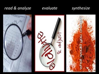
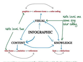
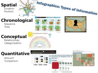
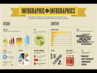
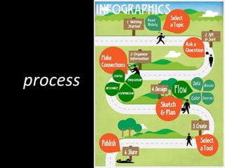
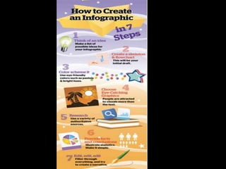
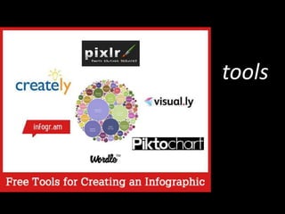
INFOGRAPHICS
Analyze, Evaluate, Synthesize


              presented by Linda V. Nitsche
                      andErin Van Guilder
exploringinfographics.wikispaces.com
read & analyze   evaluate   synthesize

• PART I
why infographics?
information glut
accelerate
decision making
Hans Rosling’s 200 Countries, 200 Years
part I
read & analyze
types
resource

qr codes
blood types
status infographics
comparison
evolution
your turn
part 2
evaluate
effective infographics
data
sources
story
flow to conclusions
design style
color & size
icons
diagrams &
   charts
words
your turn
part 3
synthesize
process
ways to present data
tools
easel.ly
infogr.am
piktochart
many
eyes
statsilk
visual.ly
your turn
Q&A


  lvnitsche@gmail.com
mrsvanguilder@gmail.com
Image Sources (Creative Commons License) in slide order:

1.    infographic title: 10170892-blue-data-space-abstract-financial-background
2.    wiki url
3.    analyze: magnifying glass http-//www.dimensionsinfo.com/wp-content/uploads/2010/01/Performance-Measurement; evaluate: evaluate-adjust http-
      //foodstorageandbeyond.com/wp-content/uploads/2010/09/evaluate-adjust; synthesize
4.    infographic: http://infographiclabs.com/news/what-is-an-infographic/
5.    infographic: http://infographicsagency.com/why-infographics/
6.    lego infographic: http://mashable.com/2012/07/18/lego-infographic/
7.    why infographics: why-infographics http-//infographiclist.files.wordpress.com/2011/11/why-infographics
8.    data visualization: Periodic-Table-slices_04 http-//www.visual-literacy.org/periodic_table/periodic_table
9.    Hans Rosling’s 200 Countries, 200 Years: http://www.youtube.com/watch?v=jbkSRLYSojo&feature=share&list=PLzLW9zephfrfX9Dqbr2ciLzCYTyj48rom
10.   analyze: magnifying glass http-//www.dimensionsinfo.com/wp-content/uploads/2010/01/Performance-Measurement
11.   elements: venngage-offers-inexpensive-data-visualization-tools-for-businesses-41206064ab
12.   types: venngage-offers-inexpensive-data-visualization-tools-for-businesses-41206064ab
13.   levels: levels http-//spyrestudios.com/the-anatomy-of-an-infographic-5-steps-to-create-a-powerful-visual/
14.   types: venngage-offers-inexpensive-data-visualization-tools-for-businesses-41206064ab (1).jpg
15.   resource: water supply ypes venngage-offers-inexpensive-data-visualization-tools-for-businesses-41206064ab (1)
16.   status: water wars http-//www.princeton.edu/~ina/infographics/water
17.   comparison: waterrichvswaterpoor http-//www.seametrics.com/blog/water-poor-rich-infographic/
18.   evolution: infographic.water.barringer http-//thecomingcrisis.blogspot.com/2012/04/infographic-secret-life-of-drinking.jpg
19.   more types: ypes of infographics source Patti Shank.jpg
20.   greenlight:green-traffic-light http-//jrfibonacci.files.wordpress.com/2010/03/green-traffic-light
21.   evaluate: evaluate-adjust http-//foodstorageandbeyond.com/wp-content/uploads/2010/09/evaluate-adjust
22.   target: targetedsalessolutions-com
23.   infographic on infographics: infographic on infographics http-//i.imgur.com/DNxvj
24.   data: water world http-//images.fastcompany.com/magazine/154/infographic/water-world
25.   sources: water the works http-//globaldimension.org.uk/resources/item/1479
26.   story: water down http-//www.seametrics.com/blog/wp-content/uploads/2011/09/16
27.   flow: water down http-//www.seametrics.com/blog/wp-content/uploads/2011/09/16
28.   design: Seametrics-Where-Water-Comes-From http-//www.seametrics.com/blog/infographic-where-does-water-come-from/
29.   color & size: foot http-//s3images.coroflot.com/user_files/individual_files/original_301733_EeI4H_vTULAwaoup710gtrL8g
30.   icons: water info http-//www.seametrics.com/blog/wp-content/uploads/2011/09/5
31.   diagrams & charts: water world http-//images.fastcompany.com/magazine/154/infographic/water-world
32.   words: water-filtration-infographic-reg http-//www.onlyinfographic.com/2012/issues-surrounding-bottled-water-coolers/
33.   greenlight: green-traffic-light http-//jrfibonacci.files.wordpress.com/2010/03/green-traffic-light
34.   synthesize: create http-//www.temptalia.com/what-would-you-create
35.   process:
36.   steps: venngage-offers-inexpensive-data-visualization-tools-for-businesses-41206064ab
37.   charts:
38.   tools: infographic_tools http-//blog.entheosweb.com/wp-content/uploads/2013/01/infographic_tools
39.   easel.ly
40.   infogr.am
41.   pictochart
42.   manyeyes
43.   statsilk
44.   visual.ly
45.   green light: green-traffic-light http-//jrfibonacci.files.wordpress.com/2010/03/green-traffic-light
46.   infographics title: 10170892-blue-data-space-abstract-financial-background

Infographics: Analyze, Evaluate and Create

  • 1.
    INFOGRAPHICS Analyze, Evaluate, Synthesize presented by Linda V. Nitsche andErin Van Guilder
  • 2.
  • 3.
    read & analyze evaluate synthesize • PART I
  • 5.
  • 6.
  • 7.
  • 9.
    Hans Rosling’s 200Countries, 200 Years
  • 10.
  • 14.
  • 15.
  • 16.
  • 17.
  • 18.
  • 20.
  • 21.
  • 22.
  • 24.
  • 25.
  • 26.
  • 27.
  • 28.
  • 29.
  • 30.
  • 31.
  • 32.
  • 33.
  • 34.
  • 35.
  • 37.
  • 38.
  • 39.
  • 40.
  • 41.
  • 42.
  • 43.
  • 44.
  • 45.
  • 46.
  • 47.
    Image Sources (CreativeCommons License) in slide order: 1. infographic title: 10170892-blue-data-space-abstract-financial-background 2. wiki url 3. analyze: magnifying glass http-//www.dimensionsinfo.com/wp-content/uploads/2010/01/Performance-Measurement; evaluate: evaluate-adjust http- //foodstorageandbeyond.com/wp-content/uploads/2010/09/evaluate-adjust; synthesize 4. infographic: http://infographiclabs.com/news/what-is-an-infographic/ 5. infographic: http://infographicsagency.com/why-infographics/ 6. lego infographic: http://mashable.com/2012/07/18/lego-infographic/ 7. why infographics: why-infographics http-//infographiclist.files.wordpress.com/2011/11/why-infographics 8. data visualization: Periodic-Table-slices_04 http-//www.visual-literacy.org/periodic_table/periodic_table 9. Hans Rosling’s 200 Countries, 200 Years: http://www.youtube.com/watch?v=jbkSRLYSojo&feature=share&list=PLzLW9zephfrfX9Dqbr2ciLzCYTyj48rom 10. analyze: magnifying glass http-//www.dimensionsinfo.com/wp-content/uploads/2010/01/Performance-Measurement 11. elements: venngage-offers-inexpensive-data-visualization-tools-for-businesses-41206064ab 12. types: venngage-offers-inexpensive-data-visualization-tools-for-businesses-41206064ab 13. levels: levels http-//spyrestudios.com/the-anatomy-of-an-infographic-5-steps-to-create-a-powerful-visual/ 14. types: venngage-offers-inexpensive-data-visualization-tools-for-businesses-41206064ab (1).jpg 15. resource: water supply ypes venngage-offers-inexpensive-data-visualization-tools-for-businesses-41206064ab (1) 16. status: water wars http-//www.princeton.edu/~ina/infographics/water 17. comparison: waterrichvswaterpoor http-//www.seametrics.com/blog/water-poor-rich-infographic/ 18. evolution: infographic.water.barringer http-//thecomingcrisis.blogspot.com/2012/04/infographic-secret-life-of-drinking.jpg 19. more types: ypes of infographics source Patti Shank.jpg 20. greenlight:green-traffic-light http-//jrfibonacci.files.wordpress.com/2010/03/green-traffic-light 21. evaluate: evaluate-adjust http-//foodstorageandbeyond.com/wp-content/uploads/2010/09/evaluate-adjust 22. target: targetedsalessolutions-com 23. infographic on infographics: infographic on infographics http-//i.imgur.com/DNxvj 24. data: water world http-//images.fastcompany.com/magazine/154/infographic/water-world 25. sources: water the works http-//globaldimension.org.uk/resources/item/1479 26. story: water down http-//www.seametrics.com/blog/wp-content/uploads/2011/09/16 27. flow: water down http-//www.seametrics.com/blog/wp-content/uploads/2011/09/16 28. design: Seametrics-Where-Water-Comes-From http-//www.seametrics.com/blog/infographic-where-does-water-come-from/ 29. color & size: foot http-//s3images.coroflot.com/user_files/individual_files/original_301733_EeI4H_vTULAwaoup710gtrL8g 30. icons: water info http-//www.seametrics.com/blog/wp-content/uploads/2011/09/5 31. diagrams & charts: water world http-//images.fastcompany.com/magazine/154/infographic/water-world 32. words: water-filtration-infographic-reg http-//www.onlyinfographic.com/2012/issues-surrounding-bottled-water-coolers/ 33. greenlight: green-traffic-light http-//jrfibonacci.files.wordpress.com/2010/03/green-traffic-light 34. synthesize: create http-//www.temptalia.com/what-would-you-create 35. process: 36. steps: venngage-offers-inexpensive-data-visualization-tools-for-businesses-41206064ab 37. charts: 38. tools: infographic_tools http-//blog.entheosweb.com/wp-content/uploads/2013/01/infographic_tools 39. easel.ly 40. infogr.am 41. pictochart 42. manyeyes 43. statsilk 44. visual.ly 45. green light: green-traffic-light http-//jrfibonacci.files.wordpress.com/2010/03/green-traffic-light 46. infographics title: 10170892-blue-data-space-abstract-financial-background

Editor's Notes

  • #2 “Certain images or photos on this page are the copyrighted property of 123RF Limited, its Contributors or Licensed Partners and are being with permission under license. These images or photos may not be used or downloaded without permission from 123RF Limited.”
  • #16 facts or how to on a topic- These provide readers with a reference for a topic, and often include ‘How-To’ guides that can be repurposed and used as promotional materials. They build goodwill with how to resources or bulletin board type guide to a topic.
  • #17 “State Of”- These infographics capitalize on, well, the current ‘state of’ an industry, trend or idea. They often combine timelines with a vision of how something is changing. They are good for capitalizing on milestones or for sounding alarms. The best ones combine timelines with a vision of how fast the world is changing.
  • #18 These, as you can guess, compare or contrast two or more things. They allow one to inject humor into content and trigger public debate.
  • #19 thought provoking and meant to encourage discussion and analysis - Evolutionary infographics provide food for thought in a TV game show sort of way. They establish the source as an authority, and can lead to deep discussions about the history of something and its change over time.
  • #20 Infographics can be categorized in a variety of ways. One way is by the type of information that they provide. Patti Shank suggests this is one way
  • #25 Data is key: Make sure the topic is interesting and that you have a good and reliable set of data.
  • #26 Make is trustworthy; add references to your data sources.
  • #27 Do some good storytelling. Think of the infographics as a story where you build up awareness and facts using the data.
  • #28 Make it matter. Draw conclusions that can be supported by the data set. Have an easy to follow red line that eventually leads to reasonable conclusions.
  • #29 Choose a design style that matches the topic. e.g. popularity of classical music would use a more old fashioned, classic design, not a modern, pop art design
  • #30 Decide on a color scheme that you can use throughout the entire infographic. Use color and size to on related / similar objects to make different values visually different.
  • #31 Keep it simple. Find ways to illustrate complex and detailed data sets in a simple and visual way.
  • #32 Use well known and easy to understand diagrams, tables, charts, timelines, annotated maps
  • #33 Don’t forget that infographics are a mix of writing and graphic design. Make your case concisely and clearly.