DEV meet-up UiPath Document Understanding May 7 2024 Amsterdam
36 41
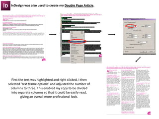
1. InDesign was also used to create my Double Page Article.
First the text was highlighted and right clicked. I then
selected ‘text frame options’ and adjusted the number of
columns to three. This enabled my copy to be divided
into separate columns so that it could be easily read,
giving an overall more professional look.
2. 7. Looking back at your preliminary task, what
do you feel you have learnt in the progression
from it to the full product?
3. Since my preliminary task I have learned a lot more about magazines in order to create a more effective,
realistic final product.
The Masthead font and logo are more
effective as they convey to the pop
genre.
Tag Line
Flash
Cover Lines are more effective with
the variety of fonts. Supporting images
also make it more visually appealing.
The main Image works better on a plain
white background. The clothes she’s
wearing also anchor with the colour
scheme used throughout.
It’s now easier to recognise which
one is the Main Cover Line with the
use of a block colour background.
Bar Code is more realistic with the
date, price and issue number all in
one place instead of spread across
the page.
Footer stands out more on a bright
background.
4. The heading font on the banner
continues from the front cover.
The date Line is smaller and more
discrete as it shouldn’t the be focus of
attention on the banner.
I have made better use of the rule of
thirds, with my main image located
on the left hand side.
The simple patterned boarder
around sub sections is more visually
appealing than block colour
backgrounds.
Cutting out the supporting images instead
of leaving a busy background creates a
much more realistic looking product.
The flash is much more effective and eye catching in
yellow. The drop shadow also gives it more of a 3D
effect.
5. Unlike my preliminary task I have also created a double page article.
When constructing this in InDesign I learned new techniques and effects in order to create a more professional
looking product.
Putting the text into columns is one of the features which I think worked particularly well as the interview is now
clearly spaced out and easy to read.
Also, in my preliminary task I didn’t include page numbers, this was was a necessity and they have now been
featured on every page.
6. I asked 10 people:
‘In what way is my music magazine better than my preliminary task?’
This is some of the feedback I got.
‘The image on the cover is a lot more effective, it looks so much more professional with a plain background’
‘The cover lines stand out more and are a lot easier to read’
‘The variety of bright colours are much more eye catching’
‘The contents has a more professional look now, the bold background colours didn’t work so well on
the preliminary task’
‘The cut out images are more effective now that they’re fitted in and around the text instead of just
in a square’
‘Even though you didn’t do an article for the preliminary task, the music one looks really good. The
colour scheme has been consistent throughout, it looks very professional’
‘I really like the main image for the article, it works well linking with the content of the interview’