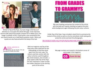
1. My main heading summarises the content of the article
with the bold serif capitals standing out against the plain
white background; again following the pink colour scheme.
Similar to Top of the Pops, my main image is the focus of
attention as it occupies the whole left page. In the interview
Arianna talks about how people compare her to Miley Cyrus; the Unlike Top of the Pops I have included a stand first to summarise the
image is symbolic of this. A pull quote is also anchored to this content of the article as well as a by line and photo credit stating who
and clearly stands out in bold black quotation marks. Other pull wrote the article and took the photographs.
quotes are also featured within the body of the text.
Both my magazine and Top of the
Pops have used a bold font for the
subheadings so that they stand My page numbers are located in the bottom corner of
apart from the main copy. The every page in the magazine.
colours used also anchor with the
colour schemes used throughout.
My article however, also includes a
drop capital unlike Top of the Pops.
This was important in order to draw
the readers attention to the starting
point of the article.
2. I asked a sample of 10 people from my target audience:
‘How realistic is my music magazine compared to a real media product?’
All of the people asked scored it 7 or more.
Number of people
Score out of 10
3. 2. How does your media product represent
particular social groups?
4. Ethnicity
My front cover shows a limited range of ethnicities as all of the images featured are of white people.
Despite this, I do mention artists of other ethnicities on both my cover and contents page
E.g. Rihanna and Nicki Minaj.
http://www.youtube.com/watch?v=tg00YEETFzg http://www.youtube.com/watch?v=4JipHEz53sU&feature=fvst