
Recommended
More Related Content
What's hot
What's hot (19)
Viewers also liked
Viewers also liked (20)
Similar to Frank Turner Album Packaging SEO
Similar to Frank Turner Album Packaging SEO (20)
More from lilywilkinson
More from lilywilkinson (20)
Frank Turner Album Packaging SEO
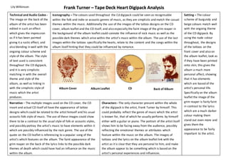
- 1. Frank Turner – Tape Deck Heart Digipack Analysis Iconography – The colours used throughout the Cd digipack could be seen as recognisable within the folk and indie or acoustic genres of music, as they are simplistic and match the casual themes within the music. Additionally the use of the images of the tattoo designs on the CD cover, album leaflet and the CD itself, and also especially the faint image of the grim reaper in the background of the album leaflet could connote the influence of rock music as well as the possible dark themes which arise within the artist’s music within the album. The use of the last images within the tattoos specifically the hearts, relate to the content and the songs within the album itself hinting that they could be influenced by romance. Album Cover Album Leaflet CD Back of Album Characters - The only character present within the whole of the digipack is the artist, Frank Turner by himself. This could probably reflect the genre of music which the artist is known for, that of which he usually performs by himself either with a guitar or piano. The portrait of the artist itself shows him to be facing away from the audience, possibly reflecting the emotional themes or attributes which feature within the music on the album. The images of tattoos and the lyrics on the album leaflet link with the artist as it is clear that they are personal to him, and make the album appear to be something which is based on the artist’s personal experiences and influences. Lily Wilkinson Technical and Audio Codes - The image on the back of the album of the artist has been edited in such an effect which gives the impression as if it has been painted giving it a rustic effect, and also blending in well with the ongoing colour scheme and style of the album. The style of text used is consistent throughout the CD digipack, and it is very simplistic matching in with the overall theme and style of the album, as well as linking in with the simplistic style of music which the artist produces. Setting – The colour scheme of burgundy and beige colours match well with the ongoing theme of the CD digipack. By using the nude colour throughout, the designs of the tattoos on the front cover and also on the album leaflet, look as if they have been printed onto skin, this gives the album a much more personal affect, showing that it has elements which are based of the artist’s personal life. Specifically on the album leaflet the image of the grim reaper is fairly faint in contrast to the lyrics which are a much darker colour making them stand out even more and gives them the appearance to be fairly important to the artist. Narrative – The multiple images used on the CD cover, the CD insert and actual CD itself all have the appearance of tattoo designs which could be related to the artist himself and his usual acoustic folk style of music. The use of these images could show there to be a contrast to the usual style of folk or acoustic styles, and possibly portray the artist’s music to have elements within it which are possibly influenced by the rock genre. The use of the quote on the CD leaflet is referencing to a popular song of the artist’s which features on the album. The faint appearance of the grim reaper on the back of the lyrics links to the possible dark themes of death which could have had an influence on the music within the album.