
Recommended
More Related Content
What's hot
What's hot (20)
Viewers also liked
Similar to Cheryl: Digipak Analysis
Similar to Cheryl: Digipak Analysis (20)
More from LewisSaunderson
More from LewisSaunderson (20)
Recently uploaded
Recently uploaded (20)
Cheryl: Digipak Analysis
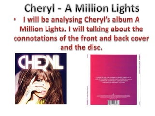
- 2. Overall the album looks very vibrant and cutting-edge which is what dance music is. As this album is very dance-orientated for this album. Her lead single Call My Name was a dance single and reached #1 in the UK. Her name Cheryl is the only text on the album with the name of the album not being mentioned. This shows that the artist is more important than the title. As this is her first album just Cheryl rather than Cheryl Cole it makes it clear she’s ditched her old last name. The font is very bright and looks lit up which connotes that album’s name of A Million Lights. The font is sans serif which gives the connation's of being modern and cutting edge. The album is also in colour, the background is a dark bluey/purple making Cheryl stand out as she’s wearing vibrant yellow and her skin looks glowing making her looking feminine as well. Her is long and down showing her feminine side which contrast to the bold title. Her long hair also gives her sex appeal which links to Andrew Goodwin’s theory. It also matches her image as she’s known for her long hair in L'Oreal adverts. Her signature hand tattoo is also displayed on the album. This also matches her image as she’s also known for her tattoos. Her hand tattoo is the most known tattoo she has when this album was released.
- 3. The track list is in the centre of the back cover showing the importance of the songs. It’s also a common convention of the back of an album cover. The album name is on both sides of the of the back. This shows that the name of the album isn’t that important but more the songs are and the artist singing them. The album also has to have the record label copyrights and the brand image. It also has the barcode to buy the album. The back cover also has the official website for the artist, which is another convention for album back covers. It helps their audience connect to the artist in different ways. There is no image of the artist on the on the back cover. This is because the album has taken influence from dance genre which is very modern and minimalist and the back cover represents this with having little on it. The back cover is vibrant pink to purple. This gives connotations of energy which dance music is. It also aims for it’s target audience predominately females.
- 4. The brand name matches the album cover reminding the audience who’s album it is. It also shows the album flows between covers, disc and intertwines which each other. The album name is also on the disc, reminding what the album is called as it’s not on the front cover. Record label copyrights again on the disc which is a necessary convention on disc covers. The website is also on the disc giving more opportunities for the audience to see the artist’s official website is called. The disc colour matches the back cover of the album which again makes the album as a whole flow. Again there is no image for the artist which shows the minimalist of the album which represent modern dance music.