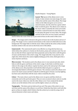
1. Charlie Simpson – Young Pilgrim
Layout- The layout of the album cover is very
simple, it only contains one main image, the name
of the artist and the name of the album. The image
relates to the folk/rock genre as it is set in a
natural location, also the artist has a guitar which
links in with the genre. The album cover relates to
the music videos created by the artist as he tends
to involve a natural location in each of his videos,
he also plays the guitar in every video. The images
and text on the cover are very central, and don’t
tend to follow the route of the eye as you seem to focus on the centre of the cover.
Image – The image used is relevant to the genre of music due to the location and use of
props. The image is set in a natural environment, in the centre of a field with trees in the
background. The image links in with the music videos made by the artist as they include
locations similar to the one seen on the front cover of the album.
Camerawork – The camerawork used is very effective as a long shot has been use,
which allows the audience to clearly see the location, props and costumes used. You can
also see that all of these aspects have been purposely used as they link in with the genre
of music and the theme of the artist’s songs. The image looks like it may also be a low
angle shot, which shows the camera slightly looking up at the artist, which gives him a
sense of power and focus.
Mise en scene – The location used in the album cover is very natural and calm, which
links in with the genre and theme of the artist’s songs. It also links in with the music
videos to the songs on the album. A guitar has been used as the main prop in the image
of the album cover, this prop link in well with the folk/rock genre as a guitar is
stereotypically linked in with this genre of music. The costumes used in the album cover
seem to be smart casual, and don’t really fit in with the genre of music. Low key lighting
has been used, which links with the music videos created by the artist.
Colour – The main colours used in the album cover are green and blue which are
commonly used in this particular genre. They are seen as natural colours and are usually
used in the music videos too. Like the other album cover I have analysed the darker
colours are at the bottom of the cover and the lighter colours are at the top.
Typography – The fonts used are both serif san serif. The name of the artist is in san
serif font and the name of the album is in serif font. I think that they link in well with this
genre as they are simple, which I believe that the artists try to create by using a lot of
natural elements in their music and videos.