FULL ENJOY - 9953040155 Call Girls in Shahdara | Delhi
Editied photo analysis
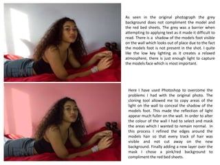
1. As seen in the original photograph the grey
background does not compliment the model and
the red bed sheets. The grey was a barrier when
attempting to applying text as it made it difficult to
read. There is a shadow of the models foot visible
on the wall which looks out of place due to the fact
the models foot is not present in the shot. I quite
like the low key lighting as it creates a relaxed
atmosphere, there is just enough light to capture
the models face which is most important.
Here I have used Photoshop to overcome the
problems I had with the original photo. The
cloning tool allowed me to copy areas of the
light on the wall to conceal the shadow of the
models foot. This made the reflection of light
appear much fuller on the wall. In order to alter
the colour of the wall I had to select and mask
the areas which I wanted to remain normal. In
this process I refined the edges around the
models hair so that every track of hair was
visible and not cut away on the new
background. Finally adding a new layer over the
mask I chose a pink/red background to
compliment the red bed sheets.
2. In the first photos taken on the bed setting the
brown knobs of the bed are visible at the end;
at first this did not appear to be a problem
however I decided to pull the sheet over in
order to make the shot look longer and so that
the model appeared to be on a large duvet.
Using the same Photoshop skills to edit the
first photographs I imitated the same
background onto this one. I prefer the models
pose in this image, there is also much more
light which allows you to see her face clearer.
3. In the original photograph the lighting prop is visible
in the top right hand corner, this makes the photo
look very unprofessional. The white wall is not very
eye catching due to white being a very bland colour,
this creates a very cold atmosphere.
In Adobe Photoshop I selected the area sounding
the model in order to keep this the same. Using
the masking tool I was able to overlay another
colour onto the background, I chose the colour
pink matching the back cover of my digipak, it
increases the warmth in the photograph and also
makes the model appear somewhere else rather
than in the school studio.