1. Lauren Barrett
A2 Photography
Unit 3: Contrasts
Connecting Essay 2:
‘Purple Dahlia’ by Flickr Member Jean McKenna
‘High Contrast Purple Flower Experiment’ from my Fine Art shoot.
Purple Dahlia by Jean McKenna is an interesting take on the use of strong purple
hues and tones in the world of high-definition macro photography. The use of
strong studio lighting creates an intense contrast in the deepest of shadows in
the background with the beautifully reflective highlights in the center of the
flower. By using a bigger flower for the composition of the photo, Jean creates a
beautiful repetitive pattern in the flower of purple and pink hues. I believe Jean
has used a HDR technique with this image to create an intense contrast of colour
throughout the colour, and the darker background contrasts with the idea that
the flower represents love and peace, whilst the darkness symbolizes
something sinister and evil. There is also arguably contrast in the size of the
petals, as they start off small and intricate in the center of the flower, whilst they
grow bigger and bigger the further spread-out they become at the edges.
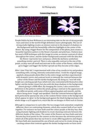
After I shot ‘Fine Art’, I experimented with a few of my results to try and produce
something with a strong, intensely contrasted colour. I took the original image,
applied a deep purple photo filter to the entire image and then experimented
with dramatic curves and contrast levels to intensify the contrast between the
colour of the flower and the darker background. By doing so, I was left with
bright eye-catching purple hues which not only contrasted with themselves (the
lighter and the darker tones) but also with the deep shadows in the background,
almost giving it a HDR effect. By changing the curves, I also created more
definition in the patterns within the petals, giving a contrast in the appearance of
the different petals, with some of them appearing plain and smooth, and the
others being more ‘rough’ and speckled. I find the contrast between light and
dark particularly spectacular also as the random flower stems in the background
which appear to ‘glow’ in the background against the black background gives the
whole image a sci-fi appeal to it, much like the set designs in films such as Avatar.
Although in comparison to each other the two images look somewhat completely
different, there are contrasting elements, which also connect both of our work
together. For instance we have both used the colour purple as the key hue, then
using dramatic lighting and shadows to create stunning contrasts between the
different shades of the colour. The center of the flowers we have both used also
become key focal points for the viewers as this becomes the attraction point at
which all of the petals then fan out from to create differing patterns and shapes.
We have both also maximized the use of levels and curves to create strong, eyecatching colours that contrast against the darker backgrounds we have used.