1. Lauren Barrett
A2 Photography
Unit 3: Contrasts
Connecting Essay 1:
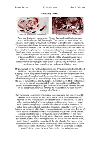
‘Bloody Rose’ by Deviant Artist Nicolas Raymond.
‘My Bloody Valentine’ My 10th Personal Shoot.
American DeviantArt photographer Nicolas Raymond specifies in plenty of
Macro and Landscape HDR photography. The contrast in colour within this
image is so strong and vivid, which really draws in the attention of any viewer.
The dark hues of the liquid drops seriously help to stand out against the softness
in the colour of the rose itself. I am also particularly drawn to the contrast in the
theme itself of the photo, where the rose symbolizes love, hope, purity, whilst the
blood symbolizes something much more sinister. The photograph could also be
read as contrasting human civilization and nature – where when someone dies
or is injured, blood is usually the sign to show this, whereas flowers simply
wither, so it in a sense gives the flower a human characteristic too. The
composition and cropping of Nicolas’ photo is particularly effective as it allows
the viewer to focus on nothing but the flower within the frame.
My photograph on the right was taken from my 10th personal shoot which I titled
‘My Bloody Valentine’. I used fake blood and fishing wire as my main props,
hanging a whole bouquet of flowers upside down on the wire to symbolize death.
Then using the blood, I dripped them across the hanging flowers to suggest the
idea that they symbolized human-beings being sentenced to death, contrasting
the idea of human life and society. I applied a de-saturated red filter to the image
to give the overall photo a much drearier, mournful tone and I kept the
composition of the image quite open to include other flowers from the bouquet
in the background, to further enhance the contrast to show ‘dead’ flowers
amongst ‘alive’ flowers.
There are many connections between my photograph and that photographed by
Nicolas. The main contrast which I am pleased about is the general theme
between life and death, and also the idea of human life and nature. The use of
colour and tone in both of our work is essential in creating the correct mood
which presents the gloomy, mournful idea of death, which is reflected in the
actual composition of each image also. Both of our images have only worked
because we both used white flowers – no matter what type they were. The use of
white flowers creates the essential contrast in the colour of the blood, whilst it
also represents the idea of purity and elegance, whilst the deep red blood
symbolizes anger and pain. Similarly, either of us could have used, for example,
red flowers, but this would have symbolized the idea of love and passion more,
which doesn’t completely contrast with the idea of death. The redness of the
blood would have also had to have been changed dramatically in order to create
that visual contrast, otherwise, it wouldn’t have been visible and therefore
wouldn’t have created the ‘dead flower’ effect that we both wanted.