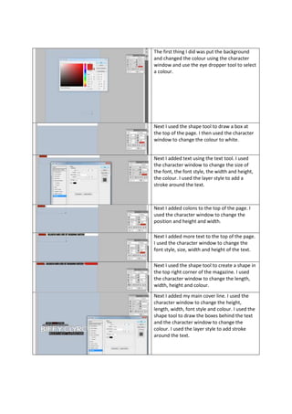
1. The first thing I did was put the background
and changed the colour using the character
window and use the eye dropper tool to select
a colour.
Next I used the shape tool to draw a box at
the top of the page. I then used the character
window to change the colour to white.
Next I added text using the text tool. I used
the character window to change the size of
the font, the font style, the width and height,
the colour. I used the layer style to add a
stroke around the text.
Next I added colons to the top of the page. I
used the character window to change the
position and height and width.
Next I added more text to the top of the page.
I used the character window to change the
font style, size, width and height of the text.
Next I used the shape tool to create a shape in
the top right corner of the magazine. I used
the character window to change the length,
width, height and colour.
Next I added my main cover line. I used the
character window to change the height,
length, width, font style and colour. I used the
shape tool to draw the boxes behind the text
and the character window to change the
colour. I used the layer style to add stroke
around the text.
2. Next I added the main image. I did this by
taking a picture of these three boys. I then on
Photoshop got rid of the background and split
each one apart so I could adjust the lining of
all three of them.
Next I added this text. First using the character
window I found text most similar to the one
on the original magazine. I added each bit of
text on a separate layer so I can move it about.
Again with the character window I changed
the colour of the text.
Next I added the colour boxes behind the text.
I used the box tool to draw boxes. Each box is
on a separate layer so I could move them
behind the text. I then double clicked on the
layer and changed the colour matching the
original magazine.
3. Next I added this text and thumbnails. First I
wrote “poster special” and “30 seconds to
mars” on separate layers so I could move
them and using the character window add
stroke to “30 seconds to mars”. I then added
the thumbnails. Then using the box tool I
added a red box behind the thumbnails to
make it look as though it has a red border.
Next I got a thumbnail of a barcode from the
internet. I then placed it on my magazine
rotating it making it look similar to the original
magazine.
Next I got a thumbnail of Biffy Clyro album
cover. Then I double clicked on that layer and
added a stroke giving it a white border.
4. Next I got a thumbnail of Bring me the
horizon. I then double clicked on the layer and
added a stroke giving it a white border. Then I
wrote each bit of text on separate layers. This
is so I can move them and change the size and
font using the character window. Then I added
a black box using the box tool behind the text.
I then added a stroke to the box giving it a
white background.
Next I added a star shape to use as a puff.
Then I added the text inside the puff. Using
the character window I changed the font and
colour to match the original magazine.