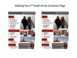
2. For my second draft I added the name of the artist/page to the image as well as the page
number so that it is more clear to the reader who is in the image and what the page is going
to be about. I did this using the horizontal type tool to add extra text.
3. Next I added borders to my images using the line tool to get straight lines. The reason why
I decided to create my borders using the line tool is because I thought that I would be able
to move each individual line where I wanted, meaning that I could easily edit my images
for future preference. However when I did this the lines were very thin so I double clicked
on the layer for the line, clicked on stroke and set the size to 1 to make it a bit thicker and
more visible.
4. After I did this I thought that the white boxes and text on my images didn’t stand out as
much so I used the same method as before and placed borders around the white boxes. I
think that this makes them stand out a lot more and makes it look much more effective.