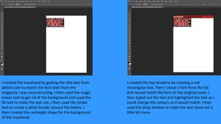
1. I created the masthead by getting the title text from
dafont.com to match the font style from the
magazine I was reconstructing. I then used the magic
eraser tool to get rid of the background and used the
fill tool to make the text red. I then used the stroke
tool to create a white border around the letters. I
then created the rectangle shape for the background
of the masthead.
I created the top strapline by creating a red
rectangular box. Then I chose a font from the list
that would match the font on the original cover. I
then typed out the text and highlighted the text so I
could change the colours so it would match. I then
used the drop shadow to make the text stand out a
little bit more.
2. I created the bottom strapline by creating a black
rectangular box. I then made two separate text
boxes, one for the large text and one for the smaller
text. I typed out the text and then I had to highlight
the “/”s because they were in yellow unlike the rest
of the text. Then I used the drop shadow tool to
make the text stand out a little more.
I created the slogan by creating a black rectangular
box and typing the text in. I then changed the colour
to white to match the original magazine cover.
3. I created the boxes on the side by making several
different shapes and then using the fill tool to make
them the same colours that they are on the original
cover.
I created the v festival notice by using the paintbrush
tool to create the same type of shape and to have
the distorted edge to it. I then got the V Festival logo
from the internet and erased the background so it
would go on the space. I then used the text tool to
make the headline and highlighted the text to make
it different colours.
4. I created the main image by taking 3 separate
photos of people who looked slightly like the people
on the front cover of the original. I then used the
magnetic lasso tool to cut them out from the
background. I then used the levels and brightness
and contrast tools to make the photo more
prominent and bold on the page.
I created the headline by using text from dafont.com
again and putting each separate piece onto the
image. I used the stroke and drop shadow tools to
make the text stand out more and to make it more
bold.
5. I created the rest of the headline by creating a white
rectangle shape. I typed out the text that was on the
original image then changed the font to match the
one on the original image then I changed the colour
to red so it matched.
I created the sell lines on the side by finding images
that looked similar to the ones on the cover of the
original cover. I then put a white stroke around them
all. I changed the font and the text colour so it would
match the text on the original front cover.