
Recommended
Recommended
More Related Content
What's hot
What's hot (19)
Viewers also liked
Similar to Focus Group Analysis
Similar to Focus Group Analysis (20)
More from kirstyharragan2
More from kirstyharragan2 (20)
Recently uploaded
Recently uploaded (20)
Focus Group Analysis
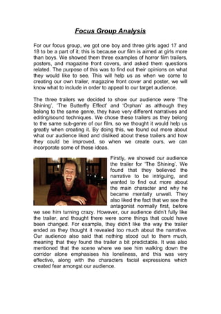
- 1. Focus Group Analysis For our focus group, we got one boy and three girls aged 17 and 18 to be a part of it; this is because our film is aimed at girls more than boys. We showed them three examples of horror film trailers, posters, and magazine front covers, and asked them questions related. The purpose of this was to find out their opinions on what they would like to see. This will help us as when we come to creating our own trailer, magazine front cover and poster, we will know what to include in order to appeal to our target audience. The three trailers we decided to show our audience were ‘The Shining’, ‘The Butterfly Effect’ and ‘Orphan’ as although they belong to the same genre, they have very different narratives and editing/sound techniques. We chose these trailers as they belong to the same sub-genre of our film, so we thought it would help us greatly when creating it. By doing this, we found out more about what our audience liked and disliked about these trailers and how they could be improved, so when we create ours, we can incorporate some of these ideas. Firstly, we showed our audience the trailer for ‘The Shining’. We found that they believed the narrative to be intriguing, and wanted to find out more about the main character and why he became mentally unwell. They also liked the fact that we see the antagonist normally first, before we see him turning crazy. However, our audience didn’t fully like the trailer, and thought there were some things that could have been changed. For example, they didn’t like the way the trailer ended as they thought it revealed too much about the narrative. Our audience also said that nothing stood out to them much, meaning that they found the trailer a bit predictable. It was also mentioned that the scene where we see him walking down the corridor alone emphasises his loneliness, and this was very effective, along with the characters facial expressions which created fear amongst our audience.
- 2. Next, we showed our target audience the trailer for ‘The Butterfly Effect’. We found out that our audience didn’t perceive this to be a typical horror film as there were different narratives introduced into the trailer, for example, a romance; our audience liked this as they believed it to be different, meaning they were interested in watching the film. The emphasis on the psychological aspect of the film made them feel like they personally knew the main character, meaning they could emphasis with him. Generally, our target audience liked the fact that this film was different, and they enjoyed the use of flashbacks in this trailer. However, they did say that some of the dialogue hinted too much to the ending of the film, and that the music didn’t fit in with the film. The audience said they would make the trailer seem more dramatic if they could change one thing. The editing and effects did stand out to our target audience, and they believed the straps to be very effective. We also showed our target audience representatives the trailer for ‘Orphan’. They liked the fact that there was a build up from the beginning to the end that built suspense and made them feel more intrigued about the movie. They also liked the fact that they got to see the change in the character as the trailer went on, similar to results from the last two trailers. The fact that a child was used in this film was liked by our audiences, as they believed it to be different and scarier. However, as seen from the last two trailers, some of our audience believed that too much of the narrative was revealed. In regards to the sting at the end of this trailer, our audience believed it both to be effective, or too predictable. By analysing these results, we found that in order to make our trailer successful, we need to include the transition of our character from normal to crazy, and ensure that we don’t reveal too much
- 3. about our narrative as this could put audiences off watching the film. The majority of our target audience liked the ‘Orphan’ trailer the most, and that it was the most persuading to get them to go and watch the film because they believed the narrative was unexpected and the use of a child antagonist was well received. After showing these trailers, we asked our audiences ‘what would you like to see in our horror film trailer’ and we found that they would like too see quick cuts and jump scares along with unpredictability, tension building music, and a focus on the main protagonist. We also showed our audience some film posters in order to find out more about how we should present our poster and what they’d like to see. We chose to use posters within the psychological horror sub-genre, as this is the sub-genre we will be creating our own piece on. We chose to use three very different film posters in order to find out what our audience liked and disliked about each one. The first poster we showed our target audience was the poster to the right promoting ‘The Awakening’. We decided to show this poster as it included a location as the background, the actor’s names, and a review, therefore making it a bit different to the other posters we showed them. When looking at this poster, our audience liked the fact that they could feel a sense of darkness because of the trees curling in, and the fact that she is covering herself made the audience feel as if she had a secret that they wanted to find out. They also noted that the trees look as if they’re moving away from her, which makes it seem more isolated and lonely. However, they agreed that the image used too much black and white, meaning it wouldn’t stand out too them. When reading the title of the film, our target audience said that this title would persuade them to watch the film in order to find out who/what is being awakened. Another poster we decided to show our audience was the poster for ‘Repulsion’. We decided to use this poster as it is very plain and simple, with a small image in the arm of a person, and reveals
- 4. nothing but the name of the film. Our audience liked the fact that the image was unique and interesting, and agreed that the black and white contrasted well with each other. However, they believed the poster to be too plain and thought that there should have been much more information on it. Because not much is revealed through this poster, audiences believed the mystery of it would make them want to watch the film as it made them wonder what the arm is doing. Also, by not showing the antagonist, a sense of excitement and horror is created because they don’t know what to expect in the movie. The poster for ‘Orphan’ was also showed to our target audience in this focus group. We decided to show them this poster as it is a more conventional poster for the sub-genre of psychological horror, and revealed an image of a girl making eye contact with them. Our focus group responded to this poster saying that they thought it was the scariest compared to the others, and they thought that the eye contact was very effective. Also, they liked that the tagline makes you want to find out what is wrong with Esther, but they don’t like the lighting that is used brightly on her face. The main image was well liked because it is simple and makes her look evil, as it’s just a picture of the antagonist so you can focus more on her and find out more about her story. The name ‘Orphan’ was also believed to be effective because the audience won’t know anything about her or what she’s capable of.
- 5. Overall, the majority of our representatives liked the poster for ‘The Awakening’ most because it hinted at the narrative and was most interesting to them. When creating our own poster, the audience said they would like us to have an eye-catching main image with the antagonist on the front along with an interesting film title and a mysterious background to leave the audience guessing. In our film poster, we have decided to make it more ambiguous as it will produce the most beneficial response from our target audience. For the magazine section of our focus group, we showed our audience three front covers from different magazines. We choose these front covers as they are all promoting films within the horror genre. We chose to show our audience this magazine front cover as we are thinking to create a general movie magazine featuring a horror movie. By finding out what our target audience like and dislike about this magazine, it will help us in the creation of our own. When we showed our audience this front cover, the immediate response was that the red stood out and linked well with the theme of flames on the masthead and the character ‘Hellboy’. The audience also believed that the name empire was effective, and that the black and red colour theme was strong and effective. However, some of them thought that there was too much writing which caused the cover too lose its effect, and that the flames were too distracting. On the other hand, some of our focus group said that they didn’t dislike anything about the front cover of this magazine. When asking about our own horror movie, we got mixed results as some said that we should make a general movie magazine in order to draw in a wider audience, but some said to make it a horror film magazine. The next magazine we showed our audience was for ‘Fangoria’, a magazine that promotes horror films. We decided to show our
- 6. audience this film magazine to find out what their opinions on the layout and image were. Our audience instantly thought that the font on the masthead was effective and very unique, and that the name ‘Fangoria’ links in well with ideas of vampires and horror. The main image of the antagonist scared the audience, meaning that it was effective. However, some said that the masthead looked tacky and unprofessional. We also found that showing the antagonist on the front cover gives a clear indication on the film, but could be revealing too much as the audience already know what the horror is. Some people in our focus group believed that by putting feature article photographs on the front cover, it slightly took the attention away from the main image; however others believed that it could attract more readers from fans who are interested in those films. This is the third magazine front cover we decided to show our audience. We chose this magazine as it is different to the others in the effect that it doesn’t use direct address, and contains a disturbing image. Our target audience answered that although the image is strange; it was effective in scaring them. In terms of direct address, our focus group participants said that they would rather have seen the character making eye contact as it feels more personal and ask if they’re asking you for help. They also said that the main image drew them in so you want to find out what is happening to the character, and why he is in that situation. Our target audience believed that the text on the front
- 7. cover is too small and they couldn’t read it, although the colours used were effective and contrasted well with each other. Another dislike about this poster was the layout, as the audience thought it wasn’t typical of a magazine front cover. Overall, the majority of our target audience preferred the ‘Virus’ magazine front cover because although the text was small, the image was more dangerous and creepy, persuading them to go and watch the film. By asking our target audience what they’d like to see on our film magazine front cover, they agreed that they would like the character in the main image to give direct address, and to include colours that will contrast well together. They also said that the ‘Fangoria’ magazine would be the one to persuade them the most to watch the film promoted as the main image is attention-grabbing. Generally, from this feedback we have gained a better insight into what attracts our audience to different pieces of media, and what we should include on our pieces in order to make them effective in luring in the target audience. This research has been very effective in also telling us what we should avoid doing on our pieces and how we can be successful in promoting our film to our target audience. By completing this focus group, we have found existing media texts in which we can use as inspirations for our pieces. I have learnt that we need to ensure our trailer focuses most on the protagonist and allows the audience to get to know her and why she has become mentally damaged. I have also learnt that on our poster, we should include something that will leave the audience wanting to find out more, e.g. a tagline. For our magazine front cover, I have learnt that it will be more effective to have the main image drawing the audience in through the use of eye contact, and adding sell-lines around the side. This piece of target audience research has been beneficial for us as we know what to include, and it has helped us to make important decisions on our practical pieces.