
Recommended
More Related Content
What's hot
What's hot (20)
Viewers also liked
Viewers also liked (20)
Similar to Comparing First Magazine Cover Design to Final Improved Version
Similar to Comparing First Magazine Cover Design to Final Improved Version (20)
More from joeeroper
More from joeeroper (20)
Recently uploaded
Recently uploaded (20)
Comparing First Magazine Cover Design to Final Improved Version
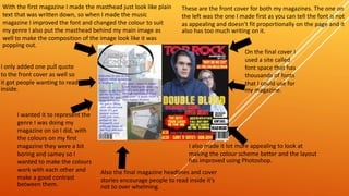
- 1. These are the front cover for both my magazines. The one on the left was the one I made first as you can tell the font is not as appealing and doesn’t fit proportionally on the page and it also has too much writing on it. On the final cover I used a site called font space that has thousands of fonts that I could use for my magazine. I also made it lot more appealing to look at making the colour scheme better and the layout has improved using Photoshop. Also the final magazine headlines and cover stories encourage people to read inside it’s not to over whelming. I wanted it to represent the genre I was doing my magazine on so I did, with the colours on my first magazine they were a bit boring and samey so I wanted to make the colours work with each other and make a good contrast between them. I only added one pull quote to the front cover as well so it got people wanting to read inside. With the first magazine I made the masthead just look like plain text that was written down, so when I made the music magazine I improved the font and changed the colour to suit my genre I also put the masthead behind my main image as well to make the composition of the image look like it was popping out.