
Recommended
More Related Content
What's hot
What's hot (20)
Viewers also liked
Viewers also liked (19)
Similar to Font Research
Similar to Font Research (20)
More from jkfernandes17
More from jkfernandes17 (20)
Recently uploaded
Recently uploaded (20)
Font Research
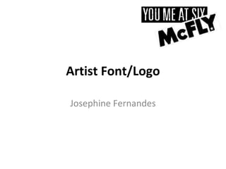
- 1. Artist Font/Logo Josephine Fernandes
- 2. Artist font/logo An artists distinct ‘font’ or logo is part of their own branding and essentially provides recognition for their fans. From researching fonts and logos of artists of generally the same genre as my song, I found various trends in colors, type and effects. I focused on the fonts of, You Me At Six, a British rock band and James Morrison and Ed Sheeran, who are both English singer-songwriters often releasing acoustic tracks of the pop-rock genre. Each logo is simple and the font can be classed as sans serif. The block lettering and simplicity makes direct reference to the genre of rock which is known to be quite blunt and to the point. A key similarity between these selected logos are the effects used on the font. When looking closely at them, each font has some sort of erosion to various letters. This identifies a common trend amongst pop-rock branding. The right colour choices are essential in an artists logo as they convey particular emotions and impressions to the consumer about the artist or band. These logos use quite earthy colours, such as brown, green and black. In comparison to artists of the pop genre, for example Katy Perry, who uses an electric blue and pink in her logo, conveys quite happy and preppy themes to be expected from her music, where as earthy colours convey the idea of quite passionate themes to the songs they produce.
- 3. Artist font/logo Text: Rounded edges, bubble writing, free flowing. Colours: Bright, representative of the possible target market (preppy colours, eye-catching) Font: Sans serif, simple but effective for the genre. Colours: earthy and pastel colours, use of black and white. Design: Simple designs, quite contemporary through the idea of simple yet smart designs – reflective of the 21 st century.
- 4. Artist font/logo I chose the ‘You Are Loved’ font, as I liked the moderate erosion, and how the style was still sans serif however also had rounded edges which gives it more of a quirky feel.