1. How effective is the combination of your main product with
ancillary texts?
When considering ancillary texts in relation to our main product, the music
video, I decided it was important to try and create some sort of brand image,
while still complying with feedback from the audience in reference to design. It
is important to create a brand image and have intertextuality between the
products to ensure the audience recognise the products as being related to the
band. I looked at the advert for The Best Of The Vines as an example:
The strong link between these two products help create a brand image and
instantly let the audience know that the advert is promoting the CD.
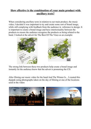
After filming our music video for the band And The Winner Is... I created this
digipak using photographs taken on the day of filming at one of the locations
used in the video:
2. I intended to use this design to create a recognisable link to the band's video for
the song Here Again and therefore some sort of brand image. However, I then
came up with this design using a doodle style 'bored at school' theme:
And in the audience feedback, members of the target audience gave a more
positive response to the doodle style design and some thought that they could
really relate to, so I decided to use it instead as I thought that it was important
to adhere to the demands of the audience.
When creating the digipak advertisment, I tried
to create intertextuality and a cohesive brand
image for the audience to recognise. I did this by
using the image of the digipak on the advert. I
decided not to use the doodles from the digipak
on the design of the advert as I wanted to use
different styles to show the band's many sides.
With the picture of the bear eating records I was
trying to show the importance of the music to the
band and how they need to “consume” it to
survive. The band can be quite serious when
rehearsing and performing, but they also know
how to enjoy themselves – the day of filming the video with the band was really
good fun and I wanted to be able to put this across with the doodles on the
digipak, which I feel relate to messing around in lessons at school. This also
relates to the target audience for the band. So I decided that the best way to
create a brand image, but still retaining the different aspects of the band's
personalities was to include the image of the digipak on the advert.
Another way in which I created intertextuality between the advert and digipak
was by using the same font on both ( N o t h i n g Y o u C o u l d S a y ) . This has the
effect of strengthening the already apparent link between the two products.