1. Image
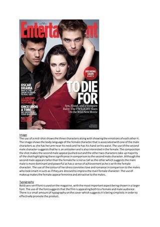
The use of a mid-shotshowsthe three charactersalongwithshowingthe emotionsof eachotherit.
The image showsthe bodylanguage of the female characterthat isassociatedwithone of the male
characters as she has herarm near hisneckand he has his hand onhiswaist.The use of the second
male character suggeststhathe is an onlookerandisalsointerestedinthe female.The composition
the shot makesthe secondmale appearpushedoutandthe othertwo characterstake upmajority
of the shothighlightingthere significance incomparisontothe secondmale character.Althoughthe
secondmale appearstallerthanthe female he isnotas tall as the otherwhichsuggeststhe main
male ismore dominantandpowerful ashasa sense of achievementashe iswiththe female
character. The use of the colourof herdressconnoteslove andromance incomparisontothe males
wholooksmart insuitsas if theyare dressedtoimpressthe mainfemale character.The use of
makeupmakesthe female appearfeminineandattractive tothe males.
Typography
Boldsans serif fontisusedonthe magazine,withthe mostimportantaspectbeingshowninalarger
font.The use of the fontsuggeststhat the filmisappealingbothtoa female andmale audience.
There isa small amountof typographyonthe cover whichsuggestsitisbeingsimplisticinorderto
effectivelypromote the product.
2. Colour
The main colourtheme onthe coveris red,blackand white.Thisconnotesasense of mysteryalong
withsignifyinglove andromance. The fontappearsmainlyinwhite whichiseffectiveasitappears
boldon a darkerbackground.The contrast of coloursmeansthe most importantaspectstothe
advertisementstandouttothe audience.The magazine titlesappearinaboldred behindthe image
whichemphasisesthe importance of the filmasthe charactersand more clearlypresentedthatthe
well-knownname of the magazine.
Layout
Route of the eye effectivelycapturesthe title of the magazine inthe primaryoptical area.Thisis
effectiveas the magazine will be generallywell knownbyitsuse of fontandcolourand therefore it
audience will seethe filmadvertisement whenbuyingthe magazine.The middle of the route of the
eye drawsthe audience tothe image inthe middle,mainlytothe femalecharacterwhichsuggests
she isthe mainelementtothe film. The terminalareadoesnotas accuratelycapture the textwithin
the cover.Insteadinfocusesonthe leftthirdat the bottomwhere textonotherissueswithinthe
magazinesispresent.The layoutiseffective howeverasitmainlyfocusesonthe filminsteadof
otheraspectsof the film.
Language and conventions
The use of the pun ‘TO DIE FOR’is effective towardsthe targetaudiencewhomayhave seen
previousfilmsorwatchedthe trailerandare aware of the storyline.The capitalisationof twilight
underthishighlightsthe importance of the filmandhow itneedstobe recognisedalsobythe target
audience of the magazine if theyhave notyetseenthe films.Thisisconventionalas itattemptsto
create brand awarenesswithitsalreadyestablishedaudience andalsoattemptstoappeal tothe
audience of the magazine.The image isconventional asthe shottype andcompositionsallowsthe
audience tointerpretthe type of genre andconceptsthatmay be included. The magazine name
‘entertainment’isalsoeffective asitsuggeststhatthe magazine will containinformationof
entertainmentforspecifictargetaudiences.Therefore generallythe targetaudience of the magazine
to some extentmatcheswiththe demographicsof the filmsaudience.