Question 6 what have you learnt about technologies from the process of constr...
Longshot Image Analysis for Horror Film Poster
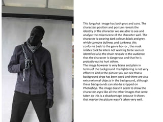
1. This longshot image has both pros and cons. The
characters position and posture reveals the
identity of the character we are able to see and
analyse the misenscene of the character well. The
character is wearing dark colours black and grey
which connote dullness and darkness this
conforms back to the genre horror , the mask
relates back to killers not wanting to be seen or
identified also the chain reveals to the audience
that the character is dangerous and that he is
probably out to hurt others.
The image however is very blank and plain in
terms of the background the lightening is not very
effective and in the picture you can see that a
background drop has been used and there are also
extra external objects in the background, although
these backgrounds can also be cropped on
Photoshop. The image doesn’t seem to show the
characters eyes like all the other images that were
taken so this is a disadvantage because it shows
that maybe the picture wasn’t taken very well.
2. I have chosen to use this image as my poster draft because of the effect and strong link it has with the genre of
my film which is slasher/ horror however I am contemplating on weather I should only use it as a draft or use it
for my poster . The red paint splash in the background is very effective because it represents the identity of the
character who is dangerous and also the genre of the film which is horror . The image it allows the audience to
make assumptions about what kind of character will be seen in the film ,this image is a one shot it makes the
character gain attention from the audience the character is also giving direct eye contact with the camera which
allows the audience to feel drawn in with the film and also it shows the facial expression behind the mask
which is serious .
3. The close up of this character reveals his identity from the misenscene we are able to see pain anger and
danger. The black mask connotes high status and boldness because the character is wearing a mask it may
create a sense of tension towards the audience - why is he wearing a mask ? Could he be hiding from
something ? What is wrong with his face ?. I would say that the lightning in the picture is slightly too bright to
be used for a horror film poster and the image doesn’t have such a big effect on the genre only the mask
gives out the genre of the film.
4. This image is very powerful and different it conforms to the genre of horror films the
misenescene in this picture has been captured very well : the chain unfolds how dangerous the
character maybe also the characters posture and facial impression looks very serious you can
tell from the eyes. The gate used expresses the idea that dangerous people should be kept
away from society. The colour black connotes boldness and darkness which relates back to the
character who has a dark past . However I don’t like this image because it would be very hard
to edit on Photoshop personally and I wouldn’t know how to make the image more bolder in
order to have a proper link with the genre .