1. Evaluation
Step by step: I used Photoshop to create my magazine
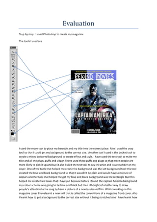
The tools I used are
I used the move tool to place my barcode and my title into the correct place. Also I used the crop
tool so that I could get my background to the correct size. Another tool I used is the bucket tool to
create a mixed coloured background to create effect and style. I have used the text tool to make my
title and all the plugs, puffs and slogan I have used these puffs and plugs so that more people are
more likely to pick it up and buy it also I used the text tool to say the price and issue number on my
cover. One of the tools that helped me create the background was the set background tool this tool
created the blue and black background so that it wouldn’t be plain and would have a mixture of
colours another tool that helped me get my blue and black background was the rectangle tool this
helped me create two boxes that I have put because before I found the captain America background
my colour scheme was going to be blue and black but then I thought of a better way to draw
people’s attention to the mag by have a picture of a newly released film. Whilst working on this
magazine cover I havelearnt a new skill that is called the conventions of a magazine front cover. Also
I learnt how to get a background to the correct size without it being stretched also I have learnt how
2. to give a title good effects such as stroke by using the blending options also I have learnt how to
make my poster suit the genre that I am doing by matching up the colours so that the background
looks as if it should be there.
Strengths: Weaknesses:
Colour scheme Add more plugs and puffs
Good main image Made background only one thing
Slogan is good
The puffs would draw attention
Plugs would draw attention
I am pleased with my cover because whilst creating it I have learnt lots of new skills. I think that my
cover is good because I haven’t covered it with information but I have given it a few plugs and puffs
to draw in the audience’s attention also I have put a well-known film cover on it so that more people
would be more likely to have a look I have used a slogan so that the audience know that there is
something good inside, these techniques would make people more likely to buy a magazine.
I think that this has followed the genre that I was trying to create because I was creating a movie
cover and everything on my cover is to do with films such as the title, plugs, puffs and my slogan.
Also the main thing that makes my cover look like a film mag is the background picture of captain
America because it is a new release and is well-known.
If I were to do this again I would add more puffs and plugs and also I would make the main image the
whole background instead of having only a little colour at the top like I have at the moment also I
would make sure that I have lots of attractive information so that the cover would stand out. Also I
would use brighter colours for my writing to that it would be easier to read and would stand out a
more.