
Recommended
More Related Content
What's hot
What's hot (20)
Viewers also liked
Viewers also liked (20)
Similar to Front cover screenshots
Similar to Front cover screenshots (20)
More from ellagart
More from ellagart (12)
Recently uploaded
Recently uploaded (20)
Front cover screenshots
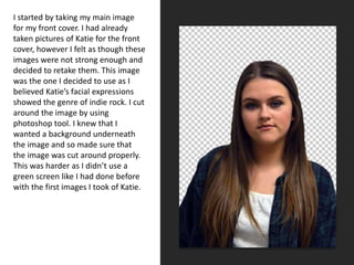
- 1. I started by taking my main image for my front cover. I had already taken pictures of Katie for the front cover, however I felt as though these images were not strong enough and decided to retake them. This image was the one I decided to use as I believed Katie’s facial expressions showed the genre of indie rock. I cut around the image by using photoshop tool. I knew that I wanted a background underneath the image and so made sure that the image was cut around properly. This was harder as I didn’t use a green screen like I had done before with the first images I took of Katie.
- 2. • Adding the background was very easy through using photoshop I was able to decide on a colour by using the results I obtained from the questionnaire that I handed out to peers and this allowed me to get an idea of a colour scheme suitable for the indie rock genre and I would also be able to use this colour scheme throughout my magazine. Grey, along with dark red, white and black showed up multiple times as being colours associated with the indie rock genre.
- 3. • My masthead was then added to the top of the front cover and I wanted the masthead to run completely from left to right. To create a real contrast and make the masthead stand out I used white against the dark grey background. I also added a drop shadow to emphasise the contrast and almost make the masthead become more unique. The idea of my masthead becoming a logo was helped by the font as I made sure the font was not used anywhere else on the front cover. Another idea I had to be aware of is making sure that Katie’s head did not cover the masthead in anyway as my magazine is clearly not a very well known or established brand as of yet.
- 4. • I then added the main coverline which was the artists name. I wanted to coordinate the colour scheme to what the artist was wearing so I added a navy blue colour to the colour scheme. This was also accompanied with the white and I hoped that this would make the coverline stand out and almost become a focus on the front cover, along with my masthead. The positioning of the main coverline was something that I struggled with, however I also wanted the positioning to help the coverline stand out so I made sure that the coverline was close to the main image to anchor it as well as positioning the two names in a unique way.
- 5. • Next I added the main subline which would give the reader a little insight to what the main article would be about. I used a puff to make the main subline stand out and this also was located close to the main image so that it could be anchored. The subline refers to what the article will be about and what people will find out about this article which is the main article featured on the cover.
- 6. • I then added the barcode which I was able to get from the internet. However I then added the date, price and issue number which are all codes and conventions of a professional music magazine. This involved making a white box around the barcode and then simply adding the text of the price, then the date which involves the month and year. Then I added the issue number and as this is the first issue of my magazine the issue number is 1.
- 7. • I then added a navy blue banner across the bottom of my front cover. This fitted in with my colour scheme and also enabled me to add the names of some popular indie bands. I was able to collect these names from the questionnaire that people filled out. This involved the question of what peoples favourite indie bands were. People gave a wide range of answers and I was able to see which of the following were the most popular and feature them on the front of my magazine and this would not only enable me to see what bands my target audience like but also which bands were the most popular.
- 8. • I then added a positioning statement. This is a common feature of a music magazine and is always placed above the masthead and is a sentence that sums up the genre of the magazine and almost sells it to the reader. My positioning statement mentions the word ‘best’ which I believe to sell the magazine to the target audience.
- 9. • Next I added the rest of my coverlines. Here I introduced more of the burnt orange colour which I believe is associated with the indie genre. This colour was not featured in the questionnaire that I gave out but I still think that it coordinates well with the navy blue, grey and white. Through analysing many professional music magazines I have seen that the introduction of a pop colour makes the magazine seem more professional.
- 10. • Finally I added the sublines which also fitted in with the colour scheme as I used white. Thos also created a contrast with the background as the white stood out from the dark grey. The sublines are only a line or two however I believe they give the reader a better insight to the reader about what each article will be about . Some of the sublines do go over the main image, however I don’t think that this affects the image or the sublines in anyway.