SlideShare a Scribd company logo
1 of 10
Evaluation: Question 1
In what ways does your media product use, develop or
challenge forms and conventions of real media products?
The production of my magazine cover inevitably had some form of inspiration behind it in
order to have something to aspire to. The magazine that I looked to as my main source of
inspiration was Total Film, the Spectre issue. There were a number of conventions that I felt I
could utilise and adapt to my own production.
A noticeable convention that I have followed is the masthead. As part of my research, I
noticed a trend with regards to the Total Film masthead and I wanted to take this on board in
order to achieve a product that appeared as professional as possible. The Total Film masthead
is always the largest item of text on the cover and is positioned towards the top of the
magazine, with room above for a skyline. Another convention that I have followed germane
to the masthead is the fact that it is behind the actor/character’s head. With the exception of
the Spectre magazine, positioned next to mine, Total Film magazine tends to have its
masthead behind the actor/character and I wanted to replicate this with my media product as
it draws more attention to the actor/character.
The masthead on the left has been taken from the Spectre magazine and the masthead on the
left is from my magazine. It is evident that my masthead has followed a similar layout to that
of the Spectre magazine, with regards to positioning, size and alignment. Also, the colour in
this instance is similar and it is intended to capture the reader’s attention mainly. Another,
convention that has been followed is the presence of a puff on the masthead, on the ‘M’ of
‘FILM’. Total Film magazine is known for having ‘The World’s Best Movie Reviews’ and
therefore this is presented as a pug on the masthead or sometimes other locations on the
cover.
Another convention that I have followed from Total Film magazine is the skyline. This is
reflected in the content of the skyline, the colour, the font and the positioning. With regards
to the positioning, the skyline that I have used follows a similar layout to the other skylines
pictured – there’s a suitable amount of space between the top of the magazine and the
masthead. In addition to this, the skyline matches the length of the masthead, which is evident
in all magazines, and this is important as it conveys a professional and organised layout.
The use of mise-en-scene on my magazine cover also follows conventions from other Total
Film magazines but challenges some at the same time. The majority of Total Film magazines
that I analysed have the actor/character positioned at the centre of the page with the use of a
mid-shot. My intention was to have more of the focus on the character’s face but still show
some of the costume so a medium close-up shot was used. The costume that the actor is
wearing is a smart blazer, jumper and shirt which is seen in the trailer when he is in police
interrogation. The film involves an interrogation scene where Ross is questioned about the
kidnapping incident and for this scene he is seen in a suit. This is therefore supposed to
reflect that particular part of the film.
The magazine cover in the top left is my media product and it shares resemblance with all
three of the other Total Film magazines shown in terms of the main image. The
representation of the main image is very similar with the Sherlock Holmes magazine and this
is because they’re both positioned at the centre of the cover, leaving the sides available for
cover lines and other magazine cover conventions e.g. pug.
Another way in which I have followed the conventions of other Total Film magazines is
related to the use of lighting. It is evident that both magazines have utilised low-key lighting
to portray certain attitudes about the character shown e.g. Daniel Craig is shown to be
mysterious and discreet which reflects the nature of the role he is playing, James Bond. My
main image features low-key lighting in order to create a sense of suspicion about the main
character whilst not revealing much to the audience in order to maintain suspense.
Another convention that I have followed pertaining to the main image is based on non-verbal
communication (NVC). The majority of Total Film magazines that I analysed as part of my
research have the actor/character shown with a grave expression and looking directly at the
camera. The intention of this is most likely to reflect the role of the actor/character e.g.
Sherlock Holmes as a detective. Using a serious expression on the character’s face on my
magazine cover was to highlight the fact that he is directly involved in a serious matter in the
film, the kidnapping of the girl. In addition to this, it was also used to create a feeling of
obscurity in order to keep the audience on edge and increase their curiosity about the
character and the film. Leading on from this, having the actor/character looking directly at the
audience is more likely to attract their attention as it instils a sense of intimidation which
would almost force them to watch the film out of fear.
Some of the Total Film magazines that I examined attempted to implement setting on their
cover to help the audience understand more about
the film they’re promoting.
In both magazines it is apparent that the publishers have tried to incorporate some form of
setting in order to provide a hint to the audience about where the film is set which may help
them understand what the film entails. For example, the Sherlock Holmes 2 magazine has a
train track in the background and The Adjustment Bureau magazine features a city in the
background. I have chosen not to follow this convention as it isn’t overly common to include
setting on the cover and I also intend for there to be an element of surprise as to where the
film is set in order to create an enigma. Also, including setting in the background can divert
the attention of the reader away from the main actor at the centre of the magazine.
The costume worn by the actor/character on my media product is perfectly visible for the
audience to see but it doesn’t reveal much about the nature of the film or what sort of role the
actor shown adopts in the film. This links back to the fact that I intend to let the audience
formulate their own interpretation of what the film could possibly involve which would
potentially encourage them to watch the film more. As well as relating to the interrogation
scene that occurs in the trailer, the suit also creates an enigma as the connotations of this type
of costume are of wealth, importance and purpose and so the audience wouldn’t associate a
character who is wearing a suit to be involved in the events that occur in the film such as a
kidnapping and interrogation.
A common convention that Total Film magazine appeared to demonstrate was the specific
way in which the cover lines are displayed. As the two examples above show, both sides of
the magazine are utilised and the cover lines are laid out simply but professionally. For my
media product I have adopted a similar layout but have tried to inject my own ideas into it at
the same time. The idea of having a big name in the filming industry, particularly an actor or
actress e.g. Daniel Radcliffe, in a bolder and bigger font as well as a different colour to the
relevant news story underneath it
appealed to me and I utilised this idea for
my media product. Also, having a few of
the latest films running down the other
side in alternating colours also came
across as a conventional
Cover Lines
Cover Lines
theme so I followed this concept too. I have chosen to position my cover lines on either side
of the main image which follows this convention of Total Film magazine. I felt that this was
an effective way to have the cover lines laid out as it ensured that both sides of the magazine
cover were being utilised and it displays a professional appearance. I selected these particular
films as well as the news story as it matched the sombre tone of the actor’s facial expression
and the masthead. ‘Hollow Town’ provides connotations of a dark and serious film so I
wanted to keep this tone consistent throughout the magazine cover.
With regards to the cover lines at the bottom of the page, I found from my research that Total
Film magazine don’t tend to have a conventional layout for these cover lines so it was
challenging to opt for a suitable layout for my cover lines whilst still resembling a Total Film
magazine. I selected a few magazine covers with cover lines at the bottom of the page and
decided on the layout and content that I approved of the most.
These are examples of the type of cover lines that I found on some Total Film magazines and
they all appealed to me to an extent and I felt I could implement something from each
example on my own magazine cover. The bottom two examples captured my attention the
most but I was unable to follow the second one as I had already included a ‘plus’ sign in a
different place on the magazine cover so I wasn’t able to fully recreate this layout on my
media product. I felt that the bottom example was a layout that I could utilise on my
magazine cover as it would complement the rest of the page and fit in well.
This is how I featured the cover lines at the bottom page and it is clear that I have followed
the convention of that particular magazine cover but have still managed to incorporate my
own style to it. These films and the actor included were featured as it matched the mysterious
and grave tone of the rest of the magazine which is a significant part of my media product as
it ensures that the audience know what type of film ‘Hollow Town’ is as the rest of the
magazine reflects similar connotations and emotions created by the film. The Hateful Eight is
a mystery film whilst Bridge of Spies and Spotlight are intense dramas and both genres tend
to evoke enigmatic feelings. Having John Boyega featured was also to create a sense of
mystery and interest as he is not very well known but is starting to creating a name for
himself after taking up a role in the latest Star Wars film.
This is the film poster that I have created which is also designed to help promote the film
trailer that my group and I are producing. After looking at many different thriller/horror film
posters I attempted to take as much inspiration as I could to help produce a film poster that
would convey ideas of the thriller/horror genre.
One key concept that I managed to grasp was the use of lighting – it was evident from the
posters that I analysed that low-key lighting is a common convention amongst thriller/horror
film posters. Therefore I tried to implement this on my media product as effectively as I
could with the background image and actors available to me. The main focus was to present
the setting in a mysterious and alarming way and I enhanced the image by darkening it to
help achieve this effect. The film content suggests that it is the town that holds the mysterious
and eerie element to the film so therefore I focused on making the setting look gloomy.
With regards to props, I found that many of the thriller film posters didn’t include props
whilst some did. The posters that did include props intended to evoke certain feelings
amongst the audience with relation to the props featured e.g. violence or vulnerability. The
fact that many posters didn’t include props shows that props don’t hold much or any
significance in that particular film - this is the reason as to why props weren’t included on my
media product.
Tag lines are extremely conventional amongst film posters of all genres and very few don’t
include them. The intention of a tag line is to create an enigma in the audiences’ mind about
the film before they decide if they want to watch it – this is achieved through trigger words
included in the tag line. It is common for the tag line to be positioned either near the top or
the bottom of the film poster and is also usually in small print as the designers don’t want to
take the focus away from the main image. Tag lines will always include some relevance to
the film plot which helps to determine whether the audience will like the film as they’ll be
able to make out what the film is possibly about from the tag line, to an extent.
The two examples above highlight the fact that tag lines hold some relevance to the film
being promoted and they also demonstrate the conventional positioning. In the Shutter Island
poster the tag line is located near the top of the poster and is in small print but can still be
seen due to the contrast in colour between the text and the background. In the Before I Go to
Sleep example the tag line holds relevance to the film plot as ‘Who Do You Trust’ highlights
the fact that the main character has lost her memory and therefore has to choose who to trust
as one of the men shown is lying and the other isn’t.
The Before I Go to Sleep poster is where I gained my inspiration to have the trigger words in
my tag line in a strikingly different colour in order to capture the audiences’ attention and
force them to think more deeply about what the film entails.
It can be clearly seen that I have used red which is a distinct contrast from the white colour of
the rest of the tag line. This is used to emphasise the fact that the protagonist’s past as a
former convict has returned to haunt him as he attempts to start his new life.
One particular convention that I have challenged on my media product is the inclusion of the
antagonist on the film poster and for him to be so prominently shown. It was clear from my
findings that thriller film posters in particular have a tendency to not show the antagonist in
the film on the poster as it diminishes the element of mystery and reveals too much to the
audience as to who is responsible for any wrong-doings or enigmas in the film.
The example shown here is one of the few film posters of
my film trailer’s genre where the antagonist is shown so
evidently and in a dominating position. Cold Comes the
Night involves a blind man taking a motel owner and her
daughter hostage to help him track down his money. The
daughter is shown in a very vulnerable position behind
the antagonist who appears menacing and frightening. I
adapted this idea to my own media product but instead
included the antagonist behind the protagonist to indicate
that he is always lurking behind the protagonist in the
film, making his life a misery. Although it would seem I
have placed the protagonist in a dominant position, I have
ensured that he still appears vulnerable through the use of
low-key lighting and the expression on his face.
The film poster that I gained the most inspiration from was the Shutter Island poster. I was
influenced by the positioning of the text as well as the positioning of the main character in
particular and I attempted to mirror a similar sort of concept on my media product.
It is evident that I
have adopted a
similar layout on
my media product
as the Shutter Island
film poster shown
here. I found that
the way in which
the text was laid out
was appealing as it
was unique and it
captured my
attention so
therefore it is likely
to attract my target
audience as the
majority of them are of a similar age group to me as I gathered from my research.
I also liked the way in which setting was incorporated on the Shutter Island poster and I also
attempted to include a similar sort of idea with a clear distinction in the sense that my poster
has the setting more centred as opposed to the Shutter Island poster which has it on one half
of the poster. I feel that by including some idea of where the film is set is a key way of
drawing in an audience as it could potentially make them more familiar with the nature of the
film e.g. a city could indicate crime.
The use of NVC is another convention that I have followed and this helps to imply to the
audience what sort of genre the film trailer is demonstrating. It is common on horror/thriller
posters for the characters included to have grave facial expressions which reflect the nature of
the film as they are often dark and sinister. All of the examples shown above reinforce this
idea as they all present grave expressions which mirror the sort of emotions provoked in the
film.
The film trailer that my group and I are producing is of a horror/thriller genre and we
therefore had a number of films that we could analyse in order to help us achieve a trailer of a
similar standard. One of these trailers was for the film Prisoners and this was the trailer where
we gained the most inspiration from as not only is it of a similar nature and follows a similar
plot but it also consists of many elements that we felt would look effective in our trailer.
A noticeable and effective convention that the trailer follows is the use of many cuts and
fades which creates a fast-paced effect and keeps the audience on edge which is one of the
aims of a horror/thriller trailer. As a group we felt that the final scenes would be the most
suitable part of the trailer where these editing techniques would look effective as this is where
tensions start rising as there is a desperate race against time for Ross who sets out to retrieve
Frank’s kidnapped daughter as well as clearing his name and proving his innocence. By
utilising fades and cuts in the Prisoners trailer, the editors have managed to keep the audience
engaged and interested whilst not revealing too much in an attempt to make them more
curious. We hoped to achieve a similar effect with the use of sharp fades and cuts in our
trailer.
Another convention that the Prisoners trailer follows is the inclusion of a significant one-liner
that is intended to be a memorable part of the trailer that the audience often remember. In the
trailer there is a short scene of dialogue where the Detective is introducing himself to the
main family and at the end of that scene he finishes with “I’m gonna find your daughters”.
This is indicative of the enigma that has occurred in the film and as it is so abrupt and direct,
it is likely to come across as alarming and will remain in the audiences’ mind. For our trailer
we included a key-one liner towards the end of the trailer in between the fast-paced scenes
where Ross is searching for the kidnapped girl in the park. This ensures that the trailer
doesn’t lose its fast pace whilst still delivering a message to the reader that is intended for
them to remember and associate with the film. It is conventional amongst horror/thriller films
to have a significant one-liner towards the end of the trailer as it keeps the audience on edge
at the end and remains with them.
The trailer utilises a number of different camera shots and angles in order to provide different
connotations of what is occurring in the particular scene. One specific shot used that the
group felt was effective was an over-the-shoulder shot from behind the detective who is
interviewing the prime suspect in the investigation. This was most likely used to present the
detective in a domineering way over the suspect and this is essentially the effect we wanted to
create in the interrogation scene that takes place in our trailer. We adapted the over-the-
shoulder shot for our scene so that Ross can be seen in between the two shoulders of the
interrogators which portrays him as vulnerable and inferior.
A key moment in the Prisoners trailer is towards the end where there’s a quick burst of
different shots of the detective and the father and then it cuts to black before showing the
father of one of the kidnapped daughters pointing a gun at the prime suspect. The scene then
fades to black and then to a shot showing the suspect on the floor of a bathroom, beaten up,
gagged and tied to a radiator. In our trailer we adopted a similar idea and it is seen after the
audience has been introduced to the main character Ross and is familiar with his past and
why he was in prison. Ross is woken up in the morning by the desperate cries of Frank
having just found his daughter has been kidnapped. Ross quickly runs downstairs and opens
his front door to see what all the commotion is about and is immediately confronted by Frank
who punches him in the face. The scene then fades to black before fading to the interrogation
scene where there is a close-up of Ross' face which is shown to be badly bruised from the
brutal punch from Frank. We felt this was an effective use of editing and camerawork as it
alerts the reader and implies that there is a grave tone to the trailer.

More Related Content

What's hot

Film mag analysis 2
Film mag analysis 2Film mag analysis 2
Film mag analysis 2Jake Shelvey
 
Evaluation ques 1
Evaluation ques 1Evaluation ques 1
Evaluation ques 1EsiDon
 
Evaluationquestion2 150324072737-conversion-gate01
Evaluationquestion2 150324072737-conversion-gate01Evaluationquestion2 150324072737-conversion-gate01
Evaluationquestion2 150324072737-conversion-gate01StephWebb
 
Evaluation Question 2: Ancillary Products
Evaluation Question 2: Ancillary ProductsEvaluation Question 2: Ancillary Products
Evaluation Question 2: Ancillary Products07schoh
 
In what ways does your media product use
In what ways does your media product useIn what ways does your media product use
In what ways does your media product useetaylorchs
 
Media2014 film mag analysis
Media2014 film mag analysisMedia2014 film mag analysis
Media2014 film mag analysisJake Shelvey
 
Analysis of magazine front covers
Analysis of magazine front coversAnalysis of magazine front covers
Analysis of magazine front coversflamingdodo
 
Magazine Front Cover, Emma's assignment 18/10/2018
Magazine Front Cover, Emma's assignment 18/10/2018Magazine Front Cover, Emma's assignment 18/10/2018
Magazine Front Cover, Emma's assignment 18/10/2018PatchCarter
 
Conventions
ConventionsConventions
ConventionsGussssssy1
 
Magazine Research
Magazine ResearchMagazine Research
Magazine Researchlmorl
 
Film magazine analysis
Film magazine analysisFilm magazine analysis
Film magazine analysisshakelamayxo
 
Digital media production
Digital media production Digital media production
Digital media production 19001069
 
Film poster analysis
Film poster analysisFilm poster analysis
Film poster analysisshakelamayxo
 
Magazine overview
Magazine overviewMagazine overview
Magazine overviewtonym17
 
Magazine analysis and planning
Magazine analysis and planningMagazine analysis and planning
Magazine analysis and planningcallumsands
 

What's hot (18)

Film mag analysis 2
Film mag analysis 2Film mag analysis 2
Film mag analysis 2
 
Evaluation ques 1
Evaluation ques 1Evaluation ques 1
Evaluation ques 1
 
Evaluationquestion2 150324072737-conversion-gate01
Evaluationquestion2 150324072737-conversion-gate01Evaluationquestion2 150324072737-conversion-gate01
Evaluationquestion2 150324072737-conversion-gate01
 
Evaluation Question 2: Ancillary Products
Evaluation Question 2: Ancillary ProductsEvaluation Question 2: Ancillary Products
Evaluation Question 2: Ancillary Products
 
In what ways does your media product use
In what ways does your media product useIn what ways does your media product use
In what ways does your media product use
 
Media2014 film mag analysis
Media2014 film mag analysisMedia2014 film mag analysis
Media2014 film mag analysis
 
Analysis of magazine front covers
Analysis of magazine front coversAnalysis of magazine front covers
Analysis of magazine front covers
 
Magazine analysis
Magazine analysisMagazine analysis
Magazine analysis
 
Magazine Front Cover, Emma's assignment 18/10/2018
Magazine Front Cover, Emma's assignment 18/10/2018Magazine Front Cover, Emma's assignment 18/10/2018
Magazine Front Cover, Emma's assignment 18/10/2018
 
Conventions
ConventionsConventions
Conventions
 
Magazine Research
Magazine ResearchMagazine Research
Magazine Research
 
Film magazine analysis
Film magazine analysisFilm magazine analysis
Film magazine analysis
 
Digital media production
Digital media production Digital media production
Digital media production
 
Film poster analysis
Film poster analysisFilm poster analysis
Film poster analysis
 
Evaluation Q1
Evaluation Q1Evaluation Q1
Evaluation Q1
 
Magazine overview
Magazine overviewMagazine overview
Magazine overview
 
Magazine analysis and planning
Magazine analysis and planningMagazine analysis and planning
Magazine analysis and planning
 
Mind maps
Mind maps Mind maps
Mind maps
 

Viewers also liked

Spheroid of tablets
Spheroid of tabletsSpheroid of tablets
Spheroid of tabletsAmy D'Amelio
 
Codex Seraphinianus
Codex SeraphinianusCodex Seraphinianus
Codex SeraphinianusHeart Disk
 
Book of soyga
Book of soygaBook of soyga
Book of soygaHeart Disk
 
Target Audience - Secondary Research
Target Audience - Secondary ResearchTarget Audience - Secondary Research
Target Audience - Secondary ResearchHashan Ariyawansa
 
Complet Rds 20142015
Complet Rds 20142015Complet Rds 20142015
Complet Rds 20142015Najhan RAHIM
 
Rectificacion del sueldo de Roust Elgue
Rectificacion del sueldo de Roust ElgueRectificacion del sueldo de Roust Elgue
Rectificacion del sueldo de Roust Elgueanitapnegrim
 
Qena Cement
Qena CementQena Cement
Qena Cementmragab
 
ComeDev in the caribbean: a SIDS perspective on Climate Change
ComeDev in the caribbean: a SIDS perspective on Climate ChangeComeDev in the caribbean: a SIDS perspective on Climate Change
ComeDev in the caribbean: a SIDS perspective on Climate ChangeFAO
 
FAO Risk Communication seminar
FAO Risk Communication seminarFAO Risk Communication seminar
FAO Risk Communication seminarFAO
 
Memoir_Deoudoum Destin_final
Memoir_Deoudoum Destin_finalMemoir_Deoudoum Destin_final
Memoir_Deoudoum Destin_finalDestin Deoudom
 
ComitĂŠs Nacionales de Agricultura Familiar: Experiencia de UNAG y la importan...
ComitĂŠs Nacionales de Agricultura Familiar: Experiencia de UNAG y la importan...ComitĂŠs Nacionales de Agricultura Familiar: Experiencia de UNAG y la importan...
ComitĂŠs Nacionales de Agricultura Familiar: Experiencia de UNAG y la importan...FAO
 
Meet Puerto Rico - IMEX 2015
Meet Puerto Rico - IMEX 2015Meet Puerto Rico - IMEX 2015
Meet Puerto Rico - IMEX 2015Valley Expo Displays
 

Viewers also liked (15)

Spheroid of tablets
Spheroid of tabletsSpheroid of tablets
Spheroid of tablets
 
Codex Seraphinianus
Codex SeraphinianusCodex Seraphinianus
Codex Seraphinianus
 
Book of soyga
Book of soygaBook of soyga
Book of soyga
 
Target Audience - Secondary Research
Target Audience - Secondary ResearchTarget Audience - Secondary Research
Target Audience - Secondary Research
 
Complet Rds 20142015
Complet Rds 20142015Complet Rds 20142015
Complet Rds 20142015
 
Rectificacion del sueldo de Roust Elgue
Rectificacion del sueldo de Roust ElgueRectificacion del sueldo de Roust Elgue
Rectificacion del sueldo de Roust Elgue
 
Gears
GearsGears
Gears
 
Qena Cement
Qena CementQena Cement
Qena Cement
 
ComeDev in the caribbean: a SIDS perspective on Climate Change
ComeDev in the caribbean: a SIDS perspective on Climate ChangeComeDev in the caribbean: a SIDS perspective on Climate Change
ComeDev in the caribbean: a SIDS perspective on Climate Change
 
Formulario
FormularioFormulario
Formulario
 
FAO Risk Communication seminar
FAO Risk Communication seminarFAO Risk Communication seminar
FAO Risk Communication seminar
 
Memoir_Deoudoum Destin_final
Memoir_Deoudoum Destin_finalMemoir_Deoudoum Destin_final
Memoir_Deoudoum Destin_final
 
Google home
Google homeGoogle home
Google home
 
ComitĂŠs Nacionales de Agricultura Familiar: Experiencia de UNAG y la importan...
ComitĂŠs Nacionales de Agricultura Familiar: Experiencia de UNAG y la importan...ComitĂŠs Nacionales de Agricultura Familiar: Experiencia de UNAG y la importan...
ComitĂŠs Nacionales de Agricultura Familiar: Experiencia de UNAG y la importan...
 
Meet Puerto Rico - IMEX 2015
Meet Puerto Rico - IMEX 2015Meet Puerto Rico - IMEX 2015
Meet Puerto Rico - IMEX 2015
 

Similar to Evaluation - Question 1

First question
First question First question
First question ellad96
 
Evaluation, Question one - Magazine cover
Evaluation, Question one - Magazine coverEvaluation, Question one - Magazine cover
Evaluation, Question one - Magazine coverrachie1234
 
A2 Media Studies Evaluation
A2 Media Studies EvaluationA2 Media Studies Evaluation
A2 Media Studies EvaluationMhussain04
 
Media Evaluation: Question 1 & 2
Media Evaluation: Question 1 & 2 Media Evaluation: Question 1 & 2
Media Evaluation: Question 1 & 2 JoeTheJaxon1997
 
A2 Media Studies Evaluation
A2 Media Studies EvaluationA2 Media Studies Evaluation
A2 Media Studies EvaluationMhussain04
 
Question 1 magazine
Question 1 magazine Question 1 magazine
Question 1 magazine katiejones1992
 
Evaluation
EvaluationEvaluation
Evaluationzahyidur
 
Evaluation
EvaluationEvaluation
Evaluationzahyidur
 
Evaluation question 2
Evaluation question 2Evaluation question 2
Evaluation question 2cherylcole-1
 
Question 1 magazine
Question 1 magazine Question 1 magazine
Question 1 magazine katiejones1992
 
Question 1 magazine
Question 1 magazine Question 1 magazine
Question 1 magazine katiejones1992
 
Evaluation question 1
Evaluation question 1Evaluation question 1
Evaluation question 1stubbornlove
 
Media film magazine
Media film magazineMedia film magazine
Media film magazineMija_Valdez
 
First question
First question First question
First question ellad96
 

Similar to Evaluation - Question 1 (20)

First question
First question First question
First question
 
Evaluation, Question one - Magazine cover
Evaluation, Question one - Magazine coverEvaluation, Question one - Magazine cover
Evaluation, Question one - Magazine cover
 
A2 Media Studies Evaluation
A2 Media Studies EvaluationA2 Media Studies Evaluation
A2 Media Studies Evaluation
 
Media Evaluation: Question 1 & 2
Media Evaluation: Question 1 & 2 Media Evaluation: Question 1 & 2
Media Evaluation: Question 1 & 2
 
A2 Media Studies Evaluation
A2 Media Studies EvaluationA2 Media Studies Evaluation
A2 Media Studies Evaluation
 
Question 1 magazine
Question 1 magazine Question 1 magazine
Question 1 magazine
 
Evaluation
EvaluationEvaluation
Evaluation
 
Evaluation
EvaluationEvaluation
Evaluation
 
Evaluation question 2
Evaluation question 2Evaluation question 2
Evaluation question 2
 
Question 1 magazine
Question 1 magazine Question 1 magazine
Question 1 magazine
 
Question 1 magazine
Question 1 magazine Question 1 magazine
Question 1 magazine
 
Question 2
Question 2Question 2
Question 2
 
Evaluation
EvaluationEvaluation
Evaluation
 
Evaluation question 1
Evaluation question 1Evaluation question 1
Evaluation question 1
 
Ancillary task 1
Ancillary task 1Ancillary task 1
Ancillary task 1
 
Media film magazine
Media film magazineMedia film magazine
Media film magazine
 
Evaluation
EvaluationEvaluation
Evaluation
 
Ancillary task 1
Ancillary task 1Ancillary task 1
Ancillary task 1
 
Ancillary task 1
Ancillary task 1Ancillary task 1
Ancillary task 1
 
First question
First question First question
First question
 

More from Hashan Ariyawansa (20)

Target Audience - Primary Research
Target Audience - Primary ResearchTarget Audience - Primary Research
Target Audience - Primary Research
 
Trailer analysis - Prisoners
Trailer analysis - PrisonersTrailer analysis - Prisoners
Trailer analysis - Prisoners
 
Trailer script
Trailer scriptTrailer script
Trailer script
 
Audience profile
Audience profileAudience profile
Audience profile
 
Conventions of my magazine
Conventions of my magazineConventions of my magazine
Conventions of my magazine
 
Social groups
Social groupsSocial groups
Social groups
 
Audience profile
Audience profileAudience profile
Audience profile
 
Step 2 of media progress
Step 2 of media progressStep 2 of media progress
Step 2 of media progress
 
Step 1 of media progress
Step 1 of media progressStep 1 of media progress
Step 1 of media progress
 
Step 1 of media progress
Step 1 of media progressStep 1 of media progress
Step 1 of media progress
 
Mood board
Mood boardMood board
Mood board
 
Masthead designs
Masthead designsMasthead designs
Masthead designs
 
Image and photography
Image and photographyImage and photography
Image and photography
 
Production schedule
Production scheduleProduction schedule
Production schedule
 
Risk assessment
Risk assessmentRisk assessment
Risk assessment
 
Flat plan
Flat planFlat plan
Flat plan
 
Flat plan
Flat planFlat plan
Flat plan
 
Flat plan
Flat planFlat plan
Flat plan
 
Magazine inspiration
Magazine inspirationMagazine inspiration
Magazine inspiration
 
niMind map
niMind mapniMind map
niMind map
 

Recently uploaded

Science lesson Moon for 4th quarter lesson
Science lesson Moon for 4th quarter lessonScience lesson Moon for 4th quarter lesson
Science lesson Moon for 4th quarter lessonJericReyAuditor
 
How to Configure Email Server in Odoo 17
How to Configure Email Server in Odoo 17How to Configure Email Server in Odoo 17
How to Configure Email Server in Odoo 17Celine George
 
Introduction to AI in Higher Education_draft.pptx
Introduction to AI in Higher Education_draft.pptxIntroduction to AI in Higher Education_draft.pptx
Introduction to AI in Higher Education_draft.pptxpboyjonauth
 
Presiding Officer Training module 2024 lok sabha elections
Presiding Officer Training module 2024 lok sabha electionsPresiding Officer Training module 2024 lok sabha elections
Presiding Officer Training module 2024 lok sabha electionsanshu789521
 
Pharmacognosy Flower 3. Compositae 2023.pdf
Pharmacognosy Flower 3. Compositae 2023.pdfPharmacognosy Flower 3. Compositae 2023.pdf
Pharmacognosy Flower 3. Compositae 2023.pdfMahmoud M. Sallam
 
The Most Excellent Way | 1 Corinthians 13
The Most Excellent Way | 1 Corinthians 13The Most Excellent Way | 1 Corinthians 13
The Most Excellent Way | 1 Corinthians 13Steve Thomason
 
Introduction to ArtificiaI Intelligence in Higher Education
Introduction to ArtificiaI Intelligence in Higher EducationIntroduction to ArtificiaI Intelligence in Higher Education
Introduction to ArtificiaI Intelligence in Higher Educationpboyjonauth
 
_Math 4-Q4 Week 5.pptx Steps in Collecting Data
_Math 4-Q4 Week 5.pptx Steps in Collecting Data_Math 4-Q4 Week 5.pptx Steps in Collecting Data
_Math 4-Q4 Week 5.pptx Steps in Collecting DataJhengPantaleon
 
Blooming Together_ Growing a Community Garden Worksheet.docx
Blooming Together_ Growing a Community Garden Worksheet.docxBlooming Together_ Growing a Community Garden Worksheet.docx
Blooming Together_ Growing a Community Garden Worksheet.docxUnboundStockton
 
Call Girls in Dwarka Mor Delhi Contact Us 9654467111
Call Girls in Dwarka Mor Delhi Contact Us 9654467111Call Girls in Dwarka Mor Delhi Contact Us 9654467111
Call Girls in Dwarka Mor Delhi Contact Us 9654467111Sapana Sha
 
Paris 2024 Olympic Geographies - an activity
Paris 2024 Olympic Geographies - an activityParis 2024 Olympic Geographies - an activity
Paris 2024 Olympic Geographies - an activityGeoBlogs
 
Employee wellbeing at the workplace.pptx
Employee wellbeing at the workplace.pptxEmployee wellbeing at the workplace.pptx
Employee wellbeing at the workplace.pptxNirmalaLoungPoorunde1
 
Hybridoma Technology ( Production , Purification , and Application )
Hybridoma Technology  ( Production , Purification , and Application  ) Hybridoma Technology  ( Production , Purification , and Application  )
Hybridoma Technology ( Production , Purification , and Application ) Sakshi Ghasle
 
Solving Puzzles Benefits Everyone (English).pptx
Solving Puzzles Benefits Everyone (English).pptxSolving Puzzles Benefits Everyone (English).pptx
Solving Puzzles Benefits Everyone (English).pptxOH TEIK BIN
 
“Oh GOSH! Reflecting on Hackteria's Collaborative Practices in a Global Do-It...
“Oh GOSH! Reflecting on Hackteria's Collaborative Practices in a Global Do-It...“Oh GOSH! Reflecting on Hackteria's Collaborative Practices in a Global Do-It...
“Oh GOSH! Reflecting on Hackteria's Collaborative Practices in a Global Do-It...Marc Dusseiller Dusjagr
 
Computed Fields and api Depends in the Odoo 17
Computed Fields and api Depends in the Odoo 17Computed Fields and api Depends in the Odoo 17
Computed Fields and api Depends in the Odoo 17Celine George
 
Incoming and Outgoing Shipments in 1 STEP Using Odoo 17
Incoming and Outgoing Shipments in 1 STEP Using Odoo 17Incoming and Outgoing Shipments in 1 STEP Using Odoo 17
Incoming and Outgoing Shipments in 1 STEP Using Odoo 17Celine George
 

Recently uploaded (20)

Science lesson Moon for 4th quarter lesson
Science lesson Moon for 4th quarter lessonScience lesson Moon for 4th quarter lesson
Science lesson Moon for 4th quarter lesson
 
How to Configure Email Server in Odoo 17
How to Configure Email Server in Odoo 17How to Configure Email Server in Odoo 17
How to Configure Email Server in Odoo 17
 
Introduction to AI in Higher Education_draft.pptx
Introduction to AI in Higher Education_draft.pptxIntroduction to AI in Higher Education_draft.pptx
Introduction to AI in Higher Education_draft.pptx
 
Presiding Officer Training module 2024 lok sabha elections
Presiding Officer Training module 2024 lok sabha electionsPresiding Officer Training module 2024 lok sabha elections
Presiding Officer Training module 2024 lok sabha elections
 
Pharmacognosy Flower 3. Compositae 2023.pdf
Pharmacognosy Flower 3. Compositae 2023.pdfPharmacognosy Flower 3. Compositae 2023.pdf
Pharmacognosy Flower 3. Compositae 2023.pdf
 
The Most Excellent Way | 1 Corinthians 13
The Most Excellent Way | 1 Corinthians 13The Most Excellent Way | 1 Corinthians 13
The Most Excellent Way | 1 Corinthians 13
 
Introduction to ArtificiaI Intelligence in Higher Education
Introduction to ArtificiaI Intelligence in Higher EducationIntroduction to ArtificiaI Intelligence in Higher Education
Introduction to ArtificiaI Intelligence in Higher Education
 
_Math 4-Q4 Week 5.pptx Steps in Collecting Data
_Math 4-Q4 Week 5.pptx Steps in Collecting Data_Math 4-Q4 Week 5.pptx Steps in Collecting Data
_Math 4-Q4 Week 5.pptx Steps in Collecting Data
 
Staff of Color (SOC) Retention Efforts DDSD
Staff of Color (SOC) Retention Efforts DDSDStaff of Color (SOC) Retention Efforts DDSD
Staff of Color (SOC) Retention Efforts DDSD
 
Model Call Girl in Tilak Nagar Delhi reach out to us at 🔝9953056974🔝
Model Call Girl in Tilak Nagar Delhi reach out to us at 🔝9953056974🔝Model Call Girl in Tilak Nagar Delhi reach out to us at 🔝9953056974🔝
Model Call Girl in Tilak Nagar Delhi reach out to us at 🔝9953056974🔝
 
Blooming Together_ Growing a Community Garden Worksheet.docx
Blooming Together_ Growing a Community Garden Worksheet.docxBlooming Together_ Growing a Community Garden Worksheet.docx
Blooming Together_ Growing a Community Garden Worksheet.docx
 
Call Girls in Dwarka Mor Delhi Contact Us 9654467111
Call Girls in Dwarka Mor Delhi Contact Us 9654467111Call Girls in Dwarka Mor Delhi Contact Us 9654467111
Call Girls in Dwarka Mor Delhi Contact Us 9654467111
 
Paris 2024 Olympic Geographies - an activity
Paris 2024 Olympic Geographies - an activityParis 2024 Olympic Geographies - an activity
Paris 2024 Olympic Geographies - an activity
 
Employee wellbeing at the workplace.pptx
Employee wellbeing at the workplace.pptxEmployee wellbeing at the workplace.pptx
Employee wellbeing at the workplace.pptx
 
Hybridoma Technology ( Production , Purification , and Application )
Hybridoma Technology  ( Production , Purification , and Application  ) Hybridoma Technology  ( Production , Purification , and Application  )
Hybridoma Technology ( Production , Purification , and Application )
 
Solving Puzzles Benefits Everyone (English).pptx
Solving Puzzles Benefits Everyone (English).pptxSolving Puzzles Benefits Everyone (English).pptx
Solving Puzzles Benefits Everyone (English).pptx
 
“Oh GOSH! Reflecting on Hackteria's Collaborative Practices in a Global Do-It...
“Oh GOSH! Reflecting on Hackteria's Collaborative Practices in a Global Do-It...“Oh GOSH! Reflecting on Hackteria's Collaborative Practices in a Global Do-It...
“Oh GOSH! Reflecting on Hackteria's Collaborative Practices in a Global Do-It...
 
Computed Fields and api Depends in the Odoo 17
Computed Fields and api Depends in the Odoo 17Computed Fields and api Depends in the Odoo 17
Computed Fields and api Depends in the Odoo 17
 
Incoming and Outgoing Shipments in 1 STEP Using Odoo 17
Incoming and Outgoing Shipments in 1 STEP Using Odoo 17Incoming and Outgoing Shipments in 1 STEP Using Odoo 17
Incoming and Outgoing Shipments in 1 STEP Using Odoo 17
 
TataKelola dan KamSiber Kecerdasan Buatan v022.pdf
TataKelola dan KamSiber Kecerdasan Buatan v022.pdfTataKelola dan KamSiber Kecerdasan Buatan v022.pdf
TataKelola dan KamSiber Kecerdasan Buatan v022.pdf
 

Evaluation - Question 1

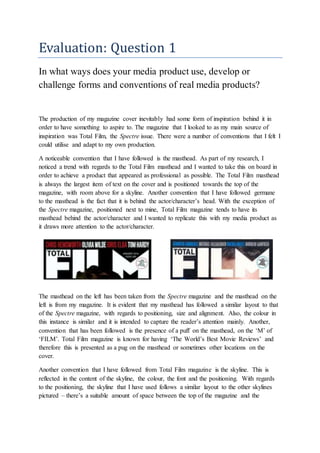
  • 1. Evaluation: Question 1 In what ways does your media product use, develop or challenge forms and conventions of real media products? The production of my magazine cover inevitably had some form of inspiration behind it in order to have something to aspire to. The magazine that I looked to as my main source of inspiration was Total Film, the Spectre issue. There were a number of conventions that I felt I could utilise and adapt to my own production. A noticeable convention that I have followed is the masthead. As part of my research, I noticed a trend with regards to the Total Film masthead and I wanted to take this on board in order to achieve a product that appeared as professional as possible. The Total Film masthead is always the largest item of text on the cover and is positioned towards the top of the magazine, with room above for a skyline. Another convention that I have followed germane to the masthead is the fact that it is behind the actor/character’s head. With the exception of the Spectre magazine, positioned next to mine, Total Film magazine tends to have its masthead behind the actor/character and I wanted to replicate this with my media product as it draws more attention to the actor/character. The masthead on the left has been taken from the Spectre magazine and the masthead on the left is from my magazine. It is evident that my masthead has followed a similar layout to that of the Spectre magazine, with regards to positioning, size and alignment. Also, the colour in this instance is similar and it is intended to capture the reader’s attention mainly. Another, convention that has been followed is the presence of a puff on the masthead, on the ‘M’ of ‘FILM’. Total Film magazine is known for having ‘The World’s Best Movie Reviews’ and therefore this is presented as a pug on the masthead or sometimes other locations on the cover. Another convention that I have followed from Total Film magazine is the skyline. This is reflected in the content of the skyline, the colour, the font and the positioning. With regards to the positioning, the skyline that I have used follows a similar layout to the other skylines pictured – there’s a suitable amount of space between the top of the magazine and the
  • 2. masthead. In addition to this, the skyline matches the length of the masthead, which is evident in all magazines, and this is important as it conveys a professional and organised layout. The use of mise-en-scene on my magazine cover also follows conventions from other Total Film magazines but challenges some at the same time. The majority of Total Film magazines that I analysed have the actor/character positioned at the centre of the page with the use of a mid-shot. My intention was to have more of the focus on the character’s face but still show some of the costume so a medium close-up shot was used. The costume that the actor is wearing is a smart blazer, jumper and shirt which is seen in the trailer when he is in police interrogation. The film involves an interrogation scene where Ross is questioned about the kidnapping incident and for this scene he is seen in a suit. This is therefore supposed to reflect that particular part of the film. The magazine cover in the top left is my media product and it shares resemblance with all three of the other Total Film magazines shown in terms of the main image. The
  • 3. representation of the main image is very similar with the Sherlock Holmes magazine and this is because they’re both positioned at the centre of the cover, leaving the sides available for cover lines and other magazine cover conventions e.g. pug. Another way in which I have followed the conventions of other Total Film magazines is related to the use of lighting. It is evident that both magazines have utilised low-key lighting to portray certain attitudes about the character shown e.g. Daniel Craig is shown to be mysterious and discreet which reflects the nature of the role he is playing, James Bond. My main image features low-key lighting in order to create a sense of suspicion about the main character whilst not revealing much to the audience in order to maintain suspense. Another convention that I have followed pertaining to the main image is based on non-verbal communication (NVC). The majority of Total Film magazines that I analysed as part of my research have the actor/character shown with a grave expression and looking directly at the camera. The intention of this is most likely to reflect the role of the actor/character e.g. Sherlock Holmes as a detective. Using a serious expression on the character’s face on my magazine cover was to highlight the fact that he is directly involved in a serious matter in the film, the kidnapping of the girl. In addition to this, it was also used to create a feeling of obscurity in order to keep the audience on edge and increase their curiosity about the character and the film. Leading on from this, having the actor/character looking directly at the audience is more likely to attract their attention as it instils a sense of intimidation which would almost force them to watch the film out of fear. Some of the Total Film magazines that I examined attempted to implement setting on their cover to help the audience understand more about the film they’re promoting. In both magazines it is apparent that the publishers have tried to incorporate some form of setting in order to provide a hint to the audience about where the film is set which may help
  • 4. them understand what the film entails. For example, the Sherlock Holmes 2 magazine has a train track in the background and The Adjustment Bureau magazine features a city in the background. I have chosen not to follow this convention as it isn’t overly common to include setting on the cover and I also intend for there to be an element of surprise as to where the film is set in order to create an enigma. Also, including setting in the background can divert the attention of the reader away from the main actor at the centre of the magazine. The costume worn by the actor/character on my media product is perfectly visible for the audience to see but it doesn’t reveal much about the nature of the film or what sort of role the actor shown adopts in the film. This links back to the fact that I intend to let the audience formulate their own interpretation of what the film could possibly involve which would potentially encourage them to watch the film more. As well as relating to the interrogation scene that occurs in the trailer, the suit also creates an enigma as the connotations of this type of costume are of wealth, importance and purpose and so the audience wouldn’t associate a character who is wearing a suit to be involved in the events that occur in the film such as a kidnapping and interrogation. A common convention that Total Film magazine appeared to demonstrate was the specific way in which the cover lines are displayed. As the two examples above show, both sides of the magazine are utilised and the cover lines are laid out simply but professionally. For my media product I have adopted a similar layout but have tried to inject my own ideas into it at the same time. The idea of having a big name in the filming industry, particularly an actor or actress e.g. Daniel Radcliffe, in a bolder and bigger font as well as a different colour to the relevant news story underneath it appealed to me and I utilised this idea for my media product. Also, having a few of the latest films running down the other side in alternating colours also came across as a conventional Cover Lines Cover Lines
  • 5. theme so I followed this concept too. I have chosen to position my cover lines on either side of the main image which follows this convention of Total Film magazine. I felt that this was an effective way to have the cover lines laid out as it ensured that both sides of the magazine cover were being utilised and it displays a professional appearance. I selected these particular films as well as the news story as it matched the sombre tone of the actor’s facial expression and the masthead. ‘Hollow Town’ provides connotations of a dark and serious film so I wanted to keep this tone consistent throughout the magazine cover. With regards to the cover lines at the bottom of the page, I found from my research that Total Film magazine don’t tend to have a conventional layout for these cover lines so it was challenging to opt for a suitable layout for my cover lines whilst still resembling a Total Film magazine. I selected a few magazine covers with cover lines at the bottom of the page and decided on the layout and content that I approved of the most. These are examples of the type of cover lines that I found on some Total Film magazines and they all appealed to me to an extent and I felt I could implement something from each example on my own magazine cover. The bottom two examples captured my attention the most but I was unable to follow the second one as I had already included a ‘plus’ sign in a different place on the magazine cover so I wasn’t able to fully recreate this layout on my media product. I felt that the bottom example was a layout that I could utilise on my magazine cover as it would complement the rest of the page and fit in well. This is how I featured the cover lines at the bottom page and it is clear that I have followed the convention of that particular magazine cover but have still managed to incorporate my own style to it. These films and the actor included were featured as it matched the mysterious and grave tone of the rest of the magazine which is a significant part of my media product as it ensures that the audience know what type of film ‘Hollow Town’ is as the rest of the magazine reflects similar connotations and emotions created by the film. The Hateful Eight is a mystery film whilst Bridge of Spies and Spotlight are intense dramas and both genres tend to evoke enigmatic feelings. Having John Boyega featured was also to create a sense of
  • 6. mystery and interest as he is not very well known but is starting to creating a name for himself after taking up a role in the latest Star Wars film. This is the film poster that I have created which is also designed to help promote the film trailer that my group and I are producing. After looking at many different thriller/horror film posters I attempted to take as much inspiration as I could to help produce a film poster that would convey ideas of the thriller/horror genre. One key concept that I managed to grasp was the use of lighting – it was evident from the posters that I analysed that low-key lighting is a common convention amongst thriller/horror film posters. Therefore I tried to implement this on my media product as effectively as I could with the background image and actors available to me. The main focus was to present the setting in a mysterious and alarming way and I enhanced the image by darkening it to help achieve this effect. The film content suggests that it is the town that holds the mysterious and eerie element to the film so therefore I focused on making the setting look gloomy. With regards to props, I found that many of the thriller film posters didn’t include props whilst some did. The posters that did include props intended to evoke certain feelings amongst the audience with relation to the props featured e.g. violence or vulnerability. The fact that many posters didn’t include props shows that props don’t hold much or any significance in that particular film - this is the reason as to why props weren’t included on my media product. Tag lines are extremely conventional amongst film posters of all genres and very few don’t include them. The intention of a tag line is to create an enigma in the audiences’ mind about the film before they decide if they want to watch it – this is achieved through trigger words included in the tag line. It is common for the tag line to be positioned either near the top or
  • 7. the bottom of the film poster and is also usually in small print as the designers don’t want to take the focus away from the main image. Tag lines will always include some relevance to the film plot which helps to determine whether the audience will like the film as they’ll be able to make out what the film is possibly about from the tag line, to an extent. The two examples above highlight the fact that tag lines hold some relevance to the film being promoted and they also demonstrate the conventional positioning. In the Shutter Island poster the tag line is located near the top of the poster and is in small print but can still be seen due to the contrast in colour between the text and the background. In the Before I Go to Sleep example the tag line holds relevance to the film plot as ‘Who Do You Trust’ highlights the fact that the main character has lost her memory and therefore has to choose who to trust as one of the men shown is lying and the other isn’t. The Before I Go to Sleep poster is where I gained my inspiration to have the trigger words in my tag line in a strikingly different colour in order to capture the audiences’ attention and force them to think more deeply about what the film entails. It can be clearly seen that I have used red which is a distinct contrast from the white colour of the rest of the tag line. This is used to emphasise the fact that the protagonist’s past as a former convict has returned to haunt him as he attempts to start his new life. One particular convention that I have challenged on my media product is the inclusion of the antagonist on the film poster and for him to be so prominently shown. It was clear from my findings that thriller film posters in particular have a tendency to not show the antagonist in the film on the poster as it diminishes the element of mystery and reveals too much to the audience as to who is responsible for any wrong-doings or enigmas in the film.
  • 8. The example shown here is one of the few film posters of my film trailer’s genre where the antagonist is shown so evidently and in a dominating position. Cold Comes the Night involves a blind man taking a motel owner and her daughter hostage to help him track down his money. The daughter is shown in a very vulnerable position behind the antagonist who appears menacing and frightening. I adapted this idea to my own media product but instead included the antagonist behind the protagonist to indicate that he is always lurking behind the protagonist in the film, making his life a misery. Although it would seem I have placed the protagonist in a dominant position, I have ensured that he still appears vulnerable through the use of low-key lighting and the expression on his face. The film poster that I gained the most inspiration from was the Shutter Island poster. I was influenced by the positioning of the text as well as the positioning of the main character in particular and I attempted to mirror a similar sort of concept on my media product. It is evident that I have adopted a similar layout on my media product as the Shutter Island film poster shown here. I found that the way in which the text was laid out was appealing as it was unique and it captured my attention so therefore it is likely to attract my target audience as the majority of them are of a similar age group to me as I gathered from my research. I also liked the way in which setting was incorporated on the Shutter Island poster and I also attempted to include a similar sort of idea with a clear distinction in the sense that my poster has the setting more centred as opposed to the Shutter Island poster which has it on one half of the poster. I feel that by including some idea of where the film is set is a key way of drawing in an audience as it could potentially make them more familiar with the nature of the film e.g. a city could indicate crime.
  • 9. The use of NVC is another convention that I have followed and this helps to imply to the audience what sort of genre the film trailer is demonstrating. It is common on horror/thriller posters for the characters included to have grave facial expressions which reflect the nature of the film as they are often dark and sinister. All of the examples shown above reinforce this idea as they all present grave expressions which mirror the sort of emotions provoked in the film. The film trailer that my group and I are producing is of a horror/thriller genre and we therefore had a number of films that we could analyse in order to help us achieve a trailer of a similar standard. One of these trailers was for the film Prisoners and this was the trailer where we gained the most inspiration from as not only is it of a similar nature and follows a similar plot but it also consists of many elements that we felt would look effective in our trailer. A noticeable and effective convention that the trailer follows is the use of many cuts and fades which creates a fast-paced effect and keeps the audience on edge which is one of the aims of a horror/thriller trailer. As a group we felt that the final scenes would be the most suitable part of the trailer where these editing techniques would look effective as this is where tensions start rising as there is a desperate race against time for Ross who sets out to retrieve Frank’s kidnapped daughter as well as clearing his name and proving his innocence. By utilising fades and cuts in the Prisoners trailer, the editors have managed to keep the audience engaged and interested whilst not revealing too much in an attempt to make them more curious. We hoped to achieve a similar effect with the use of sharp fades and cuts in our trailer. Another convention that the Prisoners trailer follows is the inclusion of a significant one-liner that is intended to be a memorable part of the trailer that the audience often remember. In the trailer there is a short scene of dialogue where the Detective is introducing himself to the main family and at the end of that scene he finishes with “I’m gonna find your daughters”. This is indicative of the enigma that has occurred in the film and as it is so abrupt and direct, it is likely to come across as alarming and will remain in the audiences’ mind. For our trailer we included a key-one liner towards the end of the trailer in between the fast-paced scenes where Ross is searching for the kidnapped girl in the park. This ensures that the trailer doesn’t lose its fast pace whilst still delivering a message to the reader that is intended for them to remember and associate with the film. It is conventional amongst horror/thriller films
  • 10. to have a significant one-liner towards the end of the trailer as it keeps the audience on edge at the end and remains with them. The trailer utilises a number of different camera shots and angles in order to provide different connotations of what is occurring in the particular scene. One specific shot used that the group felt was effective was an over-the-shoulder shot from behind the detective who is interviewing the prime suspect in the investigation. This was most likely used to present the detective in a domineering way over the suspect and this is essentially the effect we wanted to create in the interrogation scene that takes place in our trailer. We adapted the over-the- shoulder shot for our scene so that Ross can be seen in between the two shoulders of the interrogators which portrays him as vulnerable and inferior. A key moment in the Prisoners trailer is towards the end where there’s a quick burst of different shots of the detective and the father and then it cuts to black before showing the father of one of the kidnapped daughters pointing a gun at the prime suspect. The scene then fades to black and then to a shot showing the suspect on the floor of a bathroom, beaten up, gagged and tied to a radiator. In our trailer we adopted a similar idea and it is seen after the audience has been introduced to the main character Ross and is familiar with his past and why he was in prison. Ross is woken up in the morning by the desperate cries of Frank having just found his daughter has been kidnapped. Ross quickly runs downstairs and opens his front door to see what all the commotion is about and is immediately confronted by Frank who punches him in the face. The scene then fades to black before fading to the interrogation scene where there is a close-up of Ross' face which is shown to be badly bruised from the brutal punch from Frank. We felt this was an effective use of editing and camerawork as it alerts the reader and implies that there is a grave tone to the trailer.