Contact:- 8860008073 Call Girls in Karnal Escort Service Available at Afforda...
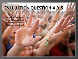
Evaluation Question 4&5
1. Who would be the audience
for your media product, and
why? /How did you attract
and address your audience?
2. AUDIENCE Gender: Male (as hip hop as was changed by striving to be
TAR G ET
MY
genre relies on traditional the best.
confirmations of masculinity)
Experiencers – These are
Age: I have decided according people who get the most out
to the information that the of life, take every
age group climbing up to experience they can, eat fast
25 years is too far up the food, and usually get bored
scale; therefore I have easily.
decided to target my Strivers – People who aim to
magazine at the age group of achieve to a higher level
approximately 16-23 years of in life, making a good
age. living, being successful.
However, these people are
Sexuality: Straight usually unsure of themselves.
Income Bracket: My target Life Matrix: Tribe Wired –
audience will be from the Digital people, usually free
income bracket of C2/D spirited and are also creative.
VAL Type: The VAL type I have Race: Realizing that the usual
chosen will be the target audience for this genre
Experiencers, as this is would mainly be aimed
common for people of this at predominantly black
age, and also the music people, however the genre is
within this genre usually has widely spreading towards
a rebellious touch to it; and different races.
also the “live life to the
fullest” approach. Also Interests: Music, Clubbing
Strivers as the music that (Nights Out), Holidays, Cars,
most artists create within the Money, Women.
genre is about how their life
3. My Design
One of the first things that
you would focus on when
attempting to make your
magazine appealing to a
relatively young audience,
would be the design of your
product (colour/font).
Primary colours such as
blue, yellow, and red would
usually be seen in this type
of magazine. Therefore, I
attempted to utilize these
colours within my own
design for my magazine.
4. FRONT COVER
The front cover of my magazine,
would attract the specified
audience as there are well-known
artists placed onto the front cover,
such as Gram, and DJ Lou, my main
featured artists on my front cover.
The large masthead placed to the
top of my front cover, connotes a
younger, and modern look to the
magazine. This would appeal to my
audience as they would like the
sight of the bright white
masthead.
Also the yellow, red, and blue used
within the background and main
image therefore allowing an
aesthetically pleasing image.
5. CONTENTS PAGE
Placing a new album advertisement,
featuring one of the main artists in my
magazine, thus creates excitement to the
contents page. This will also appeal to my
age group, as the artist featured makes
music that appeal to that age bracket.
With the design of my contents page, I
again utilized this modern look, whilst also
engaging in a bright colour scheme.
However, this doesn’t take the organization
of the page, as all text and images are
organized, using the faded A4 line effect in
the background connotes this. I used the
A4 background as it connotes structure
within the magazine, I don’t want my
audience to have the impression that Base
Chase magazine does not have any
structure.
6. Double page spread
I beleive that the placement of two
exciting titles on the top of both
pages within my double page spread
creates excitement for the reader,
also using the “house themed” font
and design connotes authenticity
within the double page spread.
I have mentioned in earlier posts that
my double page spread reflected the
essence of the genre well, as it shows
many conventions of a hip-hop
magazine using the same type of
design and also using common fonts,
and images seen within a hip-hop
magazine. I think that people who
like the genre of hip-hop will be
attracted to Base Chase magazine,
and its overall appearance.