Download as PDF, PPTX


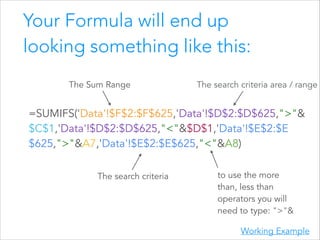
![How to use the formula
The SUMIFS formula sums the range depending on multiple
criteria. This is how it works:
=SUMIFS(sum_range, criteria_range1, criterion1, [criteria_range2,
criterion2, …])
And in plain english that means:
sum_range = The column to be added together
criteria_range1 = The search criteria area / range
criterion1 = The search term
criteria_range2 & criterion2 = Allow you to repeat with as many
conditions as you like](https://image.slidesharecdn.com/cohortanalysisingooglesheets4-140219091147-phpapp01/85/Simple-Cohort-Analysis-in-Google-Sheets-15-320.jpg)


The document discusses cohort analysis in Google Sheets, emphasizing its importance over vanity metrics like total sign-ups. It outlines a simple five-step process for conducting cohort analysis, including data structuring and using the =sumifs formula. The guide also provides tips on visualizing data and suggests involving a developer for more complex analyses.