
Recommended
More Related Content
What's hot
What's hot (19)
Similar to Inception empire
Similar to Inception empire (20)
More from george fraser
More from george fraser (20)
Recently uploaded
Recently uploaded (20)
Inception empire
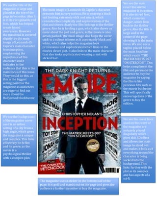
- 1. We see the title of the magazine is large and placed at the top of the page to be notice. Also it is in its recognisable red font, which has helped create brand awareness. However the masthead is covered slightly by the main image of Leonardo Di Caprio’s main character from inception, emphasising the importance of this character and it indicates to the audience that this is the main focus of this issue. They would do this, as this is the biggest selling point for the magazine as audiences are eager to find out more about the Hollywood blockbuster. The main image of Leonardo Di Caprio’s character presents him as very serious. He is wearing a black suit looking extremely slick and smart, which connotes the complexity and sophistication of the plot and shows clearly the film belongs to the thriller genre. Also he is holding a gun, which also shows us more about the plot and genre, as the movie is also action packed. The main image also helps the cover stick to a colour scheme as it uses mainly black and white, which also helps the magazine look professional and sophisticated which links to the movies clever plot. It also links to the main character that also looks sophisticated wearing a suit with slicked hair. We see the main cover line on the magazine is inception. It is also in red font, which connotes danger, which links back to the thriller genre. Also the title is large and in the center of the page showing it is the main focus. We also see a tagline placed below the main headline, which reads ‘THE MATRIX MEETS 007 “ON STEROIDS!”’ This helps compliment the film and persuade the audience to buy the magazine by saying the film is like previous hits such as the matrix but better. This will specifically encourage fans of the genre to buy the edition. We see the background of the magazine cover used is an urban setting of a city from a high angle, which gives the magazine a unique and complex. This links effectively tot h film and its genre, as the movie is a psychological thriller with a complex plot. We see the cover lines used on the cover of the magazine are uniquely placed diagonally which gives this 3D effect and allows the main image to stand out and makes it look as if everything around the character is being sucked into the background. This links further with the plot as its complex and has aspects of a sci-fi. The magazine uses a sticker in the bottom half of the page. It is gold and stands out on the page and gives the audience a further incentive to buy the magazine.