Does CO2 cause Global Warming?
•Download as DOC, PDF•
3 likes•1,156 views

This is a quantitative investigation on whether CO2 cause Global Warming? And, if it does what is the magnitude of the impact?

Recommended
Recommended
More Related Content
Similar to Does CO2 cause Global Warming?
Similar to Does CO2 cause Global Warming? (20)
More from Gaetan Lion
More from Gaetan Lion (20)
Recently uploaded
Recently uploaded (20)
Does CO2 cause Global Warming?
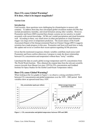
- 1. Does CO2 cause Global Warming? If it does, what is its impact magnitude? Gaetan Lion Introduction Until recently, these questions were challenging for climatologists to answer with certainty. To address them they have developed global circulation models (GCMs) that include precipitation, humidity, and cloud formation among other variables. However, Posmentier and Soon (2005) asserted that climatic systems are too sensitive to model accurately with current knowledge. GCMs can’t model precipitation and cloud formation well. According to them, very small errors in either precipitation or cloud formation trigger very large errors in temperature prediction. The recent release of the Fourth Assessment Report of the Intergovernmental Panel on Climate Change (IPCC) suggests scientists have made progress in this area. Posmentier and Soon will need time to study this update and revise or confirm their recent opinion regarding GCMs precision. Given that the mentioned exogenous climatic variables contribute much noise (until Posmentier and Soon confirm otherwise), I propose to study the direct relationship between CO2 concentration and temperature without these “noisy” variables. I purchased the data on yearly global average temperature and CO2 concentration from The World Watch Institute. They obtained the original data from the relevant scientific sources (records from Mauna Loa since 1959 for CO2 concentration and Goddard Institute for Space Studies for the Global Land-Ocean Temperature index). Does CO2 cause Global Warming? When looking at the two graphs in Figure 1, we observe a strong correlation (0.873) between CO2 concentration and global temperature over the 1959 – 2005 period. Both variables show an upward trend since 1959. CO2 concentration (parts per million) Global average temperature 390 (Land Ocean index) 14.8 380 370 14.6 360 Degree Celsius 14.4 350 340 14.2 330 14.0 320 13.8 310 300 13.6 59 63 67 71 75 79 83 87 91 95 99 03 9 62 65 68 71 74 77 80 83 86 89 92 95 98 01 04 5 19 19 19 19 19 19 19 19 19 19 19 20 19 19 19 19 20 19 19 19 19 19 19 19 19 19 19 20 Figure 1. CO2 concentration and global temperature between 1959 and 2005. Chance. Lion. Global Warming 1 of 12 6/4/2010
- 2. It would be tempting to infer that CO2 causes Global Warming. However, we can’t for two reasons. The first one is that the variables are non-stationary as they keep on rising over time. Often, such variables are strongly positively correlated even though correlation may not be meaningful. Many variables’ level does increase over time. This is true for the Consumer Price Index (CPI) and many other socioeconomic variables. Over the same period, the correlation of the CPI with temperature is even higher than CO2 concentration (0.875). This correlation is spurious. CO2 Concentration vs Global Temperature CPI vs Global Temperature 14.7 14.7 14.6 14.6 14.5 14.5 14.4 14.4 Degree Celsius Degree Celsius 14.3 14.3 14.2 14.2 14.1 14.1 14 14 13.9 13.9 13.8 13.8 13.7 13.7 310 320 330 340 350 360 370 380 0 20 40 60 80 100 120 140 160 180 200 CO2 Concentration in parts per million CPI level Figure 2. CO2 Concentration and CPI vs Global Temperature. Within figure 2, you can see how the shape of the scatter plots with CO2 concentration and CPI level as the independent variables (x axis) and temperature as the dependent variable (y axis) are almost undistinguishable from each other. They both suggest a very strong relationship with the dependent variable global temperature. With such non-stationary variables, you have to transform them into stationary ones that converge towards a mean with a constant variance. A common way to do this is to focus on the change of a variable instead of its level. Looking at the inflation rate (annual % change in CPI) instead of the CPI does this necessary transformation. The correlation between inflation and temperature drops markedly (-0.230). The high correlation between CPI and temperature (0.875) was a visual illusion we eliminated when we replaced CPI with inflation. This is illustrated below. Chance. Lion. Global Warming 2 of 12 6/4/2010
- 3. CPI vs Global Temperature Inflation vs Global Temperature 14.7 2.0% 14.6 1.5% 14.5 1.0% Change in temperature 14.4 Degree Celsius 0.5% 14.3 0.0% 14.2 0.0% 2.0% 4.0% 6.0% 8.0% 10.0% 12.0% 14.0% 14.1 -0.5% 14 -1.0% 13.9 -1.5% 13.8 -2.0% 13.7 0 20 40 60 80 100 120 140 160 180 200 -2.5% CPI level Inflation Figure 3. CPI and Inflation vs Global Temperature. Now, let’s look at the equivalent variable transformation from non-stationary to stationary for CO2 concentration level vs CO2 concentration annual % change. CO2 Concentration vs Global Temperature CO2 Concentration vs Global Temperature 14.7 2.0% 14.6 1.5% 14.5 1.0% Change in temperature 14.4 0.5% Degree Celsius 14.3 0.0% 14.2 0.0% 0.2% 0.4% 0.6% 0.8% 1.0% 14.1 -0.5% 14 -1.0% 13.9 -1.5% 13.8 -2.0% 13.7 310 320 330 340 350 360 370 380 -2.5% CO2 Concentration in parts per million Change in CO2 Concentration Figure 4. CO2 Concentration level and change As shown within figure 4, the relationship between CO2 concentration and global temperature dramatically weakened when we transformed the variables from level to % change. Indeed, the related correlations declined from 0.873 to 0.415 corresponding to an R Square of only 0.172. Thus, the change in CO2 concentration explains only 17.2% of the change in Global temperature. This suggests the majority of Global temperature change is explained by other factors besides CO2 concentration. Within figure 4, looking at the graph on the right-hand side see how a 0.5% change in CO2 concentration corresponds to changes in temperatures ranging from one extreme to another or from -1.5% to + 1.8%. Correlation does not imply causation. The second reason we can’t readily tell that CO2 concentration causes global temperature increase is because of the famous caveat “correlation does not imply causation.” You can easily measure how much two variables move in tandem (correlation). But, it is a far greater challenge to demonstrate that one variable’s behavior causes the other’s. Chance. Lion. Global Warming 3 of 12 6/4/2010
- 4. Fortunately, Clive Granger, a Nobel Prize winning statistician got us closer to capturing true causality by developing Granger Causality. Introduction to Granger Causality. If you are familiar with it, move on to the next section. To determine whether a variable causes a change in another you can implement Granger Causality in four steps. 1) Develop a Base case autoregressive model using the dependent variable and its lagged values as the independent variable. In our case, the lagged variable is global temperature in the previous year. 2) Develop a Test case model by adding a second lagged independent variable you want to test. In our case, this variable is CO2 concentration in the previous year. 3) Calculate the square of the residual errors for the Base case and Test case models. 4) Use a hypothesis testing framework to test whether these two sets of square residual errors are statistically different. If the distribution of these two samples is normal, you can use the F test or the unpaired t test. Otherwise, you can use the nonparametric Mann-Whitney-Wilcoxon test. The resulting p value from the relevant hypothesis test will give you the probability that the two samples of square residuals are the same. The closer this p value is to zero, the more the independent variable causes change in the dependent one. However, Granger Causality does not entail true causality. Granger Causality mainly determines if a variable helps predict another. You hope that such a characteristic does entail true causality; but you can’t be sure. Statisticians often refer to Granger causality instead of causality to state the difference. When Granger causality is weak (high p value) then you can state with more confidence that a variable does not cause change in the other. Granger Causality results. Even though testing the stationary variables is the more rigorous approach, to cover all basis I conducted this test twice. The first time using non-stationary variables focused on levels, and a second time using stationary variables focused on percentage changes. To test whether the square of the residuals generated by the Base model (autoregressive) and Test model (testing for CO2 concentration) I had to use the nonparametric Mann- Whitney-Wilcoxon test. This is because the distribution of the square of the residuals to be tested was far from normal. The Jarque-Berra test confirmed there was a 0% probability the distributions of the square residuals were normal. Table 1. p values that CO2 concentration Granger causes global temperature increase. Variable structure p value Non-stationary variable or 51.2% Level Chance. Lion. Global Warming 4 of 12 6/4/2010
- 5. Stationary variable or Change 68.4% Stationary variables naturally generate higher p values; yet, both Granger Causality tests suggest CO2 concentration does not cause Global temperature increase because the p values are far away from 0% and much closer to 100%. As stated earlier, when something is not Granger causing something else; you can be pretty sure it is not causing something else. Thus, we conclude CO2 concentration does not cause Global Warming. This conclusion is congruent with our finding a very low R Square between CO2 concentration change and temperature change. We can visualize the above conclusion by graphing the residuals for the Base and Test models for both Granger Causality tests. Focusing on the non-stationary variables first, we graphed the data in two different ways. Within figure 5, the graph on the left shows the absolute residual (error) in degree Celsius for each year from 1960 to 2005. The second graph to the right ranks the residual errors from highest to lowest for both the Base and Test models. When comparing both models, you can see that the Base model generated two much higher errors corresponding to the years 1964 and 1974 within the left-hand graph. But, after these two yearly periods, the gap in residual between the two models narrows considerably. From the 18th to the 46th rank, the models’ performances are undistinguishable. Non-stationary variables Non-stationary variables Base vs Test model absolute Residual Base vs Test model absolute Residual rank 0.30 0.30 Base Model Base model Test Model Test model 0.25 0.25 Degree Celsius 0.20 Degree Celsius 0.20 0.15 0.15 0.10 0.10 0.05 0.05 - - 63 66 69 84 90 93 96 60 72 75 78 81 87 99 02 05 1 4 7 10 13 16 19 22 25 28 31 34 37 40 43 46 19 19 19 19 19 19 19 19 19 19 19 20 19 19 19 20 Year Ranking from highest to lowest Figure 5. Graphs of absolute residuals for Base and Test model using non-stationary variables To confirm the relative mediocrity of the Test model vs the Base model, let’s compare the performance of the Test model with the other Test model where CPI level is the tested independent variable instead of CO2 concentration. As shown on the table below, the Test model using CPI level actually performed marginally better than the one using CO2 concentration. Indeed, its residual is associated with a lower average, median, and maximum. The table also underlines that the Base model with just an autoregressive model performed relatively well. If not for the two outliers in year 1964 and 1974, its performance would have been close to the other two. That’s stating that neither CO2 concentration nor the CPI do cause Global Warming. Chance. Lion. Global Warming 5 of 12 6/4/2010
- 6. Table 2. Residual statistics for various models using non-stationary variables. Residual in Degree Celsius Base Test model Test model model CO2 conc. CPI Average 0.098 0.083 0.082 Median 0.085 0.081 0.071 Maximum 0.281 0.181 0.170 Now focusing on the more rigorous stationary variables reflecting percentage change testing CO2 concentration let’s graph the data the same way. Stationary variables Base vs Test model Stationary variables Base vs Test model absolute Residual absolute Residual rank 2.5% 2.5% Base Model Base Model Test Model Test Model % change in temperature 2.0% % change in temperature 2.0% 1.5% 1.5% 1.0% 1.0% 0.5% 0.5% 0.0% 0.0% 1 64 67 70 73 76 79 82 85 88 91 94 97 00 03 6 1 3 5 7 9 11 13 15 17 19 21 23 25 27 29 31 33 35 37 39 41 43 45 19 19 19 19 19 19 19 19 19 20 20 19 19 19 19 Year Figure 6. Graphs using stationary variables using CO2 concentration. Looking at the graphs within figure 6 you can’t differentiate the performance of the Base Model (autoregressive) vs the Test Model (testing for CO2 concentration). Visually, it does look like change in CO2 concentration does not cause change in global temperature. The statistics as shown on the table below demonstrate that the difference between the two models is really marginal. That’s why the p value on this Granger Causality test was so high at 68.4%. Table 3. Residual statistics in percentage points for Base and Test models using stationary variables. Base Test Model Model Average 0.70% 0.67% Median 0.64% 0.54% Max 1.84% 2.17% Thus, when using established statistical methods analyzing directly the relationship between CO2 concentration and temperature we see no statistical evidence that CO2 concentration cause Global Warming. Chance. Lion. Global Warming 6 of 12 6/4/2010
- 7. Exploring impact magnitude of CO2 concentration on global temperature? Even though the first part of our study concluded that CO2 concentration does not cause global temperature increase, we still want to address the question “what if it did?” Exploring different model structures We looked at different regression algorithm to explore the best fit between CO2 concentration level and Global temperature between 1964 and 2005. Although I had data going back to 1959, I took out the years 1959 to 1963 as they were outliers. During this short period, CO2 concentration rose while temperature dropped. The basic structure of the models used CO2 concentration level as the independent variable and temperature level as the dependent variable. I got results that made more sense than when I used CO2 concentration change and temperature change (in a linear model temperatures more than doubled). Because of the caution I expressed earlier about stationary variables, I ran this basic structure through all the relevant tests to make sure it would not render resulting regression coefficients spurious. So, I tested this model for heteroskedasticity (variance of the errors is not stable). See the relevant visual test below for a linear and a log model. The heteroskedasticity graph on the left shows what changing (increasing) variance often looks like in time series data using non-stationary variables. Both the linear and log model residual profile show no such trend. Their respective variances look stable throughout the time period. Their residual graphs look identical. But, they are not. They are just extremely close which is not unexpected since the underlying variable is the same: CO2 concentration. Heteroskedasticity Linear Model Residual Log Model Residual 10 0.20 0.20 8 0.15 0.15 6 0.10 0.10 4 Degree Celsius Degree Celsius 2 0.05 0.05 0 0.00 0.00 1 2 3 4 5 6 7 8 9 10 11 12 13 14 15 16 17 18 19 20 21 85 88 91 94 97 00 03 64 67 70 73 76 79 82 70 73 88 91 00 03 64 67 76 79 82 85 94 97 -2 -0.05 -0.05 19 19 19 19 19 19 19 19 19 19 19 19 20 20 19 19 19 19 19 19 19 19 19 19 19 20 20 19 -4 -0.10 -0.10 -6 -0.15 -0.15 -8 -10 -0.20 -0.20 Figure 7. Testing for heteroskedasticity I also tested these models for autocorrelation of residual using the Durbin Watson test. Both their respective Durbin Watson values were close to 2.0 indicating no significant autocorrelation of residual. These tests confirmed that the related regression coefficients would be robust. I next explored different forms of the independent variable (log, linear, power, exponent) as shown in table 4. Chance. Lion. Global Warming 7 of 12 6/4/2010
- 8. Table 4. Regression statistics for different Global Warming model structures. Log Linear Power Exponent model model model model R Square 0.817 0.820 0.818 0.821 Standard error 0.091 0.090 0.091 0.090 As seen on the above table, the four different model structures were equally good at replicating temperature history from 1964 to 2005. R Square and Standard error are statistically undistinguishable. Nevertheless, model structure has a material implication on forecasting temperature levels by 2100 as shown on the table below. Table 5. 2100 temperature forecasts using different model structures and exploring various CO2 concentrations. CO2 Temperature in year 2100 in degree Celsius concentration Log Linear Power Exponent (parts per million) model model model model 554.4 15.89 16.36 15.99 16.17 575.0 16.03 16.58 16.14 16.41 600.0 16.18 16.84 16.32 16.70 625.0 16.33 17.10 16.49 16.99 650.0 16.47 17.37 16.66 17.29 675.0 16.61 17.63 16.82 17.60 As explored above, different model structures generate different temperature forecasts by 2100. The most left-hand column within Table 5 discloses CO2 concentration. The lowest level 554.4 parts per million (ppm) reflects what CO2 concentration would be by 2100 if it grows at the historical rate. The other levels are just exploring higher CO2 concentration scenarios. The log based model generates the lowest temperatures meanwhile the linear one generates the highest ones. Within the climatology community there is much debate on whether the relationship between CO2 concentration and temperature is logarithmic or linear, referring to the work of Michaels (2004). Thus, I will concentrate on a linear and a logarithm model only. Before venturing forward, let me just introduce Monte Carlo simulation. If you are familiar with this subject skip this section. Introduction to Monte Carlo simulation. Let’s say you build a model to forecast GDP. You use as independent variables: interest rates, inflation, oil prices, and productivity. For each independent variable you could assign a value and input it into your model. Your output would be GDP growth. You could also explore different scenarios by changing interest rates, oil prices, etc… Monte Carlo simulation handles such models well because it handles uncertainty. You don’t know what oil prices will be but you expect that the most likely scenario is $60 per barrel with a maximum of $80 and a minimum of $45. That’s actually a triangular distribution (parameters: Most likely, Max, Min) that is used often in Monte Carlo simulation. So, now you have turned oil prices into a random variable based on the mentioned triangular distribution. You go through the same exercise for all other Chance. Lion. Global Warming 8 of 12 6/4/2010
- 9. variables (interest rates, inflation, and productivity). In each case, you pick a relevant distribution. The most common ones are normal distribution (mean, standard deviation), uniform distribution (equal probability for each different value), and triangular distribution. You typically select the distribution that best fit either the existing historical data or an outlook consensus. Once, you have turned all your independent variables into random variables (defined by a specific distribution) you run a Monte Carlo simulation to run several thousands of trials with random combinations of the four random independent variables. And, you get thousands of different GDP forecasts. Monte Carlo simulation generates entire outcome distribution. Thus, you can easily derive what is the range of GDP growth that falls within a 50% probability or within a 95% probability. Dedicated software (Crystal Ball or @Risk) have rendered Monte Carlo simulation very accessible to proficient Excel users. Monte Carlo simulation framework. To forecast prospective temperature increase by 2100, the Monte Carlo simulation models had two random variables. The first one is CO2 concentration annual percentage growth. Its distribution was a customized uniform one that simply captured historical annual growth rates from 1960 to 2005. This allowed simulating CO2 concentration level in 2100. This figure became the input into a regression model to calculate temperature level and in turn temperature increase over 2005’s level. The model has a second random variable that is an error term with a normal distribution (mean = 0%; standard deviation = standard error of regression or about 0.09 degree Celsius). The error term increases the volatility of temperature outcomes. As mentioned, I used two regression models the first one treating CO2 concentration as a linear independent variable and the second one taking the log of CO2 concentration as the independent variable. Chance. Lion. Global Warming 9 of 12 6/4/2010
- 10. Monte Carlo simulation results. Running a regression model with CO2 concentration level as an independent variable and temperature level as a dependent variable, I obtained the following results using a Linear model and a Log model. Table 6. Monte Carlo simulation outcome for temperature increase by 2100. CO2 Temperature increase in Cels. concentration Linear Log ppm model model Difference Average 578.6 2.02 1.45 0.57 Median 578.3 2.03 1.46 0.57 Standard deviation 24.7 0.28 0.18 0.10 Standard error 0.8 0.01 0.01 0.00 Kurtosis 0.18 0.28 0.24 0.35 Skewness 0.20 0.15 -0.01 0.40 Percentile 1.0% 525.8 1.43 1.05 0.36 2.5% 531.6 1.49 1.09 0.38 5.0% 539.4 1.56 1.15 0.41 10.0% 547.6 1.66 1.22 0.44 20.0% 557.5 1.79 1.30 0.48 25.0% 562.3 1.84 1.34 0.50 50.0% 578.3 2.03 1.46 0.57 75.0% 594.1 2.19 1.56 0.63 80.0% 598.1 2.22 1.58 0.65 90.0% 610.5 2.37 1.68 0.71 95.0% 620.9 2.48 1.74 0.75 97.5% 630.8 2.59 1.80 0.80 99.0% 641.8 2.72 1.88 0.85 I have highlighted the Median as a proxy of the most expected outcome out of 1,000 trials. The percentile portion of the table is most interesting as you can quickly determine the probabilities associated with various temperature ranges. For instance, if we believe that the relationship between CO2 concentration and temperature is linear there is a 50% probability that temperature increase will range from 1.84 to 2.19 degree Celsius. We did this simply by reading the outcome at the 25th and 75th percentile. If we want to reach a 95% confidence level the range extends from 1.49 to 2.59 degree Celsius reading the figures at the 2.5th and 97.5th percentile. If we believe the relationship between the mentioned variables is logarithmic, the temperature ranges shrink to 1.34 to 1.56 degree Celsius and 1.09 to 1.80 degree Celsius respectively. Thus, using a combination of regression and Monte Carlo simulation we generated many different outcomes, and determined related probabilities of these outcomes. I understand that is something more complex GCMs are often unable to do (assess probability to ranges of temperature outcomes). We can represent the data graphically to compare the different distribution of the linear model vs the log model. Chance. Lion. Global Warming 10 of 12 6/4/2010
- 11. Global temperature increase by 2100 in degree Celsius 100 Log Model Frequency out of 80 Linear Model 1,000 trials 60 40 20 0 0.97 1.34 1.70 2.07 2.44 Degree Celsius Figure 8. Global temperature increase by 2100 The graph shows temperature increases are higher and more dispersed for the linear model. Conclusion. This analysis does not address whether Global Warming is occurring. This analysis simply addresses whether CO2 concentration causes Global Warming. And, by how much are temperatures likely to increase by the year 2100 solely in relation to CO2 concentration. Using Granger Causality we could not see any statistical evidence that CO2 concentration causes Global Warming. Using a combination of regression and Monte Carlo simulation, we estimated that prospective CO2 concentration by 2100 would be associated with an increase in temperature from 1.49 to 2.59 degree Celsius at the 95% confidence level using a linear model and between 1.05 to 1.80 degree Celsius using a log model. Those values are lower than the ones generated by GCMs. GCMs higher values could be due to temperature increase associated with other greenhouse gases and other physical variables not included in this statistical study. References and Further Reading Posmentier, E.S., and Soon, W. and Michaels, P. J. (eds) (2005) Chapter 10 of “Shattered Consensus: The True State of Global Warming.” Michaels, P.J (2004), “Meltdown: The Predictable Distortion of Global Warming by Scientists, Politicians, and the Media.” Chance. Lion. Global Warming 11 of 12 6/4/2010
- 12. Chance. Lion. Global Warming 12 of 12 6/4/2010