
Recommended
More Related Content
What's hot
What's hot (20)
Similar to Typography
Similar to Typography (20)
More from farheen180
More from farheen180 (20)
Recently uploaded
Recently uploaded (20)
Typography
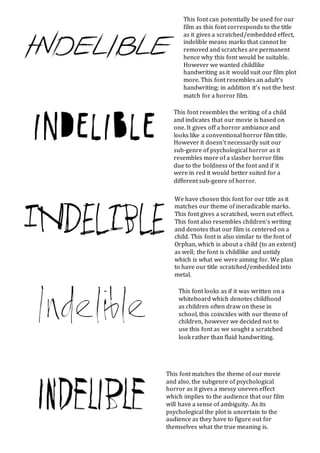
- 1. We have chosen this font for our title as it matches our theme of ineradicable marks. This font gives a scratched, worn out effect. This font also resembles children’s writing and denotes that our film is centered on a child. This font is also similar to the font of Orphan, which is about a child (to an extent) as well; the font is childlike and untidy which is what we were aiming for. We plan to have our title scratched/embedded into metal. This font can potentially be used for our film as this font corresponds to the title as it gives a scratched/embedded effect, indelible means marks that cannot be removed and scratches are permanent hence why this font would be suitable. However we wanted childlike handwriting as it would suit our film plot more. This font resembles an adult’s handwriting; in addition it’s not the best match for a horror film. This font resembles the writing of a child and indicates that our movie is based on one. It gives off a horror ambiance and looks like a conventional horror film title. However it doesn’t necessarily suit our sub-genre of psychological horror as it resembles more of a slasher horror film due to the boldness of the font and if it were in red it would better suited for a different sub-genre of horror. This font looks as if it was written on a whiteboard which denotes childhood as children often draw on these in school, this coincides with our theme of children, however we decided not to use this font as we sought a scratched look rather than fluid handwriting. This font matches the theme of our movie and also, the subgenre of psychological horror as it gives a messy uneven effect which implies to the audience that our film will have a sense of ambiguity. As its psychological the plot is uncertain to the audience as they have to figure out for themselves what the true meaning is.