The document describes the process of designing a magazine cover in several steps. First, the creator chose the "Aspire" font for the masthead because it is easy to read without being bold. A different font with a star for the letter "A" was found and considered for the logo. Effects like drop shadows, inner shadows, and outer glows were added to make the masthead stand out. Colors were experimented with and blue was selected to match the calm genre of music. Cover lines were added to complete the design of the finished front cover.
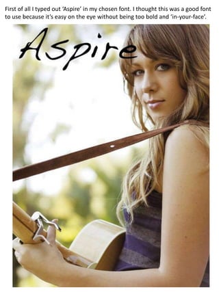
1. First of all I typed out ‘Aspire’ in my chosen font. I thought this was a good font to use because it’s easy on the eye without being too bold and ‘in-your-face’.
2. I found another font that has a star for an ‘A’ which I thought would be a good idea for a logo.
3. I experimented with effects and here a drop shadow is used which I think makes the masthead stand out more.
4. I tried out different colours, and liked the colour blue as it’s quite calm which connotes my genre of music well. This could change though depending on the photo I’ll use as my cover image.
5. I used another effect of an inner shadow which I thought made the masthead stand out even more.
6. Another effect used was a an outer glow which lightens the masthead making it more eye catching.
7. Here’s the finished front cover. I added a few ideas for cover lines to make the cover look more like a magazine.