1. •
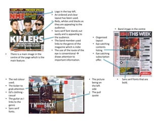
There is a main image in the
centre of the page which is the
main feature.
• The red colour
used.
• The kicker to
grab attention
• Ed’s clothing casual
• The guitar as I
links to the
genre
• Sans serif
fonts.
• Logo in the top left.
• An ordered and clear
layout has been used.
• Reds, whites and blacks as
they are appealing to the
audience.
• Sans serif font stands out
easily and is appealing to
the audience.
• The band member used
links to the genre of the
magazine which is indie
• The use of the route of the
eye is conventional
draws attention to
important information.
• Band image in the centre
• Organised
layout
• Eye catching
contents
listing
• Eye catching
subscription
offer.
• The picture
being on
the left
side
• The pull
quote
•
Sans serif fonts that are
bold.
2. • The colours used ->
appeals to the target
audience.
• The bold sans serif fonts.
• The bands mentioned link
to the genre eg. The 1975
• A main image in the
centre.
• The use of the route of the
eye draws attention to
the important
information.
• Logo on the top left.
• The coverline linking to the image
is larger than the others.
•
•
•
•
•
•
•
• Image is on the
left hand side.
• Clothes they are
wearing are
conventional
and give a laid
back look to the
artists.
Main image in
the centre.
Contents listing
on the right
Small bit of text
about the main
image.
Eye catching
subscription
offer.
Colours used.
Eye catching
header
Sans serif fonts
used.
• The bold sans serif
fonts.
• The use of a
kicker.
• The pull quote in
the middle of the
writing
• The stand first.
• The colours used
• Placement of page
numbers.