Lucknow 💋 Russian Call Girls Lucknow - Book 8923113531 Call Girls Available 2...
Student research
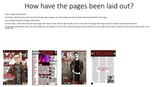
1. How have the pages been laid out?
How are pages been laid out?
Front Page = Masthead and skyline top centre of page, Main image on the centre/right main sell line bottom left and puff bottom of the page.
Cover images top right of the page under skyline.
Contents Page = Band index left hand side of page, News right and side, title top right (Inside), stories in the centre of the page with images and text included. Subscription information.
Double Page Spread (DPS) = Main title top left page and main image on the left. Title on right side saying exclusive. Pull quotes on the right, small image of the person in the exclusive bottom left, use of
Double Cap.
2. What is the text to image ratio?
• Front Cover - 70% Image 30% Text
• Contents Page - 15% Image 85% Text
• DPS – Left page 90% Image 10% Text
• Right page 5% Image 95% Text
3. How many images across all 4 pages?
• Front page - 3/4
• Contents – 4-6
• DPS – 2 – 1 left 1 right
4. Is there a consistent brand identity?
• Front Page
• Text – Red, white and black. Yellow +
• Images 1 main and 2/3 extras pictures
• Contents Page
• Red, white and black colour scheme with yellow +
• DPS
• Red, white and black colour scheme with Yellow +
• All pages
• Same font used
5. What type of language has been used?
• Front page – Formal language used.
• Contents - Formal language used.
• DPS – Mixed between formal and informal as well as Quotes.
6. How have the images been composed?
• They have been composed to suit a Indie and Pop magazine.
• Main images are big and stand out above the rest and side images
stand out a little but not as much as the main image of the magazine.
7. Is there costume variety?
• Front page – yes a little. – each act has there own style.
• Contents page – not a lot because of less images and groups .
• DPS – not much just a slight change because the DPS consists of one
person so it’s the same type of costume every time.
8. Is there variety of font?
• Front page – size of font changes and the style of font doesn’t change.
• Contents page – font size changes, but not much in change on font
style.
• DPS – font size changes but a little change in font style.
9. What type of font?
• Bold and big titles, and small for main text and stand out text is ‘RED’
example – Pull quotes.
• Main titles are big and red and stand out above the small text that is
used and shown In black.
10. What colours?
• Red, White and black colour scheme with yellow ‘+’ on Front page,
Contents Page and DPS.
11. How is the genre evident?
• Front page – Main image and text used creates the sense of indie rock
and pop rock.
• Contents – the images used and the stand out articles and bands
chosen on the band index and news sections.
• DPS – Main image and the guitar and the act the article is about.
12. any issues of representation?
• Front pages – No issues with the representation, the image and text
colours and design, represent Indie or Pop rock.
• Contents page – Not many images to give a sense of the type of
magazine it is.
• DPS – Images give a good sense and representation of indie rock.