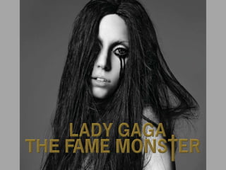
The digipak analysis discusses several elements of the album cover design and their intended meanings and impacts:
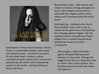
1) Dark imagery and black/white color scheme relate to the dark themes of the songs and portray a darker side of fame and youth culture that is often ignored.
2) Gold lettering refers to the title "Fame" and wealth/riches, while a gold cross suggests criticism of organized religion.
3) Images of the sexualized artist aim to attract consumers but also make a critical statement about abuse and the sexualization of women in media.
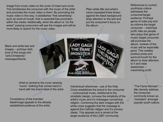
4) Familiar imagery and consistency with the artist's brand help promote the music and establish word-of-mouth advertising.