2. What we have learned about:
Genre and Audience
(Feedback take from a questionnaire pertaining to our rough cut)
• We have learned:
• Our video has a clear genre of Singer/Songwriter/Alternative – showing
that we stuck to conventions of the genre, and that those conventions are
recognisable. One comment was: "It goes against many conventions which
adds to the alternative theme“ this is positive as it shows our creativity
and breaks of conventions work for as us, rather than stunting us.
• Our video does not have a clear audience in terms of gender or age while this is positive in terms of creating for a wide audience it does also
mean that audiences meant to be involved could potentially feel
alienated, although this was actually a part of the reason behind the video
itself. The largest votes given for age was between the ages 16 – 30.
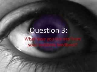
3. Our Star Image
(One Purple Eye – feedback collected from questionnaires
circulated after our treatment pitch was given)
What does the colour purple
connote?
Intentional Connotations:
• Mystery,
• Sad/Depressed,
• (Dark Purple): Creepy,
• (Dark purple) On edge, Rebellious,
• Indifferent
• Heavy,
• Dark/gloomy,
• Connotes depression/pain,
• Sick/happy/confusing
(These are all themes and connotations that
worked well with what we were trying to
achieve with the eye imagery)
Non intentional connotations:
•
•
Rock music themes,(2)
Relaxed/peaceful
•
•
(Light purple) Light & Delicate. (We took
shade into account in our final product,
ensuring the purple was very dark to avoid
this kind of reaction).
Romantic, (This wasn’t elaborated upon, so
there was nothing we could do to avoid it)
How do you feel about a star with
one purple eye?
•
•
•
•
•
•
Cool, (2) (This answer doesn’t tell us much
but is related to a positive reaction)
Weird, (7)
Cute/sexy, (This is not a connotation that we
wanted, but in the industry it would likely be
wanted).
Positive (2)
Mysterious,
Individual/different, (These would fit with
memorable, which is a large reason why we
included it).
4. What we have learned about our star
image
• The clear connotations of fear were exactly what we wanted to play up to
in our final video, and did do by heavily featuring it, (When shown our
rough cut 3/12 members of our audience thought it wasn’t used enough
and we added it several more times)
• Our eye image used several different shots and to add to the
omnipresence of it we placed on scene flashed interspersed through other
scenes with less action, or to add a more voyeuristic tone to an otherwise
harmless scene.
• Due to some of the reactions to our star image ‘sexy/cute’ we decided to
edit wildly using fades, flickers, different angles and sizes and overlays to
make the extreme close up feel intrusive and powerful, creating a sense of
being watched, as opposed to watching the artist.
• The sexual connotation is one we purposefully avoided when it was given
to us in our feedback, by showing nothing below the neck of our artist, as
well as distorting her features through the use of our extreme lighting
choices.
5. What we have learned about our Star
Image
• In reference to: ‘(Dark purple) On edge, Rebellious’ this is a
connotation we did not expect, but one we appreciate, as
the idea of rebellion is one we intended, but did not think
would be clear through image, we wanted to establish
rebellion through uncomfortable or unconventional shots
and actions, for instance our use of a screwdriver as
weapon Is meant to symbolise the ordinary turned dark,
darkness here symbolising the rebellion shown in the song.
Despite this we understand how the star image could be
considered rebellious as the colour I completely impossible,
defying nature and convention, and the heterochromia
(Only one eyes being this colour) shows opposing sides, the
black and white motif used heavily.
6. Intertextual Referencing
(The Blair Witch Project)
In our questionnaire for our treatment we asked about the
recognisability of ‘The Blair Witch Project’, as we had decided to
reference in our video.
•
13/15 students had not seen the Blair Witch project - such a small amount means
that our intertextuality may be slightly lost, but three of those thirteen specified
they had heard of it, (Others may have, but did not specify) making the themes
and styles likely recognisable, due to The Bair Witch Project’s cultural
phenomenon, large following among a wide audience and effect on the genre of
film it’s unlikely many people haven't hard of it, or know of it’s themes and styles,
for this reason we felt comfortable referencing it.
•
Of three people questioned after the showing of the rough cut video (All who had
seen ‘The Blair Witch Project’) Three of them recognised the styles and themes to
have been inspired by the movie, meaning that the references would not be lost
on our entire audience.
7. Further Feedback to Rough Cut Video
(Collected using social Media – Facebook and text)
•
We made improvements with the colour editing to stop this from being a
problem, and zoomed the clip closer so that it was completely off screen, making
the actress' lips fill the entire screen. We took into account this comment about
the table and did use a forest shot over it.
•
e
•
We experimented with doing this, but decided we preferred our original
ending of the close up 'Shh', though we were made aware that it did
become a little lost, for this reason we added extra editing to make it more
memorable.
8. Comments on Lip Syncing
These were all taken into account and fixed in the final production.
9. Feedback for Font
When we were initially designing our digipak and poster we knew font was
important, narrowing our extensive choices down to four we took a vote o
the most suite to our video, (Our audience had all seen our video)
1 Vote
4 Votes
1 Vote
7 Votes
Despite our final vote casting the fourth option as the most popular when
used on the digipak the font over crowded, the detail was lost, and a vote was
recast with the fonts 1 and 4, font 1 was voted by the entire new group as the
better one, for this reason we used font 1.